![]() Mazzraty Logo PNG
Mazzraty Logo PNG
The Mazzraty logo is green and friendly. The emblem exudes neatness, a caring attitude towards the land, and rational use of resources. The sign conveys a message of harmony with the surrounding world.
Founded in 2013 and headquartered in Doha, Al Rayyan, Mazzraty operates as a private enterprise with 201–500 employees. This scale and structure enable the company to maintain a significant influence on Qatar’s food production industry, prioritizing both quality and ecological stewardship.
Mazzraty, a distinguished farm operation based in Qatar, is a pioneer in offering 100% natural, fresh products free from chemicals and antibiotics. This commitment positions Mazzraty at the forefront of promoting healthy living for every family across the nation.
Priding itself on being the first in Qatar to implement a complete production cycle, Mazzraty ensures the highest standards of quality control. This holistic approach to production underlines the group’s dedication to excellence and reliability in the food and beverage manufacturing sector.
With an unwavering commitment to environmental responsibility, Mazzraty has invested in sustainable production processes from start to finish. The company’s initiative to achieve a 0% rate of unused byproducts, including the establishment of a water treatment facility and the production of organic fertilizer, sets a remarkable standard for sustainability in the industry.
Meaning and History
![]()
The exact date of the modern company logo’s creation is unknown. At the time of its founding in 2013, Mazzraty produced livestock feed and began transitioning to food products only in 2016. The overall image of the sign is suitable for both areas. It reflects the enterprise’s commitment to environmentalism and the protection of the environment, which underpins the enterprise.
What is Mazzraty?
An Arab enterprise of green, environmentally friendly agriculture in Qatar. Produces poultry meat, dairy products, juices, and yogurts. A modern plant processes up to 6,000 carcasses per hour. Maximum automation. Uses secondary raw materials and organic fertilizers. The company claims 0 emissions into the environment, which complies with Halal requirements.
2013 – today
![]()
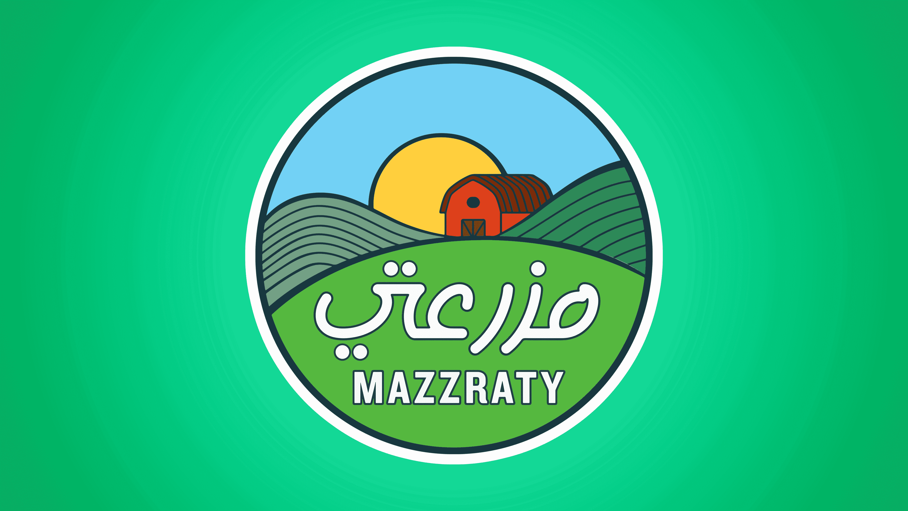
The emblem is a round sign with a white and black border. The symbol resembles a sticker placed on products to indicate quality.
Green hills and meadows immediately evoke a sense of cleanliness and environmental friendliness. In the foreground is a light green hillock with green grass. The image embodies the preparation of animal feed and pastures where livestock and poultry graze. Free-range grazing improves the nutritional value of dairy and meat products.
In the distance are two plowed fields. The straight lines emphasize the use of modern machinery and a rational approach to agriculture. The image depicts planting special grasses for making dry animal feed. One of the hillocks, likely, indicates the cultivation of berries for juices and yogurts.
At the center of the image, in the background, is a red barn for animals: a stable or chicken coop. The drawing reflects a caring attitude towards the animals. Around the picture, cleanliness and harmony prevail, highlighting the dignified treatment and meticulous adherence to Islamic requirements.
Above the logo’s fields, the Sun rises. It illuminates all of Mazzraty’s endeavors and shows that they are kind.
The name of the enterprise is placed in the foreground.
The main inscription in the logo is in Arabic because the products are primarily aimed at Qatar’s population and Muslim consumers with strict Halal compliance requirements.
Below is the English name used to represent the company to Western consumers who may want to purchase environmentally friendly products. For now, the manufacturer is focused on meeting national demand. However, in the future, it apparently plans to export.
Font and Colors
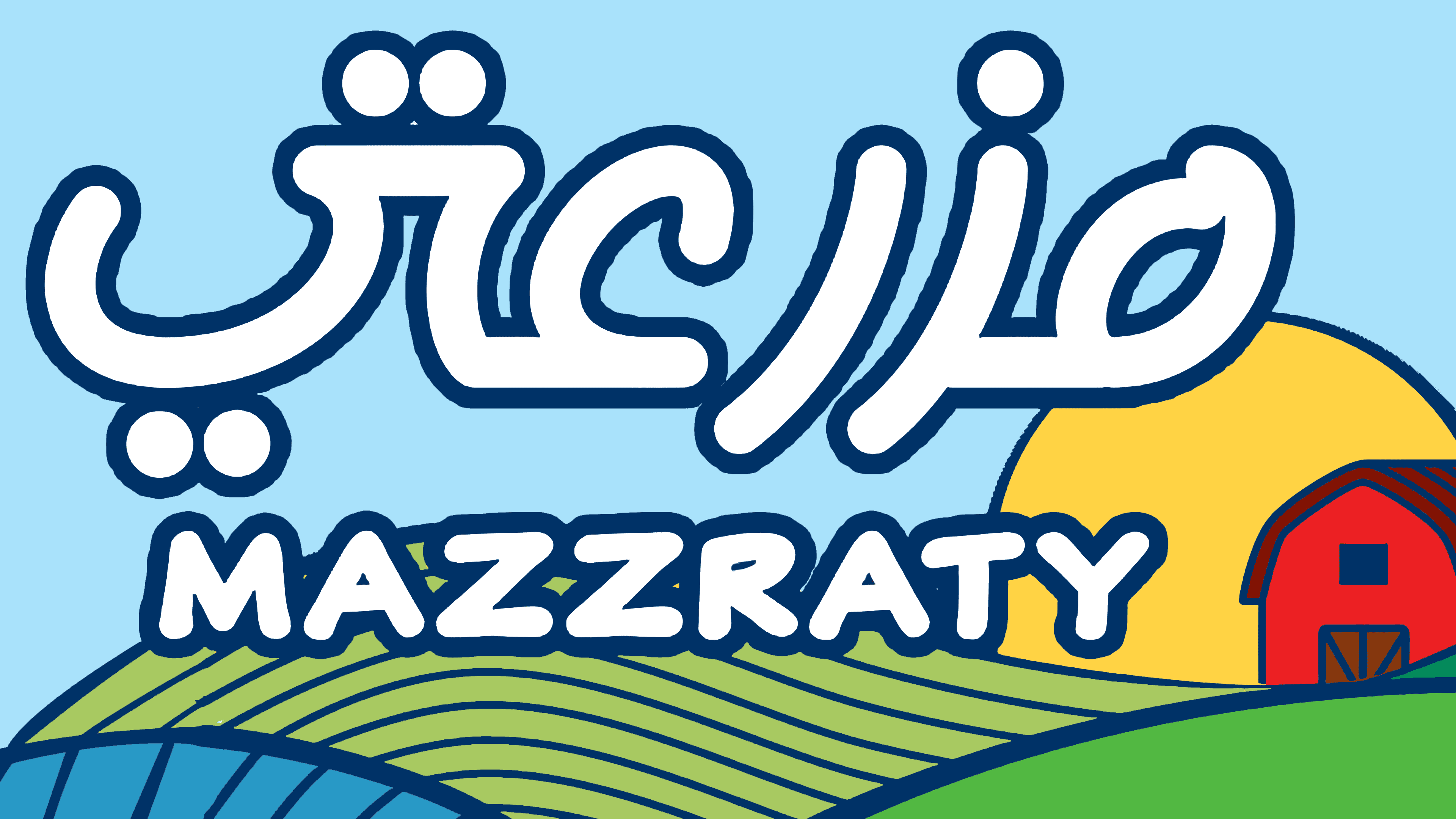
The logo features a wide palette of colors:
- White symbolizes purity and safety.
- Green shade of life, eco-friendliness, and benefits.
- Red is the color of energy provided by proper nutrition.
- Yellow is a blessing for people and a source of income for the company.
- Blue dreams, the desire to achieve more. The enterprise strives to meet the highest standards and be a producer of the future.
The font of the English inscription resembles RF Takt Ultrabold with straight, clear white letters. The wide glyphs speak of the company’s stability and steady operation.