The emblem elements link the company with the world of sports, such as racing tracks. Cars created by race car drivers can develop great speed in competitions. This message is encoded in the symbols of the McLaren logo.
McLaren: Brand overview
Meaning and History
The company’s first name was McLaren Cars, but it was changed to McLaren Automotive in 2010. Bruce McLaren, the founder of the original structure that formed the basis of the modern company, is from New Zealand. He came to the UK under the Driver to Europe program to help Australian and New Zealand athletes compete in Formula One. Bruce was very promising since childhood, and he was fond of cars because his parents maintained their service station in Oakland. By age 15, the young man had won his first serious race.
The racing career was brilliant in the new place: he became the youngest athlete to receive the US Grand Prix. He was then 22 years old. At first, McLaren raced with other brands of cars. But then he opened Bruce McLaren Motor Racing (in 1963) and built his first sports car, the M1A. The M1B followed this (she won 43 Can-Am championship victories), and the M2B (debuted in the Monaco Grand Prix). Moreover, the racer designed and tested the cars, focusing on the super-light version of the M6GT. However, the athlete died in an accident in 1970 without completing the project.
In 1985, McLaren Cars appeared but changed its name to McLaren Automotive (in 2010) because it was mostly inactive. The brand relaunch helped him revitalize and get an investment in a new venture. Initially, it was separated from other structures of the same name, but in 2017, Ron Dennis contributed to their merger as he sold his shares to the McLaren Technology Group.
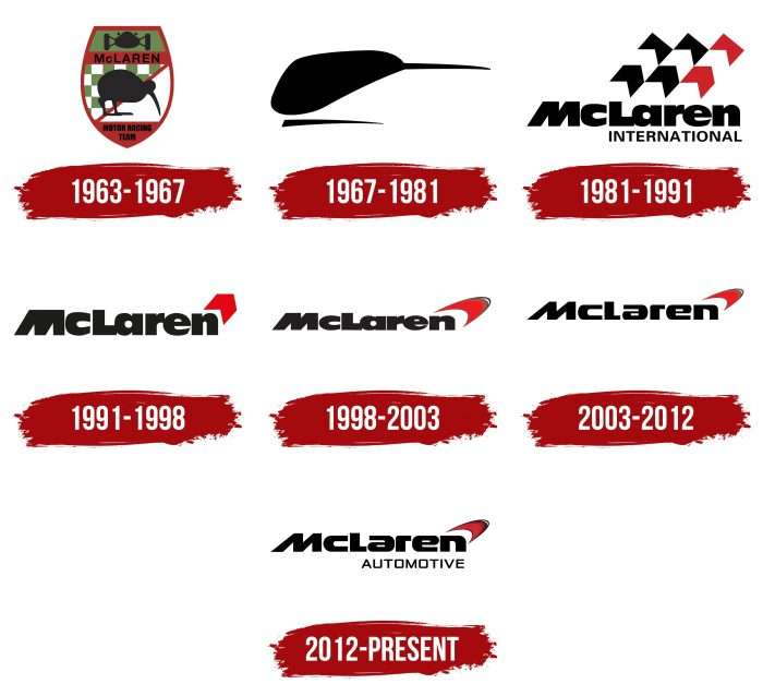
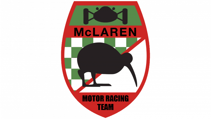
The first emblem of a racing car brand appeared as soon as it was founded. It was created in 1963 by designer Michael Turner. He offered a recognizable image of the kiwi bird that lives in the birthplace of the Bruce McLaren racer. This is a tribute to the founder of the company and his label.
What is McLaren?
It is a world-famous British car brand that is famous for its supercars.
1963 – 1967
The author used a shield as the basis of the logo to give it a heraldic shape. He divided the space into four zones of different widths. The largest is the central one, where the kiwi was drawn. The bird was black, contoured, and without naturalistic details. She stood with her head down as if she were looking for something. This image is not accidental since the kiwi has powerful legs and quickly moves on the ground, deftly overcoming obstacles. Below, in the narrow part of the emblem, there was an inscription “Motor Racing Team” – the then name of the company. At the very top, on a green field, a racing car was depicted, and under it, on a red stripe, was the name of the brand’s creator – “McLaren.”
1967 – 1981
This version was nicknamed Speedy Kiwi. It showed a bird’s head, half-pressed to the ground and directed forward. She passed Kiwi as she sprinted. The black outline with an elongated sharp beak and the same pointed line at the bottom made the logo dynamic and perfectly reflected movement.
1981 – 1991
The author of this version is Raymond Loewy. He proposed a conceptually new emblem, completely different from the previous ones. The transition to a different design is associated with the company’s rebranding, which was named McLaren International. These words were used as the main ones and were ungrouped in two lines: a large inscription – “McLaren,” and a small one – “International.” Above them was the triple racing flag, usually the starting point. But it is not just checkered: its pattern resembled the tracks from car wheels. This logo was a tribute to Marlboro’s sponsorship.
1991 – 1998
The checkered flag replaced only one detail from its drawing —a triangular arrow with a cutout at the bottom. She pointed up obliquely, symbolizing the constant movement forward and up. The word “International” has disappeared from the inscription, but the color palette and font remain the same.
1998 – 2003
The developers have replaced the acute-angled element with a rounded arc. She was double and red. The fill was between the upper and lower arched lines, connected at the ends. This “checkmark” denotes the speed mark. Smooth strokes brought harmony to the logo. The designers also changed the color of the inscription: instead of coal-black, they used dark graphite.
2003 – 2012
The font was changed in 2003. It has become softer, smoother, and more rounded, symbolizing the excellent wind flow of racing cars. This contributes to superior aerodynamics and high-speed retention.
2012 – today
After renaming the company to McLaren Automotive, it redesigned the logo. But it was not significant: mainly the inscription underwent a change, where the word “Automotive” was pressed, executed in a different font – thin, straight, chopped, with the letters “O” and “U” in the form of empty squares.
McLaren: Interesting Facts
McLaren is famous for making fast sports cars and its success in Formula One racing. It was started in 1963 by Bruce McLaren from New Zealand. McLaren made a big name in racing and car making.
- Beginnings: Bruce McLaren founded the company in 1963, making a quick impact in Formula One racing.
- First Win: Bruce McLaren drove to McLaren’s first Formula One win in 1968 at the Belgian Grand Prix.
- McLaren F1 Car: In 1992, the McLaren F1 became the fastest car around, hitting speeds of 240.1 mph. It was known for its strong carbon-fiber body, unique driver seat in the middle, and great aerodynamics.
- Racing Success: McLaren has won many Formula One races thanks to famous drivers like Ayrton Senna, Alain Prost, and Lewis Hamilton.
- Carbon Fiber Innovation: In 1981, McLaren was the first to use a carbon fiber chassis in Formula One, improving safety and setting a new standard.
- Sports Cars: In 2010, McLaren started making its own sports cars, starting with the MP4-12C, known for its carbon fiber structure and powerful engine.
- Technology Centre: The McLaren Technology Centre in England, opened in 2004, is where they develop their cars. It’s known for its modern design and environmental friendliness.
- Other Industries: McLaren also works in healthcare, pharmaceuticals, and aviation through its McLaren Applied Technologies.
- Triple Crown: McLaren is the only team to win the Monaco Grand Prix, the Indianapolis 500, and the 24 Hours of Le Mans, showing its wide range of racing skills.
- Green Efforts: McLaren is working on lowering its environmental impact, including reducing CO2 emissions and using sustainable car materials.
McLaren has come a long way from its racing roots to making advanced sports cars and using its tech knowledge in other areas, always aiming for the top in innovation and performance.
Font and Colors
The distinctive McLaren Speedmark has multiple origins. According to the first opinion, it is a reminder of the debut logo of Speedy Kiwi, as the rounded wide arc looks like the head of a kiwi bird. On other assumptions, this is a modernized chevron, personifying the sponsorship of Marlboro. The third point of view refers to the inverted “checkmark,” which is a swirling vortex that usually occurs at the top of the side supports of the car.
The designers chose a vector version of Marcus Sterz’s Moki Lean typeface, first published by FaceType, for the logo. Its alternative is the A Space font. The inscription is also similar to the Serene MTC.
The corporate palette is restrained and consists of classic colors: black, red, and white. The very first emblem also featured green.
FAQ
What is the symbol on a McLaren?
The first logo of this famous automobile and racing brand featured a kiwi, a nod to the New Zealand roots of its founder, Bruce McLaren. The kiwi represented the brand’s origins and was chosen for its qualities of speed and agility, which stand out among the more commonly used animals in car logos, such as horses or bulls.
As it evolved, the logo changed from a Kiwi to a more abstract and stylized design. This shift helped the brand reach a wider audience and supported its growth into a leader in the automotive and Formula 1 racing industries.
Can I use the McLaren logo?
You may not use the logo without prior permission. It is a registered trademark, which means it is protected by law. If you want to use it for commercial purposes, promotions, or anything else, you must obtain written permission from the brand. Unauthorized use may result in legal consequences as it violates trademark laws. The same rules apply to other names, logos, and designs on their website; they are protected and belong to their owners, and you will need permission to use them.
What does the McLaren logo mean?
The McLaren logo has various interpretations. Some believe that the swoosh shape originated from the brand’s sponsorship by Marlboro, reflecting the style of that time. Others see it as a stylized kiwi bird, honoring the New Zealand roots of its founder, Bruce McLaren. Another idea is that the logo resembles smoke from a car’s exhaust pipe, symbolizing speed and power. Each interpretation highlights a different aspect of the brand’s story and its role in motorsports and the automotive industry.
Is McLaren a Kiwi?
This famous car brand originally used the Kiwi bird in its logos to honor its founder, Bruce McLaren, who was from New Zealand. The Kiwi represented his New Zealand heritage and added a unique background to the brand. Over time, the logo changed from a Kiwi to a more modern and stylized design—an inverted arch. This new logo aims to give the brand a fresher, more abstract look while maintaining its rich racing and automotive design history.
Why is the McLaren logo a Kiwi?
The brand’s original logo featured a kiwi to honor the New Zealand roots of its founder, Bruce McLaren. Born in New Zealand, Bruce wanted to use a symbol that reflected his heritage. The kiwi bird, the national symbol of his home country, was the perfect choice. His friend Michael Turner designed the logo, using the kiwi to highlight Bruce’s origins and give the brand a unique personality. This decision helped the brand stand out by connecting it to Bruce’s past.
Is McLaren a Ferrari?
These are separate brands in the automotive industry. McLaren operates independently as part of the McLaren Group, a privately owned company that produces high-performance vehicles such as supercars and Formula One cars. Ferrari is an iconic Italian brand known for its luxury sports cars and extensive motorsport history.

