![]() Medium Logo PNG
Medium Logo PNG
The Medium logo shows the website’s connection with writers and readers. The typography underlying text publications inspired it. The emblem symbolizes the search for new ideas to be discussed on the global platform for exchanging opinions.
Medium was launched in August 2012 by Evan Williams, who had already helped create Blogger through Pyra Labs and later co-founded Twitter. After Google bought Pyra Labs in 2003 and Williams led Twitter from 2008 to 2010, he began working on a platform that would sit between a short tweet and a full publication.
The service was initially open to invited writers and became public in 2013. Its name reflected a middle format for reading and writing online. In April 2013, Medium bought Matter, a science and technology journalism site, showing an early attempt to combine open publishing with edited long-form work. By that time, the company had about 30 employees.
Medium raised $25 million in January 2014, with Greylock Partners involved, and another $57 million in September 2015, led by Andreessen Horowitz. By 2016, users were publishing 7.5 million posts a year, and the platform reached 60 million monthly readers. That same year, Medium bought Embedly and had raised $132 million in total funding.
In January 2017, Williams cut about 50 jobs, closed offices in New York and Washington, and abandoned advertising, arguing that it pushed publishers toward traffic chasing. In March 2017, Medium introduced a $5 monthly subscription, and in October, it opened the Partner Program to all writers. Later shifts included closing some publisher programs in 2018, launching in-house publications in 2019, and refocusing on independent writers in 2021. In July 2022, Tony Stubblebine became CEO. By October 2023, Medium had about 850,000 paying subscribers, while Substack became its main rival.
Meaning and History
![]()
The Medium platform is not standing still: it is constantly evolving and thus needs to update its visual identity. Initially, its concept was based on a blank page, encouraging users to record thoughts and ideas. Therefore, a logo in the form of a single letter – the “building material” of language – was quite appropriate. Since then, the site’s mission has remained unchanged but has become more sophisticated.
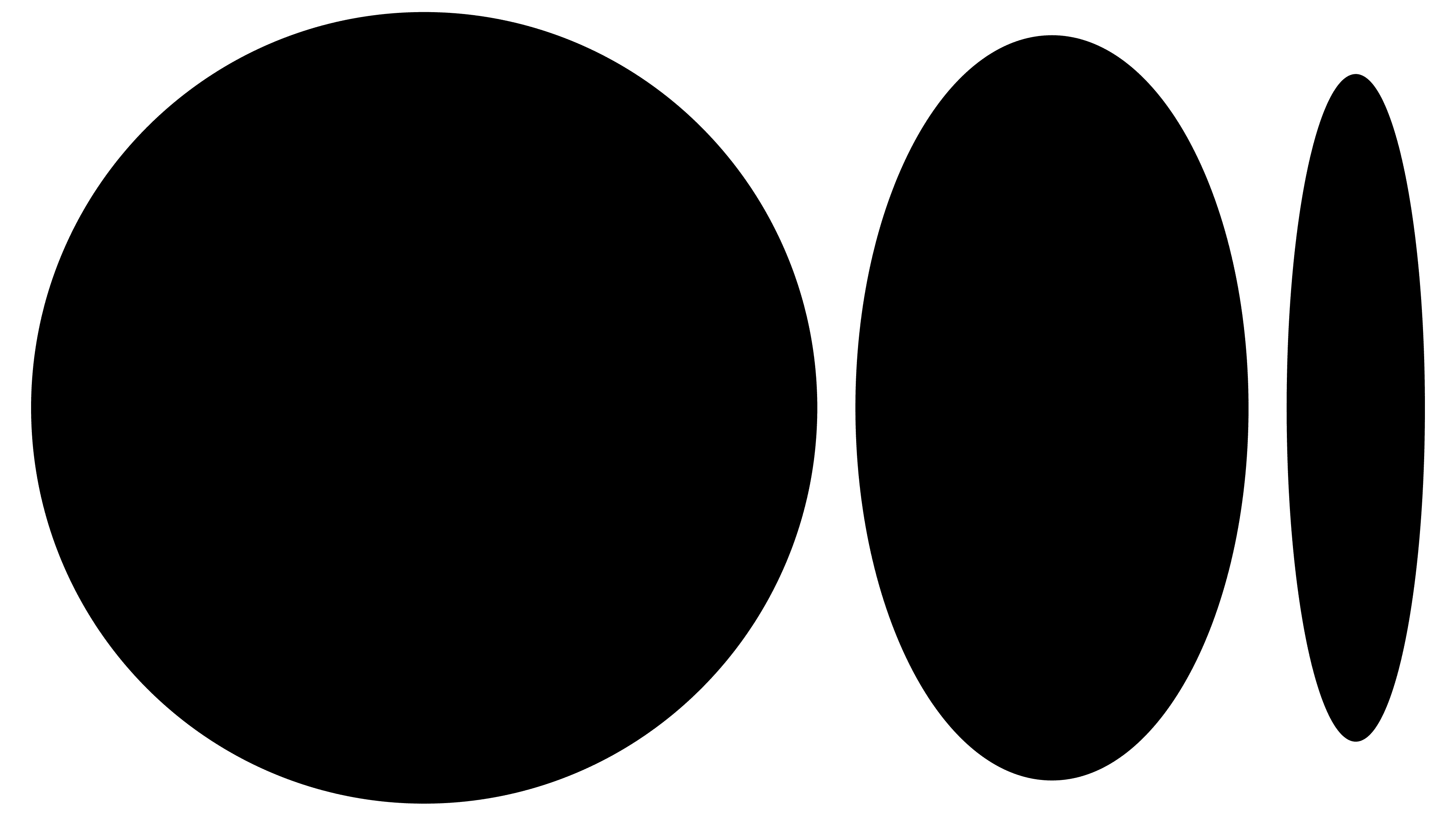
In 2015, the emblem took on a friendly appearance: a green “M,” reminiscent of quirky origami, embodied the flexibility of ideas. However, two years later, the decision was made to return to the restrained black-and-white design associated with prestige and traditional print publications. In 2020, austerity was tempered by a new visual element: a stylized ellipsis. Designers presented it as a circle and two ellipses of different widths as if receding into the distance. This is a symbol of self-expression and creative pursuits.
What is Medium?
Medium is an online platform designed for both publishing articles by professional journalists and maintaining personal blogs by ordinary users. It was established in 2012 and quickly became a place where readers could find quality content on topics ranging from literature and art to technology and science. Authors, in turn, can earn through a paid subscription.
2012 – 2015
![]()
A beta version of the site was launched in 2012. Even then, a logo with a large white letter “M” in a black square was used. Next to it was the inscription “Medium,” executed in the Stag font, distinguished by large rectangular serifs. This bold, recognizable sign emphasized the online platform’s connection to journalism and typography. Moreover, it fits perfectly into its minimalist design, where nothing is superfluous: no ads, no top panel, and no colored background.
2015 – 2017
![]()
The Medium became disillusioned with its emblem, considering it needed to be more flexible. As the site evolved, it became clear that nothing could be done with a simple black “M,” as it did not reflect the brand’s new possibilities. Designer Rod Cavazos from PSY/OPS helped fix this problem, proposing a replacement – a stylized “M” made of green color blocks. Segments of different shades represented a series of interconnected ideas. The figure they formed was innovative. This part of the logo resembled a puzzle and hinted at the paper the text carrier was made from. Next to it was the platform name, set in a black sans-serif font, roughly similar to Pria Ravichandran’s Palanquin SemiBold.
2017 – 2020
![]()
In 2017, the site changed its business model, offering users a paid subscription to exclusive content. As a result, a rebranding was carried out, allowing a return to the strict black-and-white design. Like the 2012 emblem, the new logo contained a white “M” in a black square. Only now did the letter have triangular serifs and lines of varying thicknesses, from very thin to excessively wide. This symbol was created by the Manual studio in New York.
The word “Medium,” set in a contrasting font, echoed the headers of prestigious newspapers such as The Washington Post and The New York Times. These associations subconsciously elicited trust from readers. The only thing that seemed out of place was the distance between the glyphs. The long, sharp serifs created an imbalance.
2020 – today
![]()
Like all previous ones, the modern Medium logo has a graphic symbol and a wordmark. However, instead of the “M,” an original combination of a black circle and two ellipses of different widths is now used. It appears neutral and does not interfere with authors’ self-expression when publishing their texts on the platform. It is a stylized ellipsis, a punctuation mark indicating an unfinished thought. It is often used to hint at an unspoken continuation of the story.
The word “Medium” font is similar to the one used before 2020. However, the designers slightly adjusted its form, reducing the serifs, adding slants, and stretching the letters vertically, improving the inscription’s readability. The logo was created in collaboration with COLLINS, which has also worked with brands such as Twitch and Spotify.
Font and Colors
The contrasting font with sharp serifs appears to be a modified version of SoftMaker’s Toledo Serial Bold, but it isn’t. It is an individual set of glyphs developed for the wordmark.
The emblem’s black-and-white color scheme symbolizes that Medium is a blank canvas for expressing ideas. It is also associated with white-page newspapers and black-text books.