The supermarket chain, which shows creativity in everything, could not help but distinguish itself with an original logo. The Meijer logo may seem simple at first glance, but it has an expressive contrast that draws the eye in. It’s like a magnet for customers.
Meijer: Brand overview
| Founded: | 1934 |
| Founder: | Hendrik Meijer |
| Headquarters: | Walker, Michigan, U.S. |
| Website: | meijer.com |
Meijer is an American corporation and a supermarket chain of the same name. She was the first to introduce the concept of mega-commercial centers under one roof. Today it includes 253 stores. Half of them are concentrated in Michigan, the rest – in several neighboring states (Illinois, Wisconsin, Ohio, Kentucky, and Indiana). Now it is the largest trading structure, highly rated by specialized magazines and services in the United States as the best wholesaler and retailer of food products. The founder of the company is Hendrik Meijer. The year of its inception is 1934. The location of the headquarters is the city of Walker, Michigan.
Before seriously embarking on a new type of activity, Hendrik Meijer studied the trends in the product sector. Then he was among the first to equip shopping centers with self-service and shopping carts. His undertakings brought positive results, so over time, the businessman opened similar outlets in other places in the United States. In 1962, he switched to a hypermarket format, combining department stores and grocery stores in one huge building.
Meaning and History
The original name of this organization is Meijer. It was opened in Greenville, Michigan, by a Dutch immigrant. He was not a businessman but worked as a hairdresser. However, during the Great Depression, the entrepreneur began selling groceries. The letter “s” with an apostrophe indicated that members of this family wholly owned the business. And so it was: even the 14-year-old son of the owner was among the employees.
With each major expansion of points of sale, their owner changed outdoor signs, which also served as logos. The most fundamental redesign was introduced for the 50th anniversary of supermarkets – in 1984. Then, for the first time, not only the design of the emblems were changed, but also the corporate font.
What is Meijer?
Meijer is a United States supermarket chain owned by a company of the same name. She was the first to combine several stores of different directions in one building and thus introduced the concept of hypermarkets. Now it has over 250 shopping malls. The head office is located in Walker, Michigan. The founder of the corporation is Hendrik Meijer. The time of its appearance is 1934.
1934 – 1957
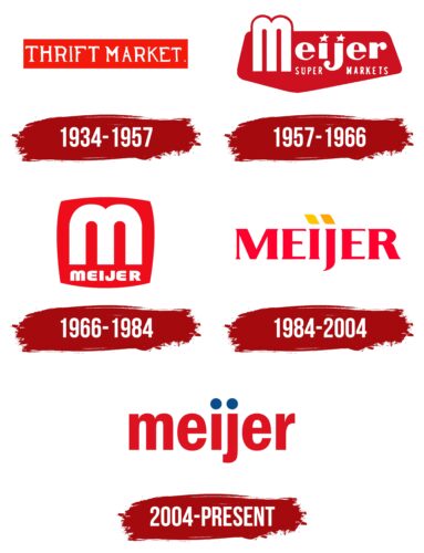
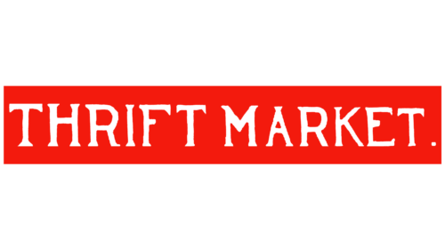
An early logo featured the white word “THRIFT MARKET” inside a red rectangle and was used as a sign. The letters were in an unusual font with triangular serifs, and a small square dot was at the end of the inscription.
1957 – 1966
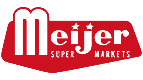
Meijer’s visual identity began with the wrong pentagon. In any case, this is exactly what the geometric figure looks like, which served as a background for the name of the new type of store. That is, it is a pentagon with edges of different lengths. It is colored red. On it are three white inscriptions, ungrouped into two parts. The first row is occupied by the name of the trade and commercial complex. It is essentially in lowercase, but with a large “M” whose legs are stretched vertically as if it were a capital letter with a rounded top. At the bottom is the phrase “Super Markets,” separated by a hook “j.”
1966 – 1984
During this period, designers took as a basis the style of the first letter in the name of the hypermarket chain. Therefore, all other characters are adapted to “m.” They have the same streamlined shapes, rounding, and lack of serifs. The inscription is in white. Of particular interest are “E” and “m”: the designers, noticing the almost absolute similarity between them, depicted them as identical. The only difference is in the rotation: in “m,” the protruding elements are directed downwards (legs) and have a vertical arrangement, while in “E,” they go to the right and are placed horizontally. A single large “m” flaunts above the brand name. The background is a red square with convex sides, like a barrel.
1984 – 2004
The reason for updating the logo was a significant date – the 50th anniversary of Meijer. In this regard, management decided to radically change the outdoor sign’s style. As a result, the designers removed the single “m,” which in appearance resembled a double gate. They took the name as a basis and typed it in bold geometric letters with clear angles and miniature serifs. Moreover, if earlier the lowercase was “m,” now it is “j,” as evidenced by the “dot” above it in the form of a parallelogram. The “i” has the same figure. The developers completely removed the background, leaving an empty white space on which the red inscription was visible.
2004 – today
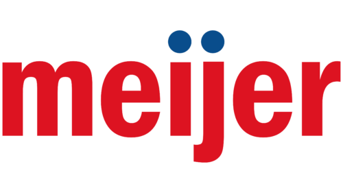
The modern logo is radically different. It contains only text, no graphics. The characters are rounded and streamlined, with smooth lines. The exceptions are “i” and “j.” They have a columnar shape with right angles. The dots above them are perfectly round, dark blue. All letters are in lowercase and traditionally colored red.
Font and Colors
The text part of the Meijer logo is characterized by frequent font changes from uppercase to lowercase. Another interesting detail is the dots above the “i” and “j.” In the debut version, miniature stars were used instead. Then yellow parallelograms appeared. In the current emblem, they were replaced by large disks with a solid blue fill. Moreover, at all times, the logo of the supermarket chain also served as an outdoor sign.
For its visual identity, Meijer chose expressive typefaces that are visible even from a distance. Almost each of them is individual, as it contains modified parts. The latest logo version uses a font completely identical to Vacer Sans Bold by Aring Typeface AB.
If we talk about the corporate palette of the trading network, then it is bright and catchy, for which the designers chose a rich red color. It was complemented by yellow, orange, and blue in different periods. In some emblems, the inscription is white.
Meijer color codes
| Maximum Red | Hex color: | #dd1321 |
|---|---|---|
| RGB: | 221 19 33 | |
| CMYK: | 0 91 85 13 | |
| Pantone: | PMS Bright Red C |
| Medium Electric Blue | Hex color: | #0a4d8c |
|---|---|---|
| RGB: | 10 77 140 | |
| CMYK: | 93 45 0 45 | |
| Pantone: | PMS 2945 C |
