


![]() Mercado Libre Logo PNG
Mercado Libre Logo PNG
The emblem of a large Argentine marketplace represents a successful deal. The Mercado Libre logo is perfect for a marketplace that acts as an intermediary between buyers and sellers. It symbolizes unity, cooperation, mutual respect, and goodwill.
Mercado Libre began in 1999 at Stanford Graduate School of Business, where Argentine MBA student Marcos Galperin pitched the idea of a Latin American version of eBay to investor John Muse. The first round brought in $7.6 million from JPMorgan Partners, Goldman Sachs, GE Equity, and other backers.
On August 2, 1999, Galperin launched the company from a garage in Buenos Aires with Hernan Kazah and Stelleo Tolda, who led the Brazilian direction. The platform was written from scratch by Galperin’s cousin Marcelo. From the start, Mercado Libre opened in several markets, including Argentina, Brazil, Mexico, Uruguay, and Colombia.
The company faced its first test during the 2000-2001 dot-com crash and Argentina’s financial crisis. Most of the region’s online commerce rivals disappeared, while Mercado Libre survived with help from eBay, which invested $7.6 million in 2001. The company later absorbed competitor DeRemate and gained its users.
In 2003, Mercado Pago was launched to address weak card use and distrust in online payments. Its escrow model released money to sellers only after buyers confirmed delivery. Mercado Libre went public on NASDAQ on August 9, 2007, at $18 per share. Mercado Envíos followed in 2011, building logistics around sellers and buyers, and Mercado Crédito appeared in 2016. In 2019, PayPal invested $750 million as Mercado Libre faced stronger pressure from Amazon in Latin America.
Meaning and History
MercadoLibre is a company that emerged relatively recently but has expanded its geographic reach and achieved significant results. Initially, the scope of its activities extended only to Latin American countries. Later, online marketplaces dedicated to e-commerce also appeared in Spain and Portugal. In addition, the site gradually expanded the number of offers and product categories, making it one of the most popular in these countries.
The platform has also repeatedly changed its corporate identity, gradually improving its core visual identity. Currently, the company uses an expressive, stylish badge designed in bright colors. It is divided into a graphic symbol and a word icon. The first is associated with trade deals during the pandemic, and the second is a classic brand-name accent. They are in harmony through a single design and well-chosen colors.
What is Mercado Libre?
Mercado Libre is the name of one of the largest international exchanges specializing in online trading. The platform offers various types of e-commerce and many online auctions. They can be accessed by users from Spain, Portugal, and all Latin American countries. The platform offers the most advantageous deals, a wide range of products, low prices, and various delivery options.
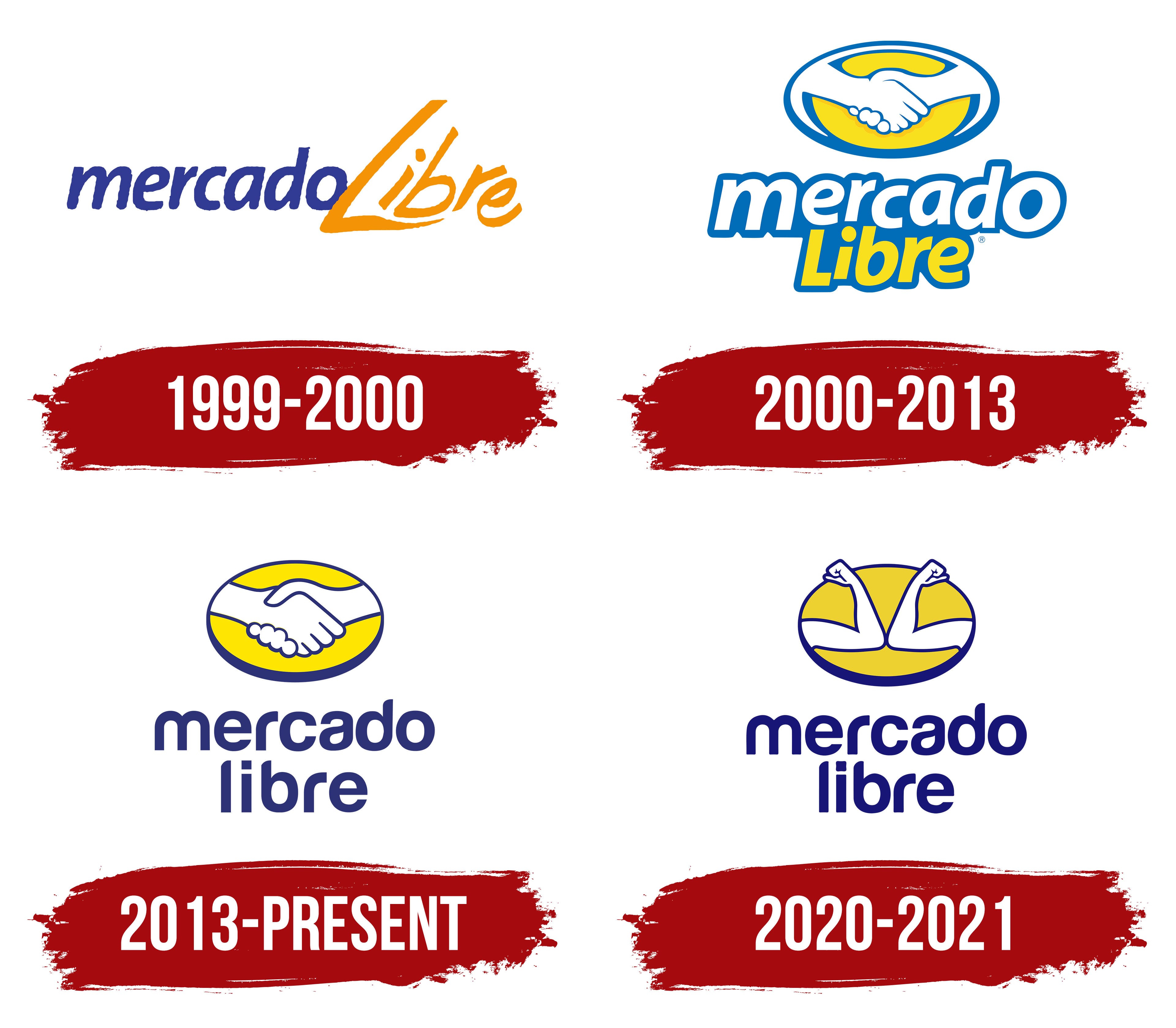
1999 – 2000
![]()
The first emblem of a well-known marketplace was created as a test sample and used for only a few months. It was a stylish wordmark with the inscription Mercado Libre. The first part of the title looked rather restrained. Smooth lines distinguished the letters and did not have serifs. The image was complemented by elegant italics, which made the inscription dynamic.
The design used a rich blue color associated with trust and reliability. The second part, denoting “freedom,” had a lighter format. It was done using handwritten designer fonts, including sans-serif letters of various sizes. A muted orange was used to convey vigor and strength.
2000 – 2013
![]()
In 2000, the company adopted a new visual concept that became the prototype for the modern logo. It consisted of several elements placed on three levels. The top level was a bright image of a handshake associated with online trade transactions.
The picture reflected compromise, unity, and achieving a certain agreement. On the second level was the word Mercado, and on the third level was Libre. The first badge was in a bold, soft sans-serif typeface, symbolizing confidence. For the main part of the letters, the designers chose a basic white color and light blue for the thin contours.
The lower inscription was created in the same style, but with a bright yellow tint instead of a white background. The selected color was also used for the design of the top picture. The color scheme denoted honesty, trust, reliability, and vitality. This was the company’s main message, and its activities were based on these principles.
2013 – today
![]()
In 2013, the company reached a new level, prompting a rebranding. The platform’s range of services and solutions expanded, and a new direction emerged in financial-sector investment. We also decided to update the visual identity. The logo has been updated and improved. The changes affected the color palette, font, and design style, introducing a new color and deeper, more saturated shades of yellow and blue.
Unlike its predecessor, this one was darker. Such changes made the logo more modern and, in terms of semantic load, increased trust, reliability, and professionalism. This was confirmed by an updated neat handshake icon and a more stylish Roman font with beveled edges. Due to improvements, the two-level inscription has also become more recognizable and readable.
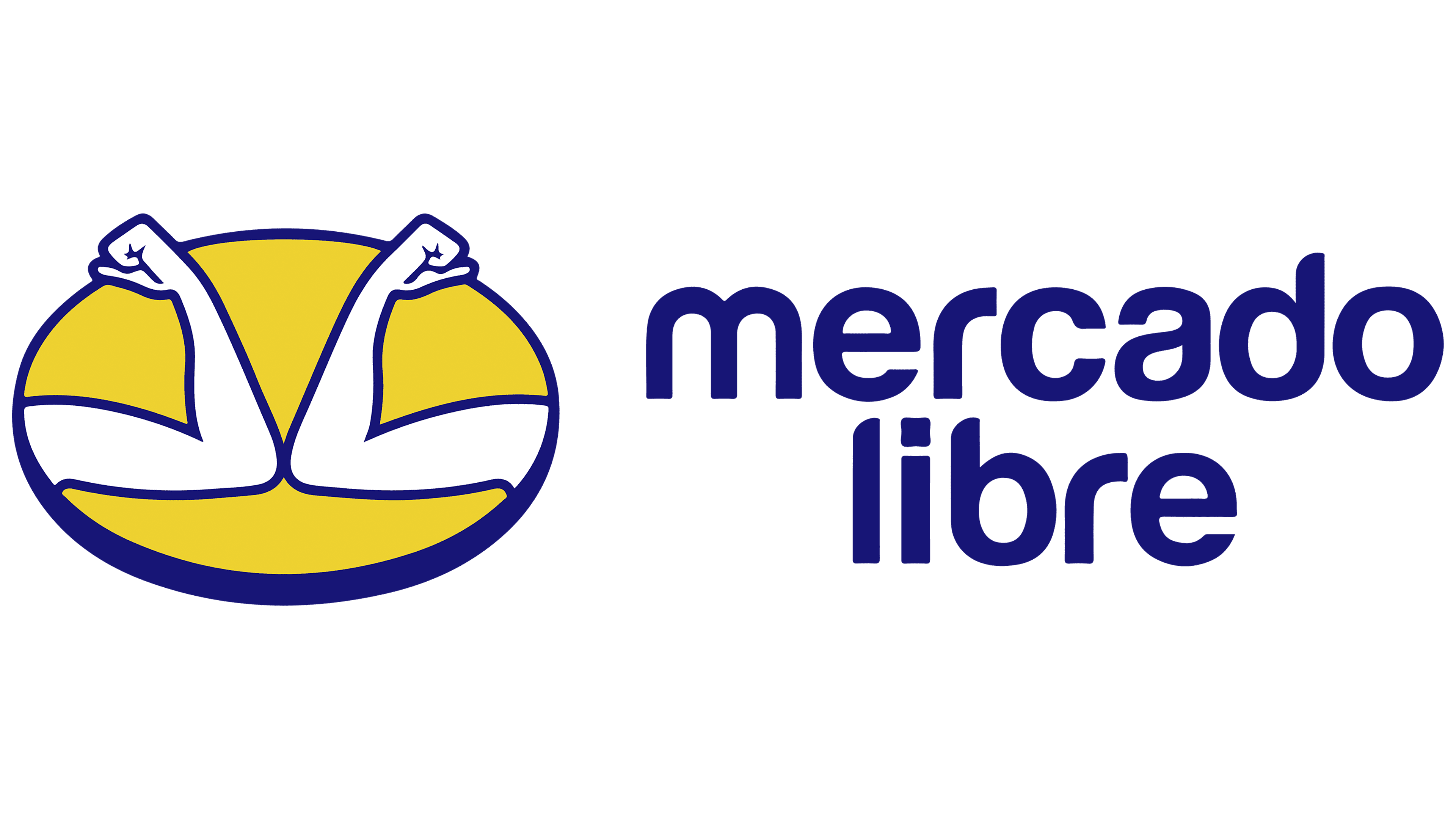
2020 – 2021
![]()
In 2020, the company logo was again finalized. The need for changes stemmed from the pandemic, which has disrupted the usual way of life. In the new conditions, the principle of social distancing emerged, significantly reducing the risk of disease. It was used as the basis for updating the current Mercado Libre logo.
Instead of a handshake, the icon shows two elbows touching, symbolizing a greeting during a pandemic. With this decision, the company emphasized the importance of new preventive measures and expressed its willingness to continue providing users access to secure online commerce.
Font and Colors
The stylish Mercado Libre brand badge exemplifies a balanced layout and a well-chosen color scheme. It combines two elements that perfectly complement each other. The soft, flowing lines of the font perfectly continue the neat contours of the decorative picture. The presented logo, with some changes, uses a laconic Helvetica format.
The presented version differs in that the original beveled cuts make the font and logo very stylish. The design decision and the absence of traditional serifs allow us to classify the format as a modern font. They are a symbol of innovation, development, and dynamism. The color scheme supports this visual concept.
The yellow in the top picture reflects harmony, positivity, and vitality. Neutral white symbolizes purity, openness, and honesty, all of which are part of the brand’s message. A beautiful, deep blue color completes the list. This shade denotes trust, calmness, security, and reliability. The company adheres to these principles from the moment of creation.