The Mercury logo has a stylish and attractive design, just like the brand’s cars. The cars are provided with everything you need for convenience on the road—no wonder the emblem positions them as premium models.
Mercury: Brand overview
| Founded: | November 4, 1938 |
| Founder: | Edsel Ford |
| Headquarters: | Dearborn, Michigan, U.S. |
Meaning and History
Edsel Ford himself came up with the name for the brand because it was his project. From 103 options, he chose the phrase Ford-Mercury to show the connection to the parent company. The in-house designers immediately developed a logo that combined the classic oval shape of the Ford badge with the word “MERCURY.” All letters have been converted to uppercase for attention.
But this symbol was not even used because Ford executives changed their minds and decided to make Mercury its own brand. So the car, which appeared in 1939, was named Mercury 8 and did not have a clear visual identification system. The model name was on the chrome grille instead of the emblem.
Later, the designers developed a logo depicting the Roman god Mercury, the patron saint of all travelers and merchants. This fictional character has been a symbol of the brand since 1939 – since Ford erected an eight-meter statue of the deity at a car show. Then the graceful profile of the Mercury was often found in advertising brochures, but it was not used for cars for a long time. He first decorated the radiator grilles in 1949. The developers stylized the drawing under the heraldic sign.
The emblem with the god Mercury gradually evolved: if his gaze was directed to the left, then over time, his head was turned to the right. It should be noted that this was not the only identity element. From 1960 to 1985, some models had a badge depicting a predatory cougar or panther. The Mercury Cougar line inspired it.
Then, on the Mercury Monarch’s hoods began to appear logos in the form of a large letter “M” in a ring frame. This happened in the 1970s. A simple symbol gave rise to a new emblem, which consisted of three arched lines within a black circle. She appeared in 1985 and gained worldwide fame. The Mercury brand is associated only with this corporate ornament, which did not leave the radiator grilles until 2011.
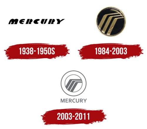
1938 – 1950s
The name of the automobile brand occupied the main place in the Mercury logo. It was set in a custom font with rounded glyphs. The only exception was “Y,” which retained the characteristic angularity of the lines. To achieve the smoothness of the first letter in the name, the designers made the upper ends of the “M” semicircular, curved, and streamlined. Both “R” and “U” received a vertical stripe that ran in the center and was divided into two unequal segments.
1950s – 1984
In the search for an individual identity, the Mercury car series has gone through several stages. This one is one of them. The logo was gradually moving from a text style to a graphic one, so the company was in an ongoing process of finding the most suitable emblem in which the external design harmoniously reflected the internal content of the elite car line.
1984 – 2003
The three parallel lines logo is based on the previous car badge with the letter “M.” The designers took a few details to preserve the original geometry. The early version contained a black circle with three curved bronze-colored stripes. It was analogous to a Speedline that transmitted the energy of movement. A thin chrome line ran along the edge. The light-colored ring enhanced the three-dimensional effect and successfully accentuated the badge on the grille.
2003 – 2011
The modern Mercury logo has the same structure as the previous one, but the palette is now completely different. The base is a white circle with a gray border. It shows the same gray stripes: three parallel arcs located approximately in the center. Their lower part looks like a wide diagonal. It bends smoothly and turns into a thin horizontal line. This emblem is supplemented with the word “MERCURY.” The upper case and strict sans serif type perfectly complements the chosen style.
There is a full-color version of the badge found on cars. It has a black circle and a silver frame, and stripes. The brand name is located in the upper half of the ring and is separated by two dots. Both logos remained in use until 2011 when Ford Motor Company decided to scale back production and liquidate the iconic Mercury brand.
Mercury: Interesting Facts
Mercury, a marque under Ford Motor Company, was founded in 1938 by Edsel Ford to bridge the market between Ford’s mainstream lineup and Lincoln’s luxury vehicles. Mercury carved out a niche for mid-range models with unique designs.
- Genesis and Mission: Mercury aimed to offer entry-level luxury, competing with General Motors and Chrysler’s mid-level offerings by melding Ford’s dependability with Lincoln’s elegance, appealing to those desiring affordable luxury.
- A Godly Namesake: Mercury, named for the swift Roman deity, symbolized speed and agility, reflecting the brand’s vehicle ambition.
- Mercury-Lincoln Synergy: For a large part of its history, Mercury was grouped with Lincoln, enhancing both brands’ marketing and distribution through a unified dealership network.
- Debut and Acclaim: The Mercury Eight, launched in 1939, marked the brand’s successful entry. It was celebrated for its robust V8 engine and stylish design.
- Design Milestones: In the 1940s and 1950s, Mercury introduced vehicles that were noted for their design, like the iconic 1949 model, which was revered for its sleek aesthetics.
- Racing and Performance: The 1960s spotlighted Mercury’s high-performance models, including the Comet and Cougar, earning accolades in racing circles.
- Customization Icon: The 1949–1951 Mercury Eight models, known as “Lead Sleds,” became favorites for customization. With their modified, streamlined appearances, they epitomized American auto culture.
- Eco-friendly Steps: The early 2000s saw Mercury embracing environmental responsibility with the Mariner hybrid SUV, pioneering among American brands in the hybrid market.
- Brand Conclusion: Despite its storied past and contributions to American auto culture, Ford ceased Mercury production in 2010 to concentrate on its core brands, with the last Grand Marquis produced on January 4, 2011.
- Cultural Resonance: Mercury’s cultural imprint is significant. Its vehicles, featured in various media, epitomized the 1950s’ cool factor, especially the 1950 Monterey, linked with the era’s rebels.
Mercury’s narrative is a blend of innovation, style, and accessible luxury, leaving an enduring mark on American automotive heritage despite its closure.
Font and Colors
The three curved lines can be interpreted in different ways. According to the official version, they reflect the brand’s historical heritage, namely a fragment of its old logo with a stylized letter “M.” According to some experts, the parallel stripes represent the famous winged helmet of the ancient Roman god Mercury. The symbol has also been compared to a hockey stick, winding road, and waterfall. It is also a Speedline that embodies the dynamics of cars.
The latest Mercury logo is in a sans-serif typeface. It bears an obvious resemblance to the Karmina Sans SemiBold typeface, which TypeTogether developed.
The two-dimensional version of the emblem is painted gray – the color of a chemical called Mercurius (i.e., Mercury). And the cars used a black and silver badge.
Mercury color codes
| Dim Gray | Hex color: | #6d6e71 |
|---|---|---|
| RGB: | 109 110 113 | |
| CMYK: | 4 3 0 56 | |
| Pantone: | PMS 424 C |


