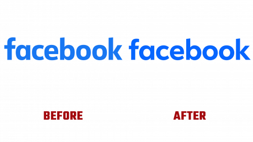
Meta has just lifted the curtain on a redesigned Facebook logo in a carefully strategized move. While the changes may appear subtle at first glance, they are part of a comprehensive plan to harmonize Facebook’s identity across multiple platforms and user touchpoints. Serving 2 billion daily users, the revamped Facebook logo aims to simplify and clarify the platform’s visual cues.
At the core of the change is an adjustment to the signature blue hue that has long been associated with the platform. The new shade is described as a “bolder expression” by Meta, which aims to give the Facebook logo—especially the “f”—a more distinct visual pop. Though some users may find the color alteration subtle, it is designed with better contrast, making it easier to identify and interact with.
The typography in the Facebook logo got a facelift, employing Meta’s in-house typeface, Facebook Sans. The typeface makeover is focused on improving legibility while ensuring a unified visual language across the social media giant’s ecosystem. These nuanced changes in the logo and wordmark were carefully made to keep the platform’s essence intact while modernizing it for a more contemporary look and feel.
Three critical objectives shaped the redesign:
- Accentuating iconic elements for a refreshed yet recognizable Facebook logo
- Achieving a consistent brand experience from the product to marketing
- Broadening the color spectrum anchored in the core blue for enhanced accessibility
Meta rolled out a new color palette in tandem with the logo. While the foundational blue remains a constant, the spectrum has been broadened to include a diverse range of secondary blues. These additional shades allow more design flexibility, making the brand’s expression more versatile and comprehensive.
The Facebook logo and color palette adjustments are the initial steps in a broader roadmap. Meta’s ambition reaches beyond cosmetic updates; it aims to continually evolve the platform to align with its commitment to encourage more user engagement and connection.
While the revamped Facebook logo may not mark a dramatic departure from its predecessor, it signifies Meta’s proactive strategy to maintain Facebook’s relevance and resonance in the digital sphere. Therefore, even if the updates appear understated, their role in Meta’s long-term vision for Facebook should not be underestimated.


