


![]() Metallica Logo PNG
Metallica Logo PNG
The group’s emblem looks down on users, hovering over everyday life. The Metallica logo references the legendary band. The sign is sharp, edgy, and metallic. It perfectly reflects the band’s musical direction.
On October 28, 1981, an ad in The Recycler brought Lars Ulrich and James Hetfield together. The name Metallica was chosen by Ron Quintana, who had considered it for a fanzine.
The first lineup included Ron McGovney and Dave Mustaine. In 1982, the demo No Life’ Til Leather circulated through tape trading. After seeing Cliff Burton perform with Trauma, the band relocated to San Francisco to recruit him.
Mustaine was dismissed before the debut and later formed Megadeth. Kirk Hammett from Exodus joined in 1983. That year, Kill’ Em All was released on Megaforce, establishing a template for thrash alongside Slayer and Anthrax.
Ride the Lightning (1984) and Master of Puppets (1986) expanded their reach without reliance on radio. During a 1986 tour with Ozzy Osbourne, a bus accident in Sweden killed Burton at 24. Jason Newsted joined after extensive auditions.
…And Justice for All (1988) brought MTV exposure with “One”. In 1991, Metallica, produced by Bob Rock, debuted at No. 1 on the Billboard 200 and went on to sell over 15 million copies in the US.
In 2000, Ulrich led legal action against Napster, which culminated in its shutdown and sparked public backlash. Newsted left in 2001, Hetfield entered rehab, and St. Anger (2003) followed. Robert Trujillo joined the same year. The band entered the Hall of Fame in 2009 and released 72 Seasons in 2023.
Meaning and History
![]()
Although the legendary band had four versions of the logo, they always replicated the original. In 2008, the logo was slightly tweaked and became the main trademark sign again. Its monochromatic nature was sometimes complemented by red, accurately conveying passion for music at the peak of emotional tension. It was also adorned with blue, curved discharges (lightning), reflecting the character of heavy-metal legends.
What is Metallica?
Metallica is a legendary American heavy metal band that has had a huge impact on the global music industry. The band was formed in 1981 in Los Angeles, but later moved to San Francisco. Its founders are James Hetfield (guitarist) and Lars Ulrich (drummer).
1983 – 1996
![]()
The famous version with the extended “Metallica” ending was created by one of the band members, James Hetfield. The inscription debuted on the cover of the album Kill ‘Em All and accompanied the band for over a decade, remaining an excellent tool for personal visualization. It consisted of the elegant extended legs of “M” and “A,” precisely replicating the style of high-class music.
The logo also had a 3D version, which appeared on the covers of the albums Ride the Lightning, Master of Puppets, and Metallica. It is now used alongside the 2008 logo and serves as additional symbolism.
1996 – 2003
![]()
In 1996, a revised version was introduced, catering to modernity and minimalism. The lighting and curved lines disappeared, and the word took on an air of austerity and lightness. It now looks taut, restrained, compressed. This variation was used in 1996 on the Load album for the CD single (I Disappear). The stylized ends of “M” and “A” give the inscription a unique look: their legs are slightly slanted and cut diagonally.
2003 – 2008
![]()
This emblem was used during the recording of St. Anger, but it did not appear on the album cover. At the same time, it is considered the most elaborate among all existing developments. The black inscription is set in bold, serifed letters, surrounded by a light, raw contour and an uneven shadow resembling flames. The first and last letters of the word are traditionally extended, creating a sharp frame that emphasizes boldness, audacity, and strength.
2008 – today
![]()
The current logo is a version developed by the design studio Turner Duckworth. It first appeared on the cover of Death Magnetic in 2008. Visually, it echoes the iconic emblem from 1983-1996, developed by James Hetfield, but differs in a more modern look. It also has a glitch variant in the 2016 album Hardwired… To Self-Destruct.
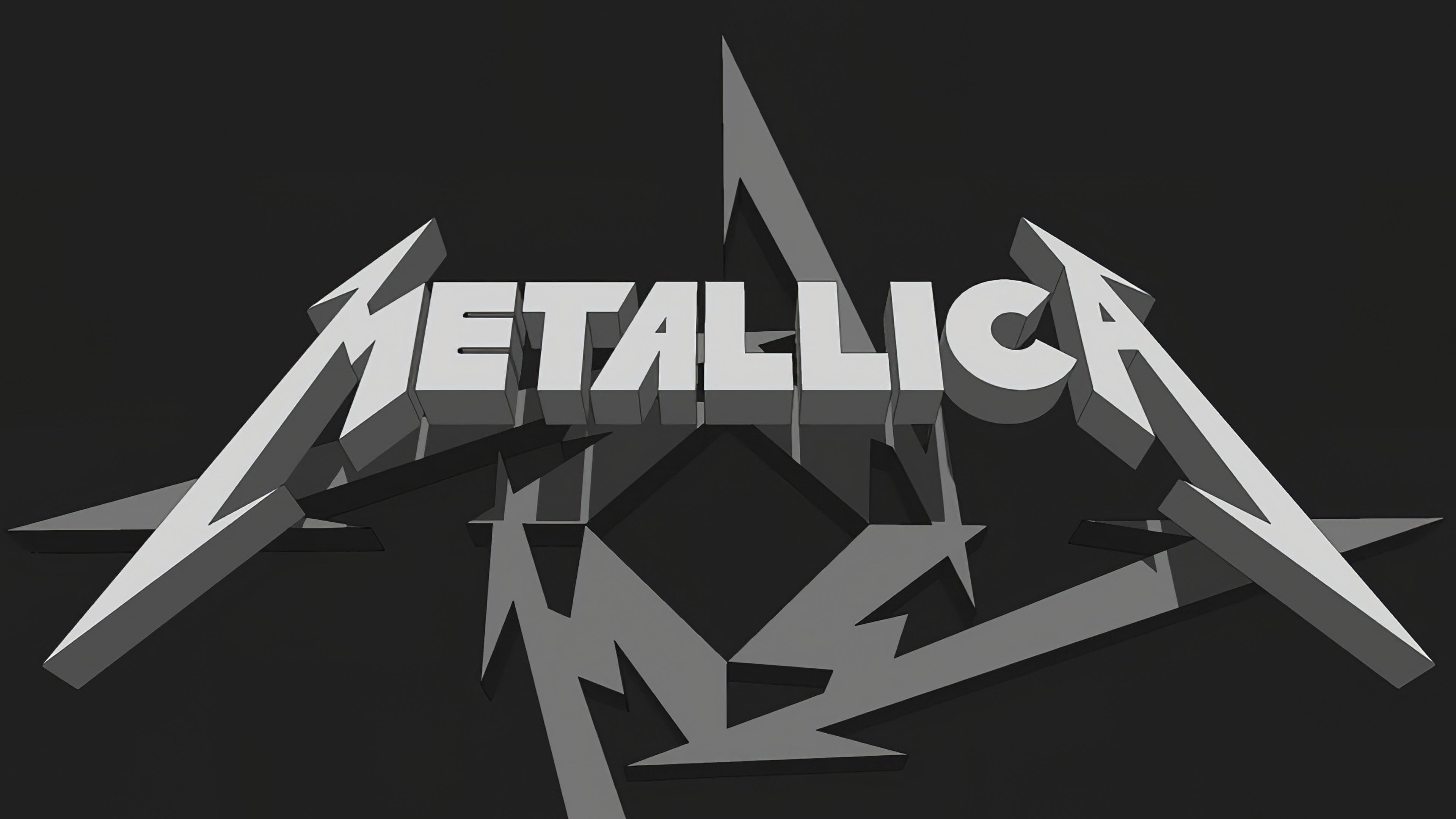
The current Metallica logo is a black inscription in bold capital letters. The elements are extended at an angle; the legs of “M” and “A” have become sharp vertical lines on both sides. This symbolism personifies the cult group’s character, accurately conveys the idea of musical compositions, and makes the emblem recognizable worldwide.
Font and Colors
The sharp, hook-like, and sinuous Metallica logo has become a bright symbol of rock music today. It belongs to the category of the most successful visualizations of metal bands. Although its creator is considered to be the songwriter, guitarist, and vocalist James Hetfield, in reality, the musician only proposed the concept, while professional designers implemented it.
The band’s logo has always looked the same: the name is a single word, a symbiosis of text and graphic parts. It is minimalist: geometric shapes, straight, clear lines, sharp lightning.
The way the word in the band’s name is written received primary attention, since the logo has no graphic elements. Early versions used the ExtraBold font, and later versions used JNL. The letters are predominantly smooth, without serifs.
The logo’s palette has remained the same, a classic combination of black and white. Such a combination emphasizes the contrast between emotions and the peak states of experience reflected in the musical compositions.