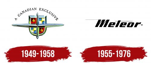
The Meteor logo is dynamic and swift. It showcases the uniqueness of the brand, designed for the Canadian market. The emblem highlights the durability of the cars, making them ideal for active travel to any part of the country.
Meteor: Brand overview
Meteor, a Canadian automobile brand, emerged in 1949 under the wing of Ford Motor Company. Crafted for the Canadian market, Meteor delivered mid-priced vehicles with distinct styling and trim while drawing from American Ford models.
The 1950s saw the brand expand its lineup with models like Custom, Niagara, and Rideau. Marketed as affordable alternatives to Mercury, these cars quickly gained popularity among Canadian consumers. The 1960s introduced models such as the Montcalm, 600, and 800, each with unique design elements and enhanced standard features. The compact Meteor S-33, launched in 1962, offered an original body and interior closely related to the Ford Falcon.
By the late 1960s and early 1970s, the brand’s sales declined. Ford restructured the lineup, integrating Meteor into the Mercury brand in 1964, rebranding it as Mercury Meteor. Despite this shift, the Meteor name continued on compact and mid-size cars in Canada, based on Ford and Mercury models.
In 1976, changing market conditions and Ford’s adjustments led to the discontinuation of Mercury Meteor, marking the brand’s end after nearly three decades.
Throughout its history, the brand occupied a crucial niche in the Canadian market, providing a mid-range option between Ford and Mercury. Over its 27-year lifespan, the brand offered reliable and affordable vehicles tailored to local tastes and conditions. Today, Meteor cars hold a special place among collectors, a nostalgic reminder of a unique chapter in Canada’s automotive history.
Meaning and History
What is Meteor?
Meteor is a historic Canadian automotive brand primarily recognized for a range of vehicles produced by Ford Canada. Created to bridge the gap between Ford and Mercury models, this brand offered a perfect mix of affordability, style, and dependable performance. These cars, known for their distinctive design and practicality, were marketed mainly in Canada and quickly gained popularity among Canadian drivers.
1949 – 1958
The first Meteor logo featured a stylized compass rose, symbolizing travel and long journeys. This car came to Canada from Ford. It was built on the base of well-known American models, with added details from Canadian manufacturing, embodying the idea of travel.
These spacious and comfortable cars were perfect for long trips. Their stability and durability made them ideal for active use. The compass rose on the logo highlighted travel and business trips, linking the car to freedom of movement and adventure.
The logo’s background includes a shield chosen as the car’s emblem. This symbol is divided into four parts. Two parts display a maple leaf on a red background, associated with Canada, and two feature a four-pointed star on a checkered white and blue background. This element connects to the Lincoln emblem, another Ford brand. Lincoln was considered the most expensive and premium brand in the Ford lineup, and incorporating its logo into the Meteor emblem emphasized the premium status of the car, designed exclusively for the Canadian market.
1955 – 1976
Starting in 1955, Meteor stopped sharing model names with Ford cars. Gaining a certain level of independence, the company chose a new logo with a black brand name inscription. The top bar of the E and the letter M had thin rays extending along their length. A dot stood at the end of the word in the center. A very thin line extended from it through the entire inscription. The name seemed to move forward quickly, leaving thin streaks of paint that appeared to be dispersed by the wind.
The image matched the brand’s name. The astronomical object, a meteor, is a small stone fragment from a large comet that flies at high speed as it enters Earth’s atmosphere. It burns up, leaving a flash and a trail. The dot in the logo represents this object. Like a bright meteor, the brand disappeared from the giant Ford corporation and left a mark in history.


