The emblem personifies harmony and perfection. The MG logo says that every facet of a sports car meets the wishes of the most demanding driver. Auto satisfies the need for speed, convenience, and safety and consumes minimal fuel.
MG: Brand overview
Meaning and History
The brand has experienced a very difficult path, moving from one form of ownership to another. Car production started when the Morris Garages promotion center was operating in Oxford. It was involved in the sales and service of transport equipment and was owned by William Morris, an engine manufacturer. Cecil Kimber has redesigned classic Morris Oxfords cars and added an MG Super Sports nameplate to the front.
In the summer of 1930, a separate company, MG Car Company Limited, was registered. Until 1935, it was Morris’s personal property, and he sold it to his holding company, Morris Motors Limited. This was followed by years of transformations with a change of owners. So, in 1952, the Nuffield Organization and Austin merged to form BMC (British Motor Corporation). Subsequently, the new structure was renamed MG Division BMC. It happened in 1967.
After a short time, she laid the foundation for the BLMC (British Leyland Motor Corporation) group. Then, the MG car brand was used by its successors, including the Rover Group, British Leyland, and the MG Rover Group, which emerged in 2005. However, after selling the parent company’s assets, it changed ownership and passed it on to the Nanjing Automobile Group. In 2007, it was taken over by the Chinese organization SAIC. At the same time, the production of cars under the MG brand was resumed.
In the UK, the first model came out in the summer of 2011. In 2019, the brand became even more active in Europe, presenting a series of high-tech and modern cars with hybrid and electric motors. In May 2021, the Marvel R, MG EHS, and MG ZS EV SUVs appeared, and in the fall, the manufacturer will launch a station wagon – the MG5 electric car. Also, the release of the Cyberster sports roadster is not excluded. As before, all models will have a branded octagonal badge with the abbreviation “MG.”
What is MG?
MG is a brand of cars produced by the British company MG Motor UK Limited. At the same time, their owner is the Chinese corporation SAIC Motor. Thus, MG can be called the largest importer of vehicles from China to the UK.
1924 – 1927
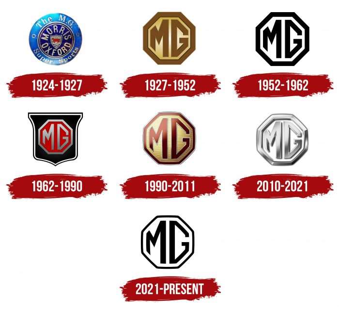
The debut logo was circular and looked like a classic rondel: a prominent centerpiece, a wide band around the hem, and a bezel. In the middle was a miniature shield surrounded by the words “Morris Oxfords” on a purple background. The inscription was capitalized and elongated. Two thin lines followed, followed by a strip of double text. Above were the designations “The M.G.,” and below – the phrase “Super Sports.” They were separated from the right and left by miniature rings.
1927 – 1952
This period belongs to the legendary icon – the octahedron, which will become a corporate identity and prevail in the automotive brand’s identity. The designers completely transformed the logo by removing all unnecessary elements and placing the geometrically stylized abbreviation “MG” in the center. The parts close to the middle have been enlarged, and those around the edges have been reduced. This made the icon dynamic and emphasized the technical focus of the brand. Due to the shadows, the sign was three-dimensional. There was a small glare between the letters as if from an external light source.
1952 – 1962
The logo received a simple form and laconic design, retaining the same elements. The color also disappeared: instead of beige, light, and dark shades, a combination of black and white appeared.
1962 – 1990
In 1962, the developers supplemented the emblem with a shield resembling an inverted bell. A corporate octahedron with a red background was placed in the center. They painted the frame and letters in silver, made the shield fill black, and the edging lines black and white.
1990 – 2011
At the end of the last century and the beginning of the current one, the sign of visual identity was renewed for the car brand. However, it was not drastically changed: the designers returned the original logo from 1927 to 1952. The adjustments were minor. So, instead of a smooth background, a ribbed one, made up of identical longitudinal stripes, appeared, and the color of Marsala replaced dark beige. The letters and edging on the emblem remain the same – as in the 1962-1990 version. The only difference was the gray stripe that outlined all the elements.
2010 – 2021
The designers turned the logo into a technical label, echoing closely with the metalized print. They used visual tools related to color transitions, highlights, and the play of light and shadow. As a result, a sign was presented that consisted exclusively of shades of gray – from shiny zinc to pastel graphite.
2021 – today
One of the earliest logo versions from 1952-1962 is used as a new identity. The difference is the thinner lines from which the letters “MG” and the octahedron are formed. Symbols, as before, are curly, with different leg heights: long—in the center, short—closer to the edge.
MG: Interesting Facts
MG, short for Morris Garages, is a famous British car brand known for its sporty cars. It has greatly impacted car history.
- Beginnings: MG was started in the 1920s in Oxford, England, by Cecil Kimber. He worked for Morris Garages, a place selling Morris cars, and began making customized MGs in 1924. These cars quickly became known for their sportiness.
- The Octagon Logo: Since 1924, MG’s eight-sided logo has become a symbol of quality and great performance, easily recognized by car lovers everywhere.
- Racing Success: MG cars have a proud history in racing, breaking speed records and shining in races like the Le Mans 24 Hours. This shows how fast and tough MG cars are.
- The T-Series: From the late 1930s to the 1950s, sports cars became popular in America and beyond. Cars like the MG TC, TD, and TF were loved for their looks, fun drive, and British charm.
- Design Innovations: MG led the way in car design and engineering, creating new types of engines and using wind tunnels to make cars that drive better and faster.
- Growing Bigger: MG joined bigger car groups after World War II, including British Motor Corporation and later British Leyland. This helped MG grow and make more types of cars, such as sedans and coupes.
- The MGB: Launched in 1962, the MGB was a hit for its good price, reliability, and sporty drive. It was the first MG with a monocoque design, making it stronger and better to drive.
- MG’s Revival: In the 1980s, MG returned with new performance cars like the MG Metro, Maestro, and Montego, mixing old MG charm with modern cars.
- New Ownership: In 2005, SAIC, one of China’s biggest car makers, bought MG. This gave MG a new start, with new SUVs and sedans and entering new markets focusing on innovation.
- MG Today: MG now sells cars, including electric and hybrid ones, like the MG ZS EV, a top electric SUV in Europe. MG combines its long history with modern design and tech, attracting new fans.
MG’s story is about evolving from a small shop in Oxford to a world-famous car brand, keeping its passion for making fun, British-style cars, even with new owners and new directions.
Font and Colors
Frequent logo updates are associated with a change in brand owners. However, he remained faithful to the personal identity he received at the dawn of its creation. A few recent adjustments are related to the automaker’s transition to the Chinese market. The octagonal shape is preserved again, as is the geometric style of the inscription in its center. Moreover, SAIC (it has owned MG since 2006) decided to improve the characteristics of the emblem and return it to a simple design. This was required to create a younger “face” of the brand – without the bloom of shadows, glare, three-dimensionality, and other special effects that add volume. The name of the trend is “flat design,” and it continues to spread actively today.
As a result, another inscription appeared: uniform in color, with thin lines and large letters. According to management, the sophisticated logo enhances the brand’s image as it releases new models. The result is a clean and dynamic logo, approved in April 2021. Its design is still based on the original octahedron and the initials MG, which, incidentally, stands for “Morris Garages.”
The developers used hand-drawn letters for the only inscription in the emblem. They have no analogs because individual designs correspond to an octahedral figure.
The corporate logo palette is restrained. Previously, it contained beige, olive, shades of red, gray, chrome, silver, and graphite. Now, the color spectrum is limited to black and white.
FAQ
What shape is the MG logo?
From 1927 to 1952, the logo was octagonal and featured the bold initials “MG” on a brown-gold background. The edges of the letters match the thickness of the octagon’s border, giving the design a balanced appearance. This style helps highlight the brand’s history and reputation in the automotive industry.
Is MG British or Chinese?
The brand was a well-known British automaker closely associated with the Longbridge plant in Birmingham. This location was once home to major British car manufacturers like Austin and British Leyland. Cars were produced there until the MG Rover Group ceased operations.
Now, the brand is owned by a major Chinese automaker, SAIC Motor. While the company still carries part of its British heritage, most activities are now based in China at SAIC Motor’s innovative research and development headquarters.
What does the MG car logo mean?
The logo represents the initials of Morris Garages, the car workshop and sales center where founder William Richard Morris established the brand. Later, he founded the MG Car Company Limited. The initials in the logo highlight the brand’s roots in the automotive industry.
Which car has the logo of MG?
The octagonal logo appears on all vehicles produced by the brand. The cars are manufactured by the Chinese company SAIC Motor, which has production facilities in Thailand and China. The distinctive logo helps identify the brand’s range of vehicles, which includes various models tailored to different needs and preferences in the automotive market.
What is MG the symbol for?
The car logo consists of letters in an octagonal frame. The letters are wider in the middle and narrower at the edges, filling the octagon. Since 2021, the logo, which mainly features black letters on a white background, has been used on all the brand’s vehicles, making them easily recognizable in the automotive market.
