


![]() MHA Logo PNG
MHA Logo PNG
My Hero Academia manga has an unusual logo with many small details. When creating the MHA logo, the designers wanted to convey the world’s versatility to express strength, energy, and progress. To some extent, this sign embodies the protagonist’s character – he is as bright, unpredictable, and changeable.
Kohei Horikoshi was born in Aichi Prefecture, Japan, and grew up on classic shonen manga such as Naruto and Dragon Ball, as well as American superhero comics, mainly Marvel. He studied design at Nagoya University of Arts, worked as an assistant to manga artist Yasuki Tanaka, and sought to build his own manga career.
In 2006, Horikoshi received an honorable mention at the 72nd Tezuka Award. In 2007, his first official one-shot, Tenko, appeared in Akamaru Jump. A year later, he published My Hero, an early version of the idea behind My Hero Academia, in which Jack Midoriya lives in a society divided between people with powers and those without.
Horikoshi’s first Weekly Shonen Jump series, Ōmagadoki Zoo, ran from 2010 to 2011 and ended after 39 chapters. His next project, Barrage, followed in 2012 and was canceled after 16 chapters. When the editors gave him another chance, he returned to the 2008 My Hero concept. On July 7, 2014, Weekly Shonen Jump published the first chapter of My Hero Academia, centered on Izuku Midoriya, a powerless boy in a world where about 80 percent of people have “quirks.”
Viz Media acquired the English-language rights in February 2015. That year, the manga won the 1st Next Manga Award in the print category and the Mando Kobayashi Manga Grand Prix. Bones launched the anime adaptation on April 3, 2016, followed by new seasons and films, including Two Heroes (2018), Heroes Rising (2019), and World Heroes’ Mission (2021). In the shonen market, MHA competed with Demon Slayer and Jujutsu Kaisen. The manga ended on August 5, 2024, with chapter 430, after surpassing 100 million copies in circulation by April 2024.
Meaning and History
![]()
MHA tells the story of an ordinary schoolboy who lacks superpowers, even though he lives in a world where they are commonplace. That is, all around are superheroes, except for a young man named Izuku Midoriya. Therefore, his life and adventures are driven by a desire to secure magical opportunities at all costs and to become like everyone else. This is his only goal.
Despite the storyline’s simplicity, the franchise’s theme is quite deep. It answers an incredibly important question: “What makes a person a hero?” Focusing on it, Kohei Horikoshi continuously searches for the answer, creating several hundred manga. Gradually, he surrounds the main character with a range of images to create an alluring, reader-friendly environment. So, for example, Fat Gum appeared. He is not just a stupid comic book character, but a harmonious way to maintain a good mood.
The series is released in both Japanese and English. It was licensed for distribution in North America by Viz Media. In parallel, it appears digitally in Shonen Jump. The weekly also presents it in English. Regardless of where and in what language the My Hero Academia (MHA) manga appears, it is accompanied by a concept logo. Moreover, the magazine and animation versions have two different logos.
What is MHA?
MHA is the abbreviation for the Japanese manga franchise My Hero Academia, which first appeared in Weekly Shonen Jump Magazine. Kohei Horikoshi created the print version, and Bones created the animated version. The first originated in 2014 (34 tankōbon), the second – in 2016 (includes five full seasons and the beginning of the sixth).
2014 – today (manga)
![]()
The logo for the MHA magazine version originated at the time of its publication. This is a text emblem in which all letters are uppercase. The inscription is ungrouped into two lines of different sizes: “My Hero” is smaller, and “Academia” is larger. The symbols are colored red and outlined with a thin yellow line. It separates glyphs from black shadows. In the lower world, they are larger and slightly repeat the outlines of printed characters, which is why they look three-dimensional. Curiously, different fonts are used in the first and second rows: in one case, an antiqua; in the other, a grotesque. The letters are slightly tilted back.
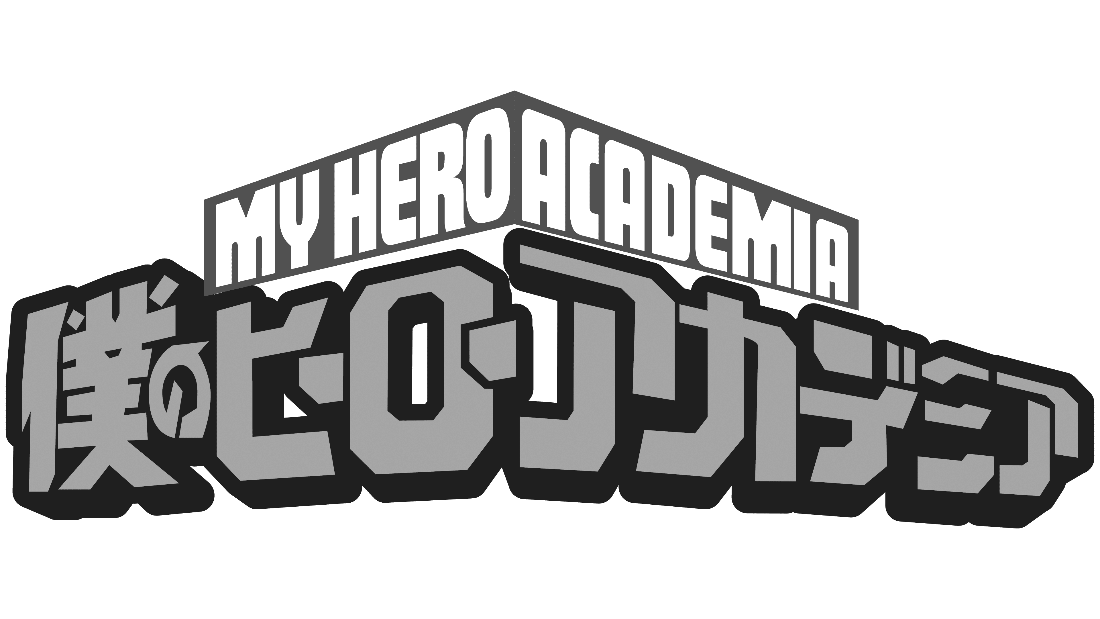
2016 – today (anime)
![]()
Although the logos use a common color scheme (red, yellow, black), they look different. In the animated version of MHA, yellow dominates: it is the color used for the name. Red serves as the background, and black as the border. Moreover, the inscriptions are made in two languages: Japanese and English. At the top are two long rectangles that meet in the middle. On the left is “My Hero,” and on the right is “Academia.” Letters without serifs, with roundings. Below are hieroglyphs. They are massive and bright, and they also form an angle at the center.
Font and Colors
Both logos are textual, but graphics can still be traced in them. For example, in the form of rectangles and geometric hieroglyphs (in the animated emblem), as well as in the form of a trapezoid (in the inscription in the printed version of the manga). This design is consistent with the idea embodied in the MHA: even in ordinary things, extraordinary possibilities are hidden.
The logos use simple typefaces with clear contours, bold lines, and massive shapes. In the manga logo, the line “My Hero” is set in grotesque, and “Academia” is set in serif. The visual identity of the animated version is more complex because the characters are made as geometric shapes with softened details and arcuate elements. The top inscription, by contrast, is simple, with straight letters without serifs. The logo palette remains the same, consisting of red, yellow, and black. The combination of these colors is well remembered, symbolizing progress, energy, strength, and movement.