Michael Jackson’s logo is like a greeting from the artist, who appears before the audience in his famous black-and-white outfit—the emblem – a footprint of a legendary personality. One look at the figure transports the viewer into the performer’s dance and music world.
Michael Jackson: Brand overview
| Founded: | 1964 – 2009 |
| Founder: | Michael Joseph Jackson |
| Headquarters: | Los Angeles, California, US |
| Website: | michaeljackson.com |
Meaning and History
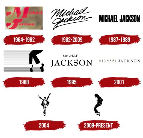
Performing on stage from an early age, the singer changed more than one visual sign. Most are tied to the artist’s iconic albums. Interestingly, the early emblems emphasize the name, Michael Jackson, while the latter focus on the artist’s dance “pa.” Figures in the logos have captured the most outstanding poses in stage productions, which have become recognizable without a signature – the last two logos do not have the singer’s name.
Who is Michael Jackson?
Often referred to as the “King of Pop,” this musician’s hits, such as Bad and Billie Jean, continue to fill the airwaves even 14 years after his death. A talented performer, dancer, producer, choreographer, and actor, he remained on the lips of fans and paparazzi throughout his career. A movie about his “moonwalk” was made, one of seven films. He is the only person who changed his skin color for the stage, undergoing numerous plastic surgeries. He was recorded in the Guinness Book of Records as the most successful artist of all time, and there’s an entire Wikipedia page dedicated to Jackson’s impressive list of achievements.
1964 – 1982
In 1964, Michael turned 6. A year earlier, he joined the group founded by the Jackson brothers’ father, and until 1971, he didn’t have a separate solo career. Therefore, the logo probably appeared in the ’70s on his first single, Got to Be There.
The emblem consisted of the singer’s name in red. The ends of the letters M and J were turned into hearts and resembled lion tails. This technique created an association of the young performer with a lion cub, possibly due to his curly cloud of hair.
The red color and heart symbol indicated special love and attention towards the boy. By age 11, Jackson’s song I Want You Back reached the number 1 spot on the Billboard Hot 100 and entered the Grammy Hall of Fame.
1982 – 2009
This emblem was used for the singer’s loudest and most popular album, Thriller. On the logo, the performers’ first and last names are handwritten. The artist performed and wrote 4 out of the nine songs. Therefore, it is reasonable to assume that the collection’s cover also features the showman’s autograph. However, most fans do not recognize Michael’s handwriting in the signature. Hence, the emblem’s design is likely the work of professional designers.
The choice of natural handwriting, resembling an autograph, was an attempt to:
- Bring the album closer to the audience.
- Hint at the performer’s stardom.
- Show that the songs reveal the musician’s personality, his soul.
- Emphasize the authorship of the songs.
The slightly diagonal placement adds energy to the inscription, giving a sense of movement and development.
The collection of 9 songs received 34 platinum certificates and ranks second among the best-selling albums in history. Since 1982, no one has broken this record. In 2023, the album continues to be purchased at 3,000 copies per week.
1987 – 1989
A logo consisting of black, elongated uppercase letters was used for the seventh album, Bad, and its accompanying tour, which lasted 1.5 years. The color of the inscription hints at the artist’s skin and hair color, and the elegance of the lines reflects his slim build. Special padding in the jacket was used to enhance the performer’s stage appearance.
Eight singles were released from the album, and five topped the Billboard Hot 100.
1988
Initially, the logo was accepted by the production company Optimum Productions in 1987, responsible for the artist’s short films and music videos. Subsequently, the image became the logo of The Michael Jackson Company, LLC, founded in 2006.
On the emblem, the artist’s feet are captured in a dance pose, where he stands in profile on the toes of his shoes. This movement was first shown at the Motown 25: Yesterday, Today, Forever performance in 1983 and gradually became iconic.
The singer is positioned to the left of the emblem and is dressed in his famous stage costume with black shoes, trousers, and drooping waves of white socks.
Black lines are stretched like strings across the rest of the emblem, reminiscent of a musical staff. This technique points to the artist’s musical career and movements in time with the music.
1995
The emblem of the 9th album, HIStory: Past, Present and Future, Book I, is simple and majestic. The singer’s name is written on two levels. At the top center, in thin small capital letters, is Michael, and below, in large serifed characters, is Jackson.
The emphasis on the singer’s surname is no accident. The content of the compilation, consisting of two parts, is considered his most personal, telling the story of the musician’s life like a diary. It conveys emotions, experiences, and protests.
The artist’s family tremendously influenced his creative future and was the starting point. In it, the musician’s self-determination is found. The songs’ themes are a response to accusations of child sexual abuse. Therefore, it was important for Jackson to rely on his good name.
And the emblem conveyed this state. With the diminished reputation lost, Michael finds strength in his creative flight and realization of who he is.
The letters of the inscription are still narrowed, emphasizing the musician’s slimness. The serifs point to individual traits, upbringing, and the nobility of the singer. They hint at the sharp issues of a society that chases sensations, disregarding norms and truth.
2001
The last album released during his lifetime, Invincible, and its singles received a golden logo. The emblem uses a division in writing the singer’s name and surname, as in the previous sign. However, the name Michael is in a golden computer font this time, showing that it has entered history and will live on the internet for years. The fame of the performer and his songs will be preserved for posterity.
Symbols created from separate elements resemble the disjointed movements of a robot – another iconic dance of the performer.
The musician’s surname is written in an entirely different style: black letters with serifs, but not as sharp as in HIStory. After all, the Jackson family will remain famous thanks to the performer and the group The Jackson 5.
Interestingly, the division in writing the name and surname first occurred in the logo after Michael left the Jehovah’s Witnesses community and moved from the family estate in Encino to his home (1988). This technique seemed to illustrate the singer’s break with his family. And it repeated on two consecutive emblems.
2004
The logo was spotted on The Ultimate Collection – a 4-disc compilation featuring the musician’s most famous songs. It’s no surprise that the “victorious” dance pose of the singer with raised arms was used for the logo. The movement resembles the final pirouette of a dance when the audience bursts into wild applause. The technique symbolizes the essence of the career, a collection of the best, most beloved works.
The image clearly shows the famous socks, the musician’s hat, and a black suit. The tilt of the head to the side and downward is also one of Jackson’s legendary dance positions. Therefore, the King of Pop is immediately recognizable without a signature.
The logo is repeated on the cover of the posthumous album 2009, “This Is It.”
2009 – today
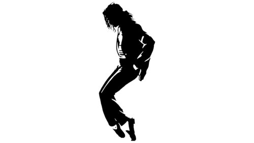
The latest emblem captured the toe stand, a move not used by any other artist in their performances. The logo perfectly replicates the singer’s stage appearance and hairstyle. Interestingly, Jackson’s posthumous symbol became not his name but his image, affirming recognition of the star as a showman, artist, and choreographer.
Font and Colors
The black-and-white contrast is the hallmark of most of the singer’s logos. This approach reflects the transformation of the celebrity’s appearance and the peculiarity of the artist’s stage costumes. The combination of white and black outfits creates an image of a gentleman and aristocrat. It emphasizes the impeccable royal style of the star.
Michael Jackson color codes
| Black | Hex color: | #000000 |
|---|---|---|
| RGB: | 0 0 0 | |
| CMYK: | 0 0 0 100 | |
| Pantone: | PMS Process Black C |


