For the Michelob Ultra logo to be bright and visible on the labels of the beer brand, the designers decorated it with a red ribbon. To some extent, it testifies to the high quality of the product because the seals confirm the originality of letters and documents used to be supplemented with the same ribbons. The brand name is designed in two completely different fonts, which speaks of its extraordinary approach to design.
Michelob Ultra: Brand overview
| Founded: | 2002 |
| Founder: | Anheuser-Busch |
| Headquarters: | United States |
Meaning and History
Michelob Ultra’s history began in 1896 when Adolphus Busch (one of the co-founders of Anheuser-Busch) developed a unique beer recipe and named it after the Czech city where Anton Dreher once opened his famous brewery. Over the next century, the brand continuously developed. As a result, alcohol has new versions with different compositions – for example, with vanilla or chocolate. Some of the experimental lager varieties are no longer in production. And others, on the contrary, became very popular and became famous outside the United States.
The last category includes Michelob Ultra beer, first released in 2002. This drink is considered dietary because it contains much fewer calories and carbohydrates than its counterparts. And it is prepared with just four ingredients: water, hops, rice, and barley. The success of the beer brand is because Anheuser-Busch initially identified a target audience for it – professional athletes and ordinary people who lead an active lifestyle. That is, she chose the least competitive niche of the alcohol market.
Throughout its history, Michelob Ultra has had two logos that are approximately similar to each other. Brand name with brand name and red ribbon adorns every metal can and a glass bottle of pale lager. This is one of the reasons for the recognizability of the drink.
What is Michelob Ultra?
Michelob Ultra is one of the brands of the American brewing company Anheuser-Busch. This brand produces a light lager that is low in calories and carbohydrates. It appeared in 2002, while the first original Michelob beer recipe was obtained in 1896.
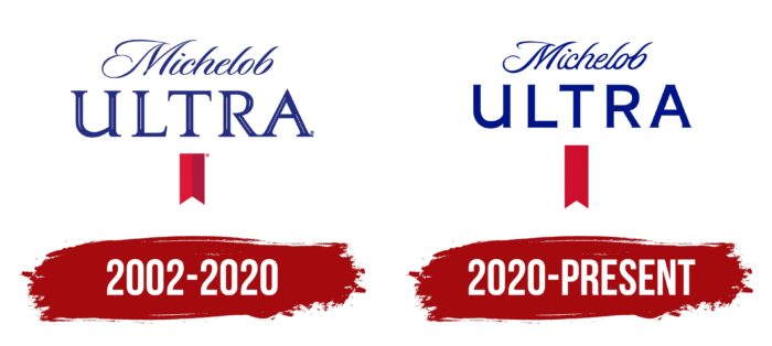
2002 – 2020
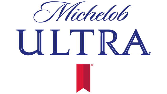
Michelob Ultra diet beer was introduced to the Anheuser-Busch range in 2002. In the original version of the logo, the first word of the brand name was at the top, and the second word was right below it, centered. For Michelob, the designers chose an elegant, thin font that mimics handwriting. The inscriptions were characterized by smooth lines, numerous roundings, and decorative scrolls. All letters, except “M” and “b,” were connected.
The word “ULTRA” looked more impressive. First, it consisted only of capital glyphs. Secondly, it used a bold serif typeface. Long, thin lines of white were drawn within most of the horizontal and diagonal strokes. At the same time, the letters themselves in the brand name were dark blue.
At the bottom, the artists depicted half a red ribbon with a triangular cutout at the end. Ribbons of the same shape were once decorated with wax seals. The color of this element was not uniform: the entire left side was dark red, and the right side was completely burgundy.
2020 – today
The 2020 rebranding created a minimalist take on the Michelob Ultra logo. The typeface of the first word has become rougher due to the wider lines, although the original calligraphic imitation has been retained. The characteristic slope of the letters and rounded curves remained unchanged. But “ULTRA” now looks in a new way: the designers made the serifs incredibly small and at the same time increased the thickness of the strokes and painted over the white gaps. At the same time, the red ribbon was almost doubled in size. In this version, it is no longer divided into color blocks.
The most striking and visible element of the Michelob Ultra logo is not the brand name but the red ribbon. It is located vertically and is bifurcated at the lower end, just like the ribbons used in wax seals. Considering that these seals once confirmed the authenticity of various documents, the red stripe on the emblem of the beer brand is a symbol of the quality and originality of its products.
Font and Colors
“Michelob” is an example of a cursive script that is also known as a script. It imitates calligraphic handwriting. In this case, semi-connected because the first letter “M” stands alone and is not connected to the rest. The glyphs have a pronounced slope to the right, with the tops of the lines also curved.
And for the word “ULTRA,” the designers chose a completely different font: strict, straight, bold, in upper case. It is vaguely similar to Stolzl Regular by The Northern Block or Expressway SemiBold by Typodermic Fonts Inc. when added with short, sharp serifs. But the capital “U” looks odd: it has a vertical stroke on the right side, like the lowercase “u” glyph.
Two primary logo colors: Navy Blue (#000e8a) and Monza Red (#cf0629). These shades are now strongly associated with the Michelob Ultra brand and its diet lager.
Michelob Ultra color codes
| Navy Blue | Hex color: | #000e8a |
|---|---|---|
| RGB: | 0 14 138 | |
| CMYK: | 100 90 0 46 | |
| Pantone: | PMS 2738 C |
| Monza Red | Hex color: | #cf0629 |
|---|---|---|
| RGB: | 0 14 138 100 90 0 46 | |
| CMYK: | 0 4 20 7 | |
| Pantone: | PMS 185 C |
