Micromax: Brand overview
In 2000, Rahul Sharma and three other co-founders started Micromax Informatics in Gurugram, India, as an IT software venture. Eight years later, the company switched to manufacturing cell phones, focusing on budget feature phones as its core offering. By 2010, Micromax had established a strong foothold in the Indian cell phone market, challenging established giants like Nokia and Samsung.
After initial success, Micromax became the tenth-largest smartphone distributor in the world by 2014. The brand even enlisted Hollywood celebrity Hugh Jackman as its ambassador. Despite such a meteoric rise, the company soon found itself under attack from Chinese competitors such as Xiaomi, Oppo, and Vivo, which offered low-cost but feature-rich smartphones. As a result, Micromax’s market share fell from 22% in 2014 to around 9% two years later, a period that was also marked by the departure of key employees.
To regain its position, Micromax unveiled a strategy in 2018 to launch around 20 new smartphones over the next two years. The goal is to regain its position in the sub-$15k price segment. While the company continues to struggle against stiff competition from its Chinese counterparts, the growing anti-China sentiment in India presents a unique opportunity for the company to regain its former glory.
Meaning and History
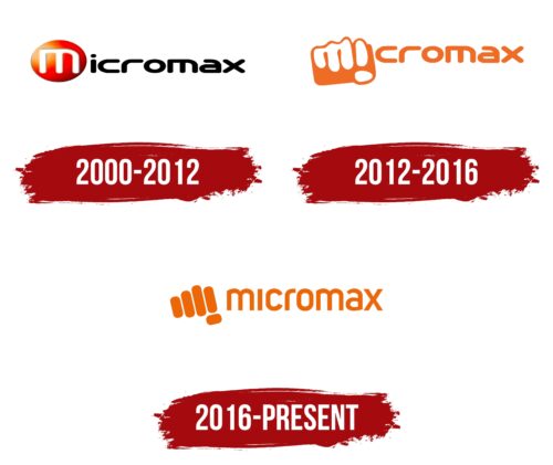
2000 – 2012
2012 – 2016
2016 – today
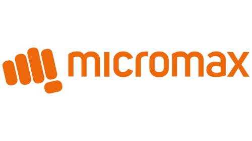
The logo of the Indian manufacturer of household appliances is made in bright monochrome: it is painted in orange, a pure southern color familiar to the inhabitants of hot countries. The emblem is an original symbol consisting of four vertical and one horizontal line arranged in the shape of a fist, symbolizing unity. The emblem also shows stylized letters “M” and “i” – the first letters of the company’s name. Next to it is an inscription, also colored in orange. It is made in lowercase font and looks smooth due to the absence of serifs. Most of the glyphs are rounded, except for the letters “i” and “x.”
The orange color of the logo brings thoughts of the setting sun, warm and inviting. The first shape gives the impression that the company is a close-knit community. The letters “M” and “i” embedded in the fist are reminiscent of a little secret that one wants to know about. With the company name also in orange and plain letters, the logo looks unified and easy on the eye. Even the letters “i” and “x” stand out a bit, but not too much, just enough to catch the eye.
Micromax color codes
| Spanish Orange | Hex color: | #ec6707 |
|---|---|---|
| RGB: | 236 103 7 | |
| CMYK: | 0 56 97 7 | |
| Pantone: | PMS Bright Orange C |
