


![]() Miles Morales Logo PNG
Miles Morales Logo PNG
Although the Miles Morales logo is visually balanced, the hero it represents is passionate as he tries to balance being an ordinary teenager and a vigilante in society. The external calm cannot completely hide this, as the emblem’s palette, font, and style still manifest the heroic essence.
Miles Morales grew out of a 2010 debate over Donald Glover, whose online campaign to play Peter Parker in Sony’s reboot prompted writer Brian Michael Bendis to rethink who could carry the mask. Bendis also cited Barack Obama’s election as a sign that a new hero could speak to a new generation.
Bendis and artist Sara Pichelli created Miles for Marvel Comics as a Brooklyn teenager of African American and Latino heritage. He debuted in August 2011 in Ultimate Comics: Fallout No. 4, following Peter Parker’s death in the Ultimate Universe. Bitten by a genetically modified spider, Miles gained familiar powers, including camouflage, invisibility, and a bioelectric venom strike.
The reaction was mixed but strong. Some critics saw the character as political, while readers helped push him into wider culture. In 2012, Ultimate Comics: Spider-Man won a GLAAD award, and Miles appeared on USA Today. In 2013, he entered a costumed Marvel show at Walt Disney World. After Secret Wars in 2015, Miles moved into Earth-616 and became part of the main canon.
His mass breakthrough came with Sony Pictures Animation and Columbia Pictures’ Into the Spider-Verse, released on December 14, 2018. It later won the 2019 Oscar for Best Animated Feature. Pixar and Disney Animation were among studios that recognized its impact. In 2020, Insomniac Games released Marvel’s Spider-Man: Miles Morales for PlayStation 5, selling more than 10 million copies by early 2022. Across the Spider-Verse followed on June 2, 2023, while the legacy he inherited was compared in weight to Superman.
Meaning and History
![]()
This legendary character has several iconic logos, like the comic in its many incarnations (films, toys, cartoons, novels, games). They all share a similar style, with references to the basic image or its name. In this case, the creators of the computer action game preserved the connection to the comic by using the developer’s name, Marvel, and the phrase “Spider-Man” in the visual identity. The design also shares similarities: it is strict, serious, and business-like. The game decoration is found only in the individual icon of Miles Morales, which the main character wears on his chest. It also appears in promotional materials as a cult symbol: by it, you can immediately recognize the cult character.
What is Miles Morales?
Miles Morales is a third-person action-adventure computer game that was released in 2020. It is part of a popular media franchise featuring the eponymous character, Miles Morales, a superhuman. It’s a spin-off and continuation of Marvel’s Spider-Man from 2018. The hero’s image itself appeared as early as 2011. It was conceived at the American publishing house Marvel Comics by writer Brian Michael Bendis and artist Sara Pichelli. The developer of this version of the game was Insomniac Games, and Sony Interactive Entertainment released it. As of 2023, it was only available for two platforms: Windows and the latest generations of PlayStation.
2020
![]()
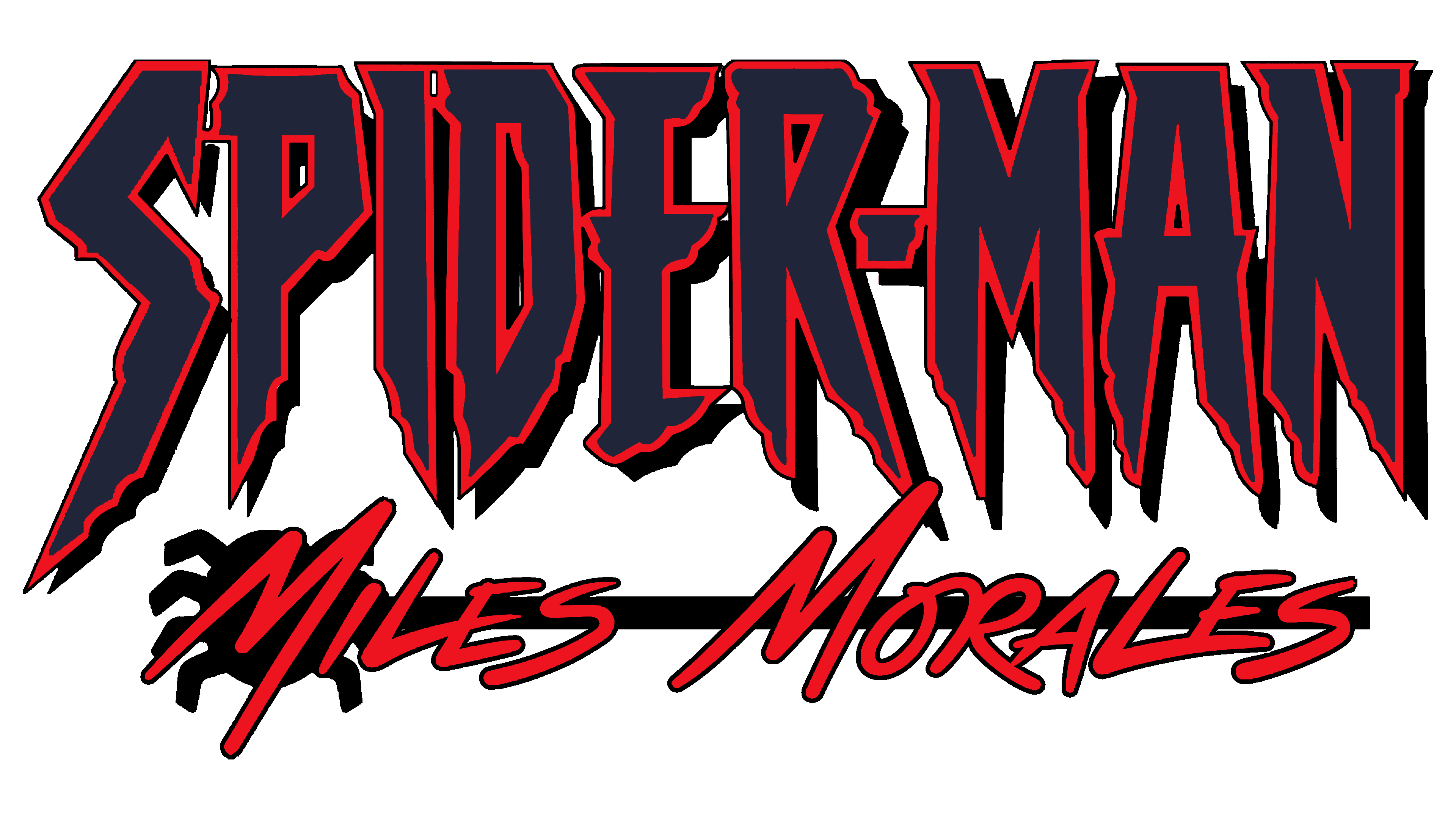
The computer game logo consists exclusively of text. It occupies three levels because each part represents only one of its features. For example, “Marvel” is the publisher where this character first appeared in comics. It is the owner of it, as well as all the mythology associated with it. The top line is designed in the magazine’s official style: a white inscription in a red rectangle, set in tall, sans-serif letters.
In the middle row, there’s an indication of the superhero’s nature and, consequently, his exclusive abilities: “Spider-Man.” This inscription is made in bold grotesque with uppercase glyphs. Some letters have their strokes cut off, creating sharp spikes. Because of this, “S” looks like a hook, “I” is perceived as a sharpened stake, and “R” resembles a person standing on tiptoe. Diagonal cuts are also in “E” and “A,” replacing the middle stroke and crossbar.
The third line consists of the name of the game’s main character, Miles Morales. It is applied with uneven letters of varying heights. The font is thin, lowercase, and choppy. Despite identical glyphs, there is not a single identical letter: each has a specific length of legs, creating the impression of graffiti on a wall. In the first case, the elongated tip of the stroke of “L” transitions into the central element of “E” and, in the second, into the lower one.
Symbol

The individual symbol of Spider-Man is, of course, a spider. It has four hook-like legs with sharp ends and dripping blood. The entire symbol is painted in blood-red, not so much to intimidate as to clarify: such an arthropod is dangerous, as it is a predator, not a harmless insect. This impression is necessary for the concept of a superhero who, on the one hand, must be defenseless and vulnerable and, on the other, aggressive and impregnable. No wonder the spider’s fragile body is covered with an exoskeleton. Its chelicerae are also sharp and venomous. Its background is a thin red ring.
Font and Colors
The logo for the Miles Morales game combines the energy of street graffiti with the precision of modern graphic design. The upper portion of the title features a bold geometric typeface with striking diagonal lines reminiscent of web patterns. Similar stylistic elements appear in fonts like Spider-Man and Knockout No. 47 Bantamweight, though the letterforms here are more uniquely customized.
The middle text is rendered in an italic, hand-drawn script style, with smoothly connected letters that give the writing a natural rhythm and visual speed mirroring the agility and motion of the character.
The bottom part of the logo uses letters of varying height, imitating a marker-written tag in urban graffiti style. This adds a rebellious tone to the design, reflecting Miles’s youth culture and individuality.
The color scheme is built on a contrast of black, white, and vivid red. Black emphasizes the character’s boldness, white conveys openness and sincerity, and bright red symbolizes the energy and pulse of city life. The absence of blue separates Miles from the classic Spider-Man image, highlighting the independence of his story.