The Milka logo symbolizes softness and tenderness, highlighting the brand’s famous milk chocolate. It emphasizes the company’s commitment to making high-quality chocolate using the finest ingredients. The logo represents the warmth and comfort Milka aims to bring into every home, focusing on its unique taste and long-standing traditions. It also symbolizes the joy and pleasure of sharing chocolate with loved ones.
Milka: Brand overview
In 1825, Philipp Suchard opened his chocolate shop in Switzerland, laying the groundwork for Milka, a global brand owned by Mondelez International. Known for its creamy flavor and distinct purple packaging, Milka has become a symbol of quality chocolate.
The brand Milka was born in 1901 from the combination of the words “milch” (milk in German) and “cacao.” This chocolate was special because it used Alpine milk, giving it a unique, creamy taste.
Milka gained popularity quickly after its launch. By the 1920s, using purple for its packaging helped it stand out. Throughout the years, Milka expanded its offerings with new flavors and types of chocolate to keep up with consumer preferences.
The period from the 1970s to the 1990s was crucial for Milka, seeing significant growth through mergers and acquisitions. The merger with Tobler to create Interfood, followed by the purchase by Jacobs Suchard and eventually Kraft Foods (now Mondelez International), turned Milka into a global presence.
The 2000s and 2010s were marked by innovation and impactful advertising featuring the iconic purple cow, which forged a deeper bond with consumers. Milka introduced new products, including filled chocolates, cookies, and crackers, staying ahead in the market.
Now, Milka is sold in over 40 countries and is a leading European and American chocolate brand. Its commitment to sustainability and ethical sourcing is shown through its partnership with the Cocoa Life program, supporting cocoa farmers and their communities.
Meaning and History
What is Milka?
Milka is a well-known milk chocolate brand recognized for its unique flavor and smooth texture. The chocolate’s distinctive purple packaging and the image of an Alpine cow highlight its Swiss origins. Milka offers a variety of chocolate bars, candies, and other sweets conveniently divided into small squares for easy consumption.
1901 – 1903
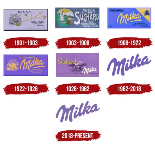
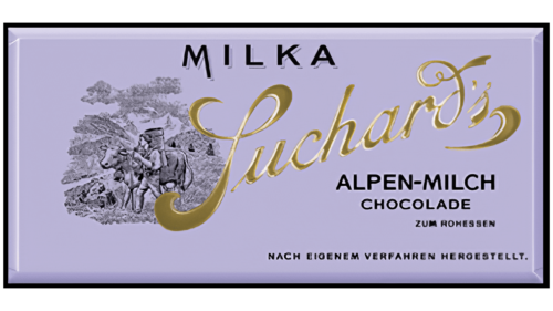
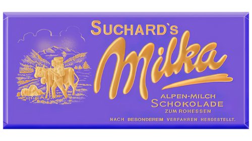
Between 1901 and 1903, Milka established a marketing strategy that still influences its brand today. The first logo displayed a chocolate bar wrapped in lilac-colored paper, which became a key part of its visual identity.
Adding milk to the chocolate enhanced its taste and added new meanings to the brand’s symbolism. This change created an image of a cow in the green Alpine meadows, representing purity, naturalness, and high milk quality. The choice of lilac, lavender, and purple for the wrapper colors was purposeful, reflecting the colors of the blooming Alps and underlining the product’s natural and eco-friendly attributes.
Images of a shepherd leading a cow to pasture highlighted the unique and high-quality milk from Alpine meadows, where cows eat flowers and herbs that enhance the milk’s flavor. The name “Milka,” displayed at the top of the chocolate bar, merges the German words for milk (“Milch”) and cocoa (“Kakao”), emphasizing the main ingredients and the chocolate’s creamy taste.
The brand started with the original name “Suchard,” after the founder’s surname. This name was used for the first products and was highlighted in gold to signify the chocolate’s premium quality and distinctiveness. Every aspect of Milka’s design and name was thoughtfully chosen from the start, reflecting a clear and purposeful concept.
1903 – 1908
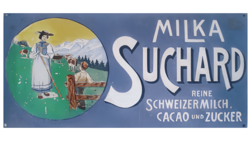
At the beginning of the 20th century, the brand’s emblem was vibrant and colorful, truly a work of art that captured the spirit of the era and traditions. The design emphasized naturalness and simplicity. It featured a scene in an Alpine village with a milkmaid and a young shepherd boy, set against cows grazing peacefully. This image was chosen to evoke a cozy, warm atmosphere, showcasing a connection to nature and traditional production methods.
The chocolate wrapper’s text highlights the ingredients’ health benefits, stating that the chocolate is made from only Alpine milk, cocoa, and sugar. This reflects the brand’s commitment to natural ingredients and high-quality standards. The use of white for the wrapper lettering underscores the purity and naturalness of the milk, key to the chocolate’s distinctive taste.
1908 – 1922
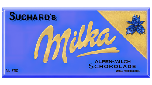
In 1908, the chocolate brand was named Milka, marking a significant moment for the company. The name appeared in golden letters at the logo’s center, representing the brand’s commitment to high quality and uniqueness. The gold color of the ‘Milka’ inscription suggested luxury and high status, emphasizing the product’s premium quality.
The founder’s last name, Suchard, appears subtly in the top left corner of the wrapper, acknowledging his role in creating the chocolate and underscoring the brand’s rich history and heritage. The “Suchard’s” mark serves as a reminder of Milka’s origins and distinct recipe.
Golden design elements on the wrapper include a golden corner with three buds of the Alpine rose, symbolizing purity, beauty, and innocence, which align with Milka’s brand values. The Alpine rose also signals the chocolate’s natural ingredients—cocoa, milk, and sugar—free from artificial additives. The flower also emphasizes the exceptional taste of the Alpine milk used in the chocolate.
1922 – 1926
The Milka logo was redesigned in the early 20th century with gold elements on a lilac background. This design highlights the brand’s long-standing heritage while signaling its growth and prosperity. Gold against lilac emphasizes luxury and high quality, making Milka a superior product.
The colors and style chosen reflect Milka’s advantage over other chocolates by focusing on its natural ingredients and unique qualities. Milka chocolates stand out due to their exceptional quality, using only natural ingredients like Alpine milk and cocoa. This commitment to quality is visually represented in the logo’s golden design.
The slogan “Milka – the finest chocolate, fit for kings” accurately represents the brand’s commitment to high standards and perfection in every chocolate piece. A history of innovation and adherence to tradition backs this.
1926 – 1962
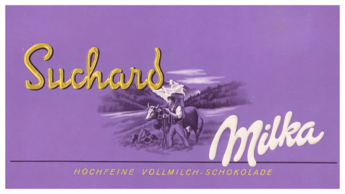
To showcase its rich history, the brand owner highlighted the Suchard surname in gold on the logo. Gold represents high quality and luxury, which matches the brand’s prestigious history of over a century. The founder’s surname and the brand name are equally prominent, suggesting their shared importance to the brand’s heritage.
The logo cleverly positions the original chocolate name on the left and the modern name on the right, creating a visual timeline that tells the story of the product’s evolution over time. This design captures the brand’s historical significance and popularity among chocolate enthusiasts.
The logo centers on images of a shepherd and cows with the Alps in the background. These images underline the high-quality, natural milk used in the chocolates. The white Milka inscription below this scene highlights the chocolate’s creamy and delicate flavor, emphasizing its rich milk content.
1962 – 2018
In the mid-20th century, the Milka chocolate logo shifted towards a simpler and cleaner style, embracing minimalism. This change led to a more concise logo with just the lilac Milka inscription, making the brand’s visual identity clearer and more distinct. The Milka inscription and its unique color were also trademarked during this time.
The lilac color has deep symbolism, is associated with calm, relaxation, and dreaming, and aligns well with Milka’s brand image. The brand advertises its chocolate as a treat and an invitation to take a break, relax, and savor the moment, turning chocolate into an enjoyable personal ritual.
Additionally, the lilac color distinguishes Milka from competitors, who use traditional brown and dark shades in their packaging. This unique color choice draws consumer attention to store shelves and enhances the brand’s recognizability and memorability.
2018 – today
The Milka brand recently updated its emblem, making thoughtful changes to reflect its values better. The logo now features a lighter shade, which suggests the chocolate’s delicate and light qualities. This new color helps emphasize the chocolate’s soft texture and rich taste, adding to each piece’s comfort.
The logo now works well with the slogan “Tenderness Inside,” which captures the essence of Milka’s chocolate. This phrase highlights the emotional and sensory experience that comes with each bite. The updated logo and slogan signal Milka’s commitment to offering chocolate as a treat.
Font and Colors
The Milka logo features a custom, smooth, and elegant font that captures the brand’s essence, reflecting the tenderness and sweetness of its chocolate. It resembles fonts like Notera 2 Black or Genty Regular, but it has been uniquely adjusted to give it a gentle and distinctive appearance that is easily recognizable.
The logo’s color theme centers on a soft lilac paired with white. This color complements the brand and underscores its commitment to catering to consumer tastes. The lilac hue in the logo is subtle yet luxurious, making it stand out in a balanced way. This color enhances the logo’s appeal and conveys the chocolate’s high quality and delicious character.
Milka’s packaging prominently uses lilac, which underscores the brand’s identity. This consistent application of lilac in Milka’s branding materials strengthens the link between the color and the brand, helping Milka products be easily distinguished on store shelves. This consistent use of color aids in building strong brand recognition, enabling Milka to maintain a significant presence in the competitive confectionery market.
FAQ
What does the name Milka chocolate mean?
The name “Milka” comes from combining the words “milk” and “cocoa,” which are the main ingredients in the chocolate. “Milch” is the German word for milk, and “Kakao” means cocoa. These ingredients make Milka chocolate creamy and full of flavor.
Milk makes chocolate smooth and sweet, while cocoa adds the rich chocolate taste that people love. Cocoa also has health benefits, like antioxidants. The name “Milka” shows the brand’s focus on quality and using pure ingredients. It promises customers a great chocolate experience with a perfect milk and cocoa mix. The name is also easy to say and remember, which has helped make the brand popular worldwide.
What is the mascot of the Milka?
Lila, a friendly Simmental cow, is Milka’s well-known mascot. She wasn’t chosen by chance; she symbolizes what Milka stands for, including the high-quality milk used in their chocolate. Simmental cows are known for their gentle nature and excellent milk, which aligns with Milka’s focus on top-notch ingredients.
Having Lila as the mascot does a lot for Milka. She represents the clean and natural milk crucial for making Milka chocolate creamy and tasty. Lila also makes the brand more welcoming. Her image helps Milka reach out in a friendly way, making it feel open to people of all ages. Often shown with beautiful alpine backgrounds, Lila reinforces the link between Milka chocolate and its pure, natural ingredients. Lila got an update to keep her looking fresh while keeping her classic charm.
Who is Milka named after?
Milka Chocolate is named after Milka Trnina, a famous opera singer from Croatia. Her singing was so beautiful that it captivated people all over the world. The person who started Milka Chocolate was a big fan of hers. He loved her performances so much that he went to her concerts everywhere.
He was so impressed by her talent and the beauty of her voice that he decided to name his chocolate “Milka” after her. This shows how much he admired her and wanted his chocolate to be associated with the qualities she represented – elegance and excellence. The name “Milka” gives the chocolate brand a special story, connecting it to a legacy of beauty and talent.
Why is Milka purple?
Milka chose purple for its packaging to stand out in a busy market. Purple is often linked to royalty, luxury, and uniqueness. Milka wanted to show that its chocolate is a treat, a special, high-quality experience.
The company also added a cow to the design, first in black and white and then in purple, which has become a key part of Milka’s look. It was a smart way to show the quality and purity of the milk in their chocolate. The cow, representing milk, and the purple color make Milka easy to recognize and different from other chocolates. The purple color makes Milka stand out and adds to the feeling of indulgence, comfort, and pleasure that people love about the chocolate.
