


![]() Milwaukee Logo PNG
Milwaukee Logo PNG
The Milwaukee logo is energized because it represents a power-tool manufacturer. Such a brutal, bold, and aggressive style would suit a guitar brand, but the designers decided otherwise. They played interestingly with the company’s products and created a creative symbol filled with hidden fury.
Milwaukee Tool’s history began in 1918, when A.H. Petersen received a request from Henry Ford to create a compact drill for Ford assembly lines. Petersen developed the Hole-Shooter, a quarter-inch one-handed drill weighing about five pounds and powered by a Westinghouse motor. In 1922, Albert F. Siebert joined him, and the two formed the A.H. Petersen Company.
A fire destroyed the factory in 1923, and the business closed. Siebert bought the remaining assets at auction and founded Milwaukee Electric Tool Corporation in Milwaukee, Wisconsin, in 1924. The company first survived in part by repairing tools from other makers while building its own line. In 1930, Milwaukee received a U.S. Navy specification rating and expanded into grinders, electric hammers, sanders, and polishers.
In 1935, Milwaukee released a lightweight 3/4-inch hammer drill. In 1949, it introduced its first right-angle drill, and in 1951, the Sawzall reciprocating saw became one of its best-known products. In 1965, the company moved to a new plant in Brookfield, where its headquarters remained. Ownership later passed through Amstar Corporation in 1976, Merrill Lynch Capital Partners in 1986, and Atlas Copco in 1995.
In 2005, Atlas Copco sold Milwaukee to Techtronic Industries, or TTI, for $626.6 million. TTI also owns tool brands such as Ryobi and AEG. Under TTI, Milwaukee launched the V28 lithium-ion battery in 2005, the M12 and M18 platforms in 2008, hand tools in 2010, and the FUEL system in 2012. In 2022, it opened a hand-tool plant in West Bend, Wisconsin. In the professional power tools market, Milwaukee competes mainly with Stanley Black & Decker’s DeWalt.
Meaning and History
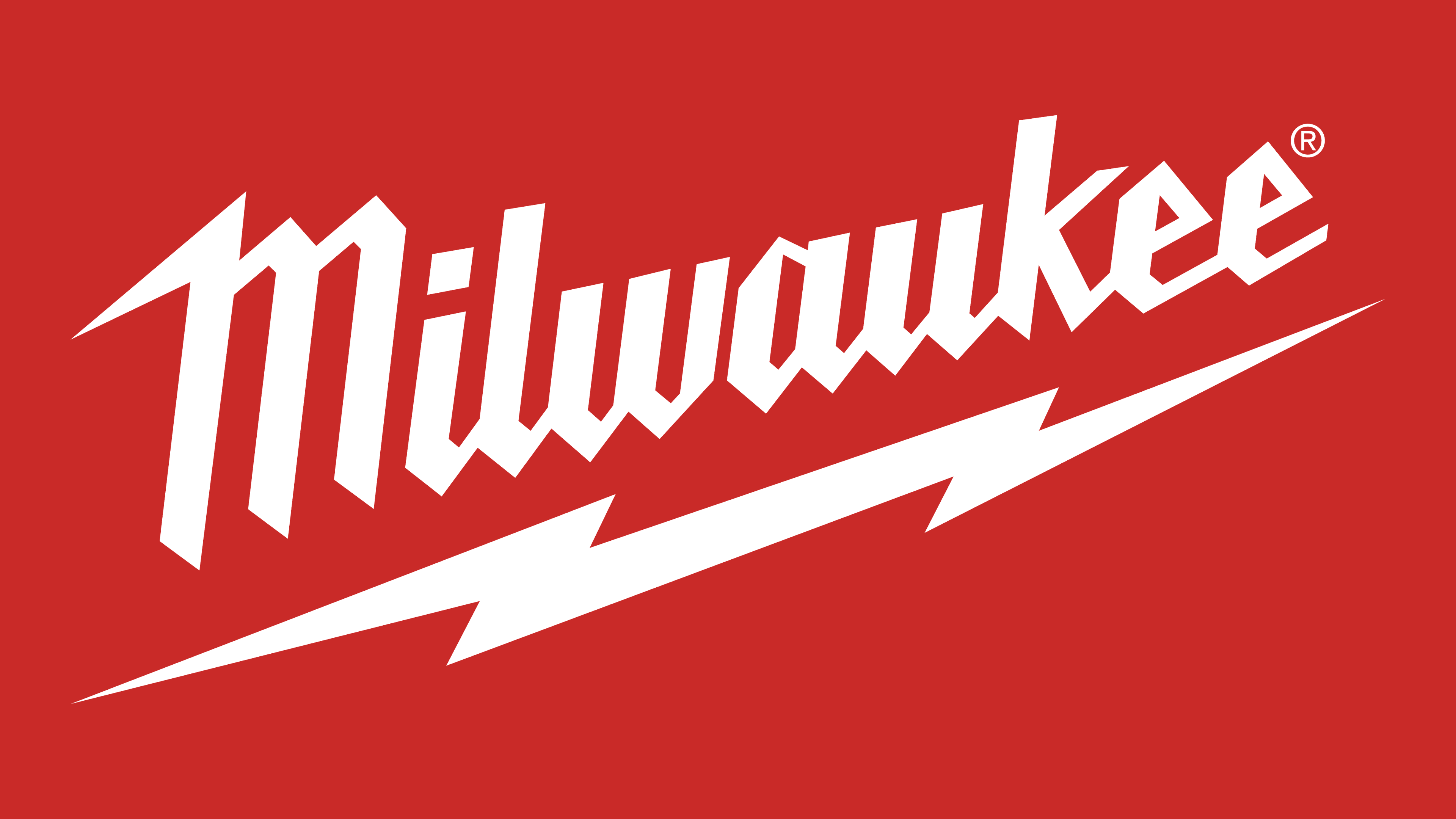
The brand’s corporate identity is defined by an energetic, powerful logo distinguished by sharp elements. An additional bright accent is made as a lightning bolt, which underlines the main inscription. It is the manufacturer’s main symbol and the electrical components used to make the product’s main part. The name design is a great continuation of the chosen style. It reflects dynamism, strength, and energy.
The visual concept reflects the stability of the chosen strategy. The company has not changed its logo since its inception, yet it does not look outdated. The picture fully conveys the message’s essence and makes the brand’s products recognizable. This effect is achieved by the inscription’s expressive design and the addition of a bright lightning icon. The graphic element, in this case, symbolizes energy and progressiveness. A beautiful, bright color complements the conceptual line.
What is Milwaukee?
Milwaukee is one of the largest tool companies in the world. It is currently a subsidiary of Techtronic Industries. It operates in the city of Brookfield (Wisconsin, USA) and supplies products to domestic and foreign markets. The company offers customers high-quality power tools (mains and battery) and a variety of hand tools (screwdrivers, hand saws, pliers, knives, cutters, etc.).
The visual identity was established when Milwaukee was founded in 1924. Albert F. Siebert founded the company. The entrepreneur used his business and the remaining assets from his business partner’s company after the fire. The new firm received an incredibly energetic logo that perfectly reflected its scope and values. Its main feature is a special font decorated with sharp geometric lines.
Sloping down, it demonstrates progress, innovative technologies, and active development. It emphasizes a stylized lightning icon beneath the main element. It has several meanings at once, conveying the key features of a well-known manufacturer. In the context of the Milwaukee concept, lightning means movement, strength, and power. These characteristics can be applied to the company’s products and the whole.
Another important characteristic is the lack of frames. The logo elements are set against a plain, neutral background without outlines or shapes. This feature means limitless possibilities and continuous improvement. Milwaukee never rests on its laurels and is always looking for ways to improve the quality of its products.
In addition to the chosen design, the designers have chosen an appropriate contrasting color scheme that fully reveals the brand’s main message. The brand comes in two contrasting colors. Together, they symbolize the manufacturer’s versatility: progressiveness, courage, professionalism, and strength. In addition, a harmonious scale is associated with a readiness for growth and movement.
Font and Colors
The Milwaukee corporate logo is incredibly recognizable. A powerful, sharp geometric inscription, an expressive graphic element, and a rich color scheme facilitate this. To design the inscription as a company name, the designers chose a specially stylized font created based on Millie Bold. One can single out clear, sharp corners, bold lines, and narrowed bends among its features.
The chosen option complements the graphic element and demonstrates power, professionalism, and vitality. These characteristics perfectly describe the activities of one of the largest American companies. The brand has long been recognized as a reliable manufacturer whose products are distinguished by exceptionally high quality.
This is also reflected in the memorable color palette used to design the lettering. The text and stylized lightning bolt are rich red, showcasing energy, passion, and strength. The designers also used a neutral white background to emphasize this bright hue. It is used as a balancing piece, connecting all the elements.
In addition, the white color conveys a message from a well-known tool manufacturer: honesty and integrity. The company guarantees this attitude not only to its customers but also to business partners. In general, the combination of fiery red and white colors is very expressive, making the company’s corporate identity especially noticeable among competitors’ emblems.