Like a computer chip, the Mint logo invites users to enter a separate virtual world created on the screen by the operating system. The theme of openness, novelty, development, and continuous improvement can be traced in the emblem.
Mint: Brand overview
| Founded: | August 27, 2006 |
| Founder: | Clement Lefebvre |
| Website: | linuxmint.com |
Mint (more precisely, Linux Mint) is a free Linux kernel operating system built using Debian and Ubuntu. It is characterized as simple, powerful, comfortable, and elegant at the same time. This framework consists of personal software and provides capital support for various forms of multimedia. The operating system comes with a wide range of open source applications. The project’s author is Clement Lefebvre, which aimed to get the perfect desktop for ordinary users and small businesses. Therefore, the user community participates in the development of the OS along with the development team. The distribution kit was launched in 2006.
The system provides ease of loading and responsiveness to user commands by simplifying several components. It is assembled on several bases, each with its leader, so the operating system is considered popular. The core structure is powered by Cinnamon and is overseen by Clement Lefebvre. Fluxbox is run by Shane Joe Lazar, KDE by Jamie Boo Birse, Xfce by merlwiz79.
There are also official communities actively involved in improving and developing Linux Mint. They are located in Spain, Italy, Russia, Germany, France. These groups test and continuously improve the system, making it available in many languages of the world. The desktop is provided with a full package of additional software and has an open-source code and graphic designation.
Meaning and History
The openness of the code and convenient adaptability are what the operating system manufacturer wants to see in their identity. That is why almost every Mint logo (except the first one) contains an image of a fist clenched and raised in solidarity with users. That is, the company supports everyone who chooses its digital platform. But this is not just a sign, but the initial letter from the name. It is graphically stylized and bears little resemblance to a typographic symbol.
2006 – 2007
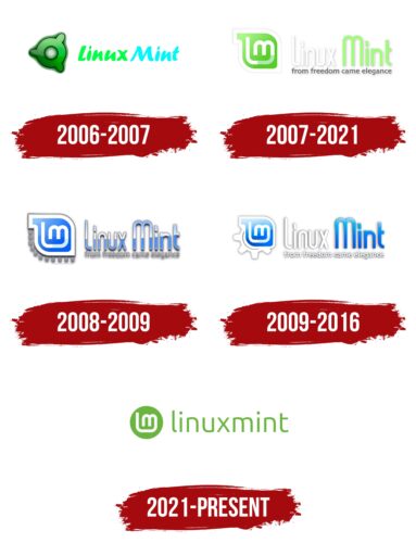
The debut logo was released simultaneously with the first version of the OS. It was immediately associated with the elements of the visual identity of Ubuntu. In particular, with three recognizable wide projections on the round element. Everyone has the same width and color. The base palette is green with gradient transitions. The ring with outward semicircles is outlined on both sides with a thin black line, making the logo clearer, as it is surrounded by a vague “haze.” To the right of the icon in the system name in bold italics. Moreover, each word is colored in a separate color: “Mint” – in a bright blue of the neon spectrum, “Linux” – in a green shade of light green.
2007 – 2021
In 2007, the logo was completely redesigned, resulting in a version known to a wide range of users. The change in concept led to a change in the appearance of the trademark. There is an elongated tail from the lowercase “m” to the left and up, which connects with the uppercase “L” and flows smoothly into it. The place of their joining is highlighted in gray, while everything else is painted white on a mint background. Both symbols are depicted in a complex geometric shape surrounded by a white stripe.
On the right is the expanded name of the operating system, with each word having its color. Linux is white; Mint is light mint. There are blurry gray shadows around the letters. The “t” does not have the second half of the bar. The lettering is in lower case, but despite this, “m” and “l” are much larger than the rest of the characters. Below them is the phrase “from freedom came elegance.” This is the brand’s motto.
2008 – 2009
The KDE version of the logo contains the same elements as the previous logo but with a different color scheme. Plus, miniature gears along the bottom left of the icon were added to it. The designers replaced green with blue and removed the gradient. Therefore, now the borders of the colors are sharp: they do not pass one into another, but break off, forming contrasting parts: above – light (there is white), below – dark (blue). The background on the icon is blue, but otherwise, everything is the same. The lettering has received an additional shadow, which makes it look like hovering above the surface.
2009 – 2016
The developers made several adjustments to the logo, keeping the same concept. They removed many gears and left one, which they enlarged and made the background for the personal identification mark. The designers painted the word “Linux” in white, “Mint” – in blue and lightened the lower inscription.
2021 – today
The designers removed the gear reminder and simplified the complex logo configuration. Now it’s just a disc with an “m” in the center. The glyph looks like a tightly clenched fist. This impression is created by an elongated stem that goes to the left and rises in front of the letter. The operating system’s name is also played on in color: the circle is completely painted in mint green. On the right is the inscription “linuxmint.” It consists of two connected words, the boundaries of which have been erased because the designers have converted all letters to lowercase.
Mint: Interesting Facts
Linux Mint, celebrated for its ease of use and stylish interface, appeals to newcomers and seasoned users. It leverages the stable underpinnings of Debian and Ubuntu to deliver a comprehensive and user-friendly operating system.
- Genesis and Goal: Launched in 2006 by Clement Lefebvre, Linux Mint aims to offer a richer experience right from the start by pre-including browser plugins, media codecs, DVD playback support, Java, and more.
- The Cinnamon Desktop: Though Linux Mint supports various desktop environments, Cinnamon, created from GNOME 3, stands out. It is designed for those who prefer a traditional desktop setup with a modern aesthetic.
- Unique Naming Convention: Linux Mint versions are uniquely named after female characters that end with “a” and are also names of plants or herbs, reflecting the “Mint” motif. Names like “Ada,” “Tessa,” and “Ulyana” are a few examples.
- Widespread Appeal: Ranking high on DistroWatch, Linux Mint’s appeal lies in its straightforwardness, reliability, and robust community support, making it a favorite among many.
- Broad Compatibility: Aiming for wide accessibility, Linux Mint excels in recognizing hardware and ensuring software compatibility, easing the transition for users switching to Linux.
- Simplified Software Management: Its Software Manager intuitively houses over 30,000 packages, simplifying application installation for users of any skill level.
- Exclusive Mint Tools: The operating system includes bespoke tools like MintUpdate, MintInstall, and MintMenu, enhancing system management and user interface.
- Community-Centric: Although benefiting from corporate partnerships, Linux Mint thrives as a community-focused project, valuing user input and contributions for its development and upkeep.
- ISO Verification Feature: Following a 2016 security incident, Linux Mint introduced an ISO verification tool within its update manager, enabling users to confirm their system’s integrity post-installation.
- Privacy Prioritized: Linux Mint stands firm on privacy, avoiding the data collection practices seen in some other operating systems. It collects no personal data from users, upholding the principles of open-source freedom.
Linux Mint marries Linux’s robustness with user-friendly features, establishing itself as a go-to option for users worldwide, thanks to its blend of performance, simplicity, and customization options.
Font and Colors
Since 2016, the 2007 version has been used. It marks the entire product line, as the authors emphasized the unity, not the differences, of the operating system operating on different platforms. But the structure of the sign remained the same: on the left – the OS icon, on the right – its name.
The authors of the logo settled on a typeface that closely resembles both Mint Spirit and Prozak Light. Each of them has its differences and coincidences. They are united by smooth lines, harmonious transitions, rounded corners.
The proprietary palette is indicated in the name of the trademark – it is a mint color. It is combined with white and has a gradient transition in some areas. Previously, the emblem was painted blue and gray.
Mint color codes
| Kelly Green | Hex color: | #69b63d |
|---|---|---|
| RGB: | 105 182 61 | |
| CMYK: | 42 0 66 29 | |
| Pantone: | PMS 361 C |
