The creator of the famous game Minecraft is creative not only with the projects he works on but also with his visual identity. That’s why the Mojang logo is a reflection of his creative inspiration. And its casual style is a reminder that the studio is associated with the field of entertainment.
Mojang: Brand overview
| Founded: | 2009 |
| Founder: | Markus Persson |
| Headquarters: | Stockholm, Sweden |
Mojang is a well-known gaming software manufacturer that is of Swedish origin. The company’s main office is located in Stockholm, and the head is Jonas Mårtensson. Currently, the brand is a subsidiary of the American company Xbox Game Studios, a division of the legendary Microsoft. Besides its outstanding leadership, Mojang is also known for developing the iconic Minecraft game. It is constantly being improved, resulting in new exciting versions.
Mojang Studios is one of the best video game developers. The company began its journey as a small company, which was created with the aim of carefully working on the popular Minecraft game. Subsequently, it became one of the company’s key products and entered the list of the most popular computer games. But, Mojang’s activities were not limited to this. Cobalt and Scrolls appeared in the line, which was available to users of standard Windows and macOS, and Linux users.
Meaning and History
On all company products, you can see a playful icon that expresses the brand’s corporate identity. It consists of an originally designed title placed inside a two-level frame. A distinctive feature is a non-standard font, which symbolizes a creative approach, creativity, and vigor. It is these principles that have guided the employees of the well-known developer Mojang for many years.
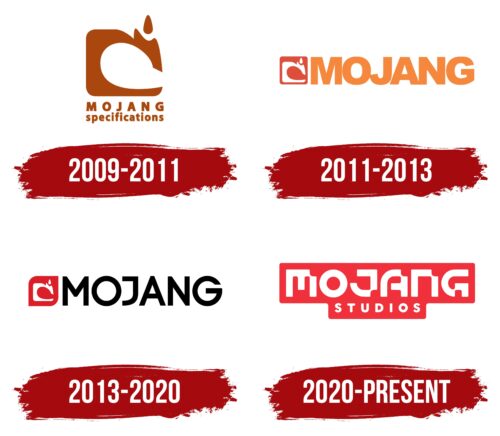
For all the work time, the creative manufacturer has changed several variants of corporate identity. Each of them reflected the state of affairs and the company’s strategy in different periods. In addition, Mojang management always strives to follow trends. This applies to both the process of developing game programs and the visual concept. New versions of the logo have always been innovative and creative.
What is Mojang?
Mojang is one of the best Scandinavian game publishers. The company appeared more than ten years ago and, during this time, managed to become a successful developer. It was Mojang that released the cult game Minecraft, which is known all over the world. The management of the company is carried out directly from the main office in Stockholm, as well as from the office of the parent company Xbox Game Studios.
2009 – 2011
Mojang officially entered the market in 2009. It was founded by a Swedish programmer and game designer and had an established visual identity back then. The logo of that time consisted of a neat name and an extraordinary abstract figure that favorably emphasized an unusual field of activity.
According to company representatives, the silhouette of a sewing machine inspired the creation of the element. In this context, such a figure demonstrates a focus on creating something new. A beautiful flowing font complements the expressive figure in Myriad Black style. It is characterized by confident, soft lines without serifs.
Due to this, the Mojang specification inscription looked quite minimalistic but, at the same time, very stylish. Such a font evoked associations with trust, comfort, and friendliness. Positive emotions were also evoked by rich orange colors, which denoted vitality, joy, and energy.
2011 – 2013
2011 was a landmark year in the history of Mojang since the original version of the cult game Minecraft was released during this period. A significant event became a prerequisite for a new stage in development and updating the corporate identity. As a result of the painstaking work of the designers, an excellent positive emblem appeared, which favorably emphasized the company’s success.
The visual concept included using the previous content but in a new design. The changes affected the design, layout, and font. The new version used a strict, simple Arial Black font, demonstrating professionalism and high quality. It was used to design a simplified inscription, which now consisted of one word – Mojang.
The massive confident component was complemented by a compact figure, which has already become traditional for the brand logo. This time she represented a white badge placed in a red frame. The main element was painted in a light orange shade. The use of this color scheme is fully justified. White symbolizes honesty, red symbolizes energy and strength, and orange is the color of creativity and joy.
2013 – 2020
In 2013, the company’s revenue reached record levels for the entire period of existence. In the same year, Jonas Mårtensson took over as CEO. The events that took place prompted the idea to carry out another rebranding. This decision made it possible to create a more stylish and up-to-date version of the logo. The badge was still based on the big company name, Mojang. The chosen font resembled the style of Code Pro.
Its characteristic differences were more accurate and thin lines with straight cuts. The design reflected confidence, strength, and a flexible approach. These features were also emphasized by strict black coloring. It is associated with reliability and high quality. In addition to the inscription, the new logo also featured the traditional Mojang badge. It is a symbol of creativity, and the contrasting colors in the form of white and red colors meant power, activity, and development.
2020 – today
In 2020, the company celebrated its 11th anniversary on a large scale and, in honor of this, decided to radically change its visual identity. Instead of a simple, sophisticated typeface, the designers opted for a non-standard format, which has become a feature of the Mojang logo. It is characterized by the presence of many neat notches with which all the letters of the name are strewn. The lines themselves are straight and soft, similar to those used in previous versions.
The author’s version was supplemented with a simple classic font used for the design of the bottom inscription – Studios. The combination of unusual authors and simple modern fonts indicates the harmony of innovation and traditional technologies used by the manufacturer. A bright touch in this concept is a beautiful frame, fitting the inscription along the contours. The form is completely undermined for a two-level word mark. It is narrowed at the bottom and widened at the top.
Font and Colors
Mojang is a company that stands out from other video game makers. This is noticeable not only in software products but also in corporate style. The manufacturer’s logo is designed in an unusual style using bright colors and a designer font. The exclusivity of the word mark immediately catches the eye. Attention is drawn to the clear notches located on each letter. The lines are generally quite massive, which adds confidence to the icon.
The neat and compact word Studios complement the title block. A classic modern version of the font was used for this part of the wordmark, similar to the Gellix format. These are clear thin lines with straight cuts. The coloring in the presented emblem is quite expressive. For the design of the letters, white was used (a symbol of openness and reliability), as well as red, indicating the flow of strength and energy. It is in this vein that the manufacturer has been working throughout the entire period of existence.
Mojang color codes
| Imperial Red | Hex color: | #f0313b |
|---|---|---|
| RGB: | 240 49 59 | |
| CMYK: | 0 80 75 6 | |
| Pantone: | PMS Bright Red C |
