


![]() Moleskine Logo PNG
Moleskine Logo PNG
You can recognize a quality Moleskine product by its characteristic features and strict company logo. It is a minimalistic picture, the main element of which is the brand name. Such an icon is a prime example of a design often chosen by giant companies that demonstrate their solidity through a laconic, compact logo. In the presented version, the main principles of such a design are evident: minimal detail and strict monochrome colors.
Moleskine’s story began before the company itself, with 19th-century French pocket notebooks known as “carnets moleskines.” They had black-coated covers, rounded corners, elastic closures, and compact pages for daily notes. The brand later built part of its identity around the claim that artists and writers such as Van Gogh, Picasso, and Hemingway used similar notebooks, though firm documentary proof is limited.
In 1986, the last small family producer of these notebooks in Tours, France, closed after the owner’s death. In 1987, British travel writer Bruce Chatwin described their disappearance in The Songlines, using the phrase “Le vrai moleskine n’est plus.” In 1995, Italian translator Maria Sebregondi read the book and brought the idea of reviving the notebook to Modo & Modo, a Milan-based publishing house founded by Francesco Franceschi.
The Moleskine trademark was registered in 1997, and the first batch of 3,000 to 5,000 notebooks was produced in China. The new version used a synthetic cover, but kept the black color, rounded corners, elastic band, rear pocket, and cream paper. The notebooks first appeared in a small bookshop on Milan’s Corso Buenos Aires, with inserts linking the product to Hemingway, Matisse, and Chatwin. Against rivals such as Leuchtturm1917 and Rhodia, Moleskine leaned on cultural memory rather than paper specifications.
In 2006, Société Générale Capital bought Modo & Modo, and the company became Moleskine Srl. In 2007, it acquired global trademark rights. By 2012, Moleskine was sold in 22,000 stores across 95 countries. In 2013, it was listed on the Milan Stock Exchange. In 2016, Belgium’s D’Ieteren bought control of the company in a deal worth about €500 million.
Meaning and History
![]()
The Moleskine enterprise was founded by the Milanese publishing house Modo&Modo. For some time, the first samples of goods were made here. But soon, the production of popular notebooks was separated from Modo & Modo, resulting in the creation of a new enterprise named Moleskine. The new business began to develop rapidly and gradually entered the international level. Notebooks appeared in stores in Europe and Asia.
Throughout history, a well-known manufacturer has changed its emblem only once. But in this case, rebranding did not involve drastic changes. The logo has not changed much, which testifies to the company’s unchanging values and its desire for stability. In addition, the original badge fully reflected the essence of the brand. The only change in this case was the use of a miniature decorative sign associated with smartphone-based planning and note-taking.
What is Moleskine?
Moleskine is one of the world’s best manufacturers of luxury notepads and stationery. Founded in Italy, it continues to work on products loved by millions of buyers and constantly replenishes its range with accessories, books, writing utensils, and leather bags. The main difference in this production is the high-quality materials, which are characterized by durability and long service life. A special contribution to the company’s development was made by the Modo & Modo publishing house, where the first product samples appeared.
1997 – 2013
![]()
The company’s foundation is tied to the launch of the first batch of black pocket notebooks designed by Maria Sebregondi and her business partners. It was in 1997, and from that moment, the history of another famous brand began. When the first products were created, the company had already established its own unique logo, consistent with traditional design principles. It did not have bright elements, expressive frames, or spectacular shadows.
The picture was very restrained and concise, while also showing a high level of professionalism. This concept perfectly reflected the characteristics of the goods. Moleskine notebooks and other products are crafted exclusively from high-quality materials yet look very simple.
To emphasize these features, the designers created a minimalist badge with just one inscription. A fancy, chic font was used for its design, with sharp, elongated serifs. It gave the logo elegance and favorably emphasized the brand’s elitism. The classic black-and-white colors also emphasized the special status. They demonstrated timelessness, purity, reliability, and prestige.
2013 – today
![]()
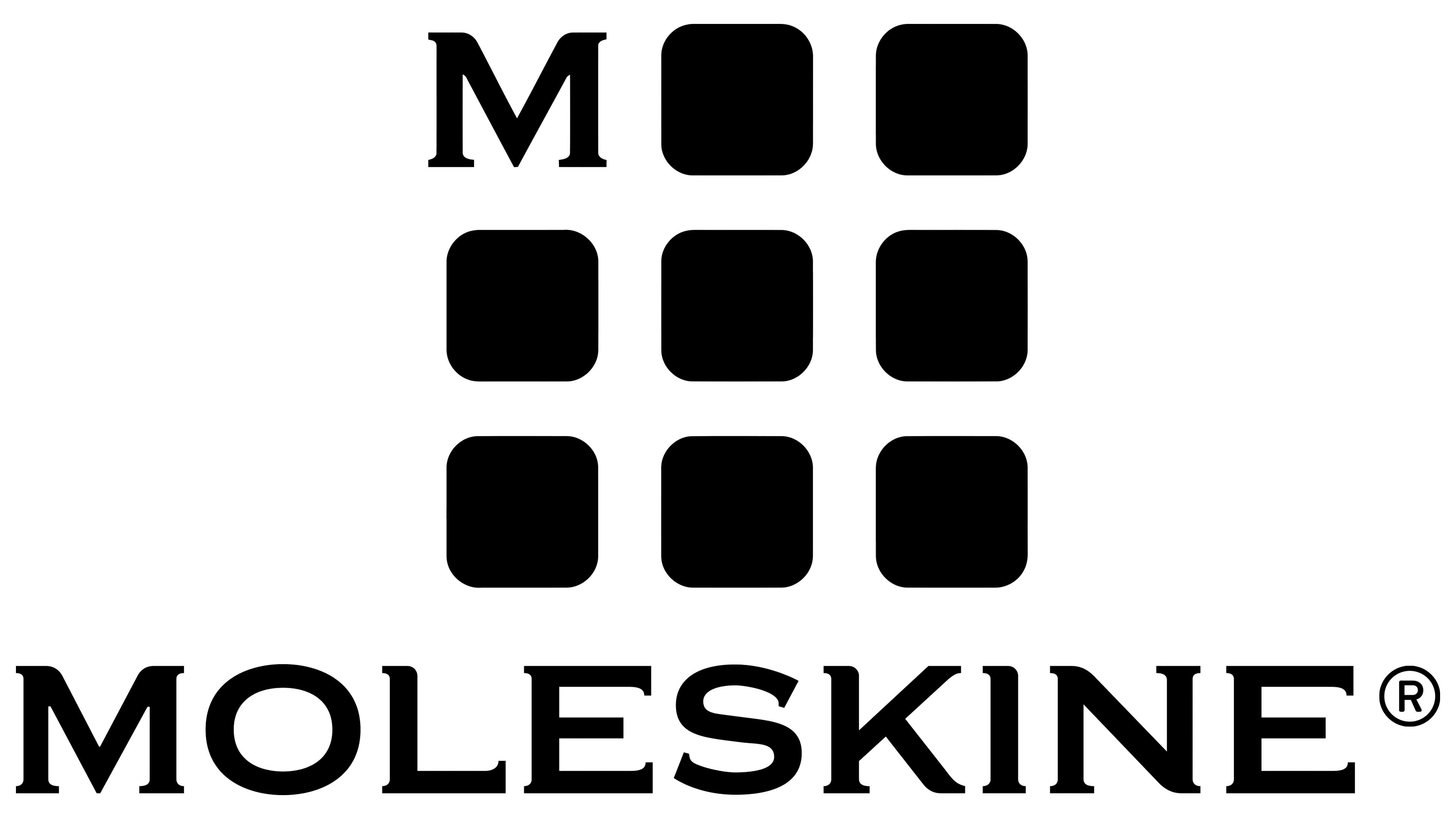
In 2013, Moleskine decided to change the logo. The new version retains almost all the features of its predecessor and adds additional details. It was a square icon with several cells and a miniature letter M in the top row. This picture significantly expanded the main message of the famous brand.
It denoted functionality, competent planning, and organization. All this was achieved with the notebooks the company provided, which allowed writing down everything necessary and planning the day. The specified line of the visual concept is also reflected in the main inscription, “Moleskine”. It symbolizes creativity, confident positions, and high professionalism.
Characteristics are seen in a clearly defined Roman type with decorative modifications. Unlike the previous logo, the elongated, sharp serifs have changed slightly here. Now, in some letters, they are directed only in one direction, while in the original version, decorative serifs were directed in both directions. This decision made the logo more solid and stylish, while the traditional colors emphasized reliability and excellent quality.
Font and Colors
Moleskine is one of the elite companies whose products are appreciated by customers worldwide. This feature served as the basis for developing the visual concept. The designers chose a beautiful, minimalist style to emphasize the company’s solid status, uniqueness, and professionalism. It manifests itself in a strictly modified font and a restrained color palette.
The font format is similar to Copperplate Gothic. It features confident thin lines with serifs. In the picture shown, the tails of the letters are slightly altered. They are quite sharp and elongated in one particular direction. The feature emphasizes creativity and strict adherence to established standards.
The description is typical of the company throughout its existence. These features are also evident in the classic black-and-white color scheme. In the context of visual identity, black means prestige, authority, and reliability. In this case, white symbolizes purity, honesty, and timelessness.