


![]() Momondo Logo PNG
Momondo Logo PNG
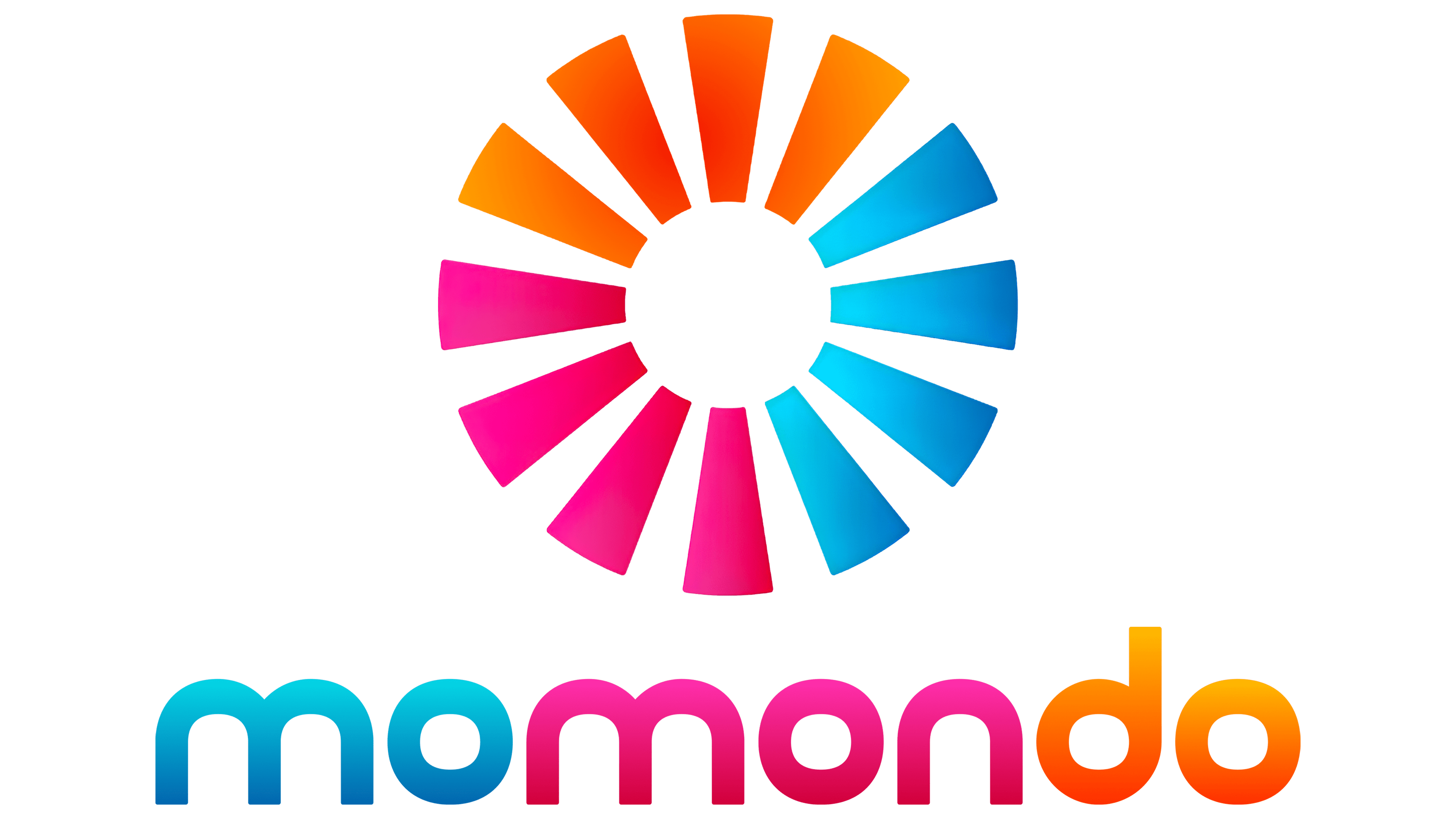
The popular service is easily recognized by its incredibly bright, playful Momondo logo, which showcases a wide range of services. Its iridescent coloring also emphasizes the fun and friendly atmosphere that comes with travel organized through the aggregator. In general, the visual concept perfectly conveys the principles on which the company is based and its vision of an ideal journey.
Momondo began in Copenhagen in September 2006 as a Danish travel metasearch platform for flights, hotels, and car rentals. A group of IT developers led by Torvald Stigsen, with support from investor Claus Wulff, built a service that aggregated airline and travel-agency prices into a single interface. Unlike Skyscanner, Momondo tried to combine price comparison with a stronger travel-oriented brand voice.
In its early years, Momondo grew mainly in Scandinavia and Europe. In March 2011, it was acquired by Cheapflights Media, the British company linked to the Cheapflights platform and investor Hugo Burge. Burge became CEO of the combined business, and in 2012, the holding changed its name to Momondo Group. Cheapflights remained active, but Momondo became the main brand for international expansion.
In 2014, Great Hill Partners invested about $105 million in Momondo Group, providing the company with capital to expand into additional markets. The brand’s best-known campaign came in June 2016 with “The DNA Journey,” created with AncestryDNA. Momondo filmed 67 people discovering unexpected genetic links to other countries and cultures. The video passed 120 million views in its first month and won 43 industry awards, including Cannes Lions and Clio prizes.
On February 7, 2017, The Priceline Group, later Booking Holdings, announced the purchase of Momondo Group for $550 million in cash. The deal closed in July 2017, after which Momondo and Cheapflights moved under KAYAK. Skyscanner, bought by China’s Ctrip in 2016, remained a key European rival. In 2019, Momondo continued its image campaigns with “The World Piece,” built around 61 connected tattoos for people from 61 countries.
Meaning and History
![]()
Momondo is a real travel metasearch engine that lets you find the perfect accommodation and book tickets. Its multifunctionality is perfectly combined with a user-friendly interface and a bright, stylish design. Over the years, it has improved significantly and is now one of the best aggregators globally. Every day, it is visited by thousands of users from around the world.
Many people immediately recognize it by its memorable logo, which demonstrates the service’s versatility and focus on positive emotions. This is facilitated by a multi-colored range consisting exclusively of bright shades, as well as the inscription’s original style. The letters are distinguished by rounded, flowing shapes that evoke associations with comfort and trust.
What is Momondo?
Momondo is a trusted online resource that specializes in travel services. It is currently owned by KAYAK, a subsidiary of the well-known Booking Holdings corporation. On the site, you can find suitable accommodation and flight options. In addition, you can find car rental offers here and pick up an interesting trip idea. The resource spans a vast geography, so residents of different countries can access it.
Momondo was officially launched in 2006 by Danish-born Thorvald Stigsen. Users had access to a fully formed, user-friendly website distinguished not only by the quality of service but also by an expressive visual identity. Designers have developed a colorful, attractive logo for the well-known brand, demonstrating openness to travel and a desire to experience the world’s beauty.

The company still uses this emblem because Momondo’s main message has remained unchanged. Its essence was that travel gives unforgettable emotions and many positive impressions, and a convenient aggregator will always help solve key issues. The developers have collected only reliable and proven accommodation options, air ticket offers, and ideas for the competent organization of the weekend on the site.
The service’s versatility is reflected in the logo. This combines several bright colors at once. They are used to decorate specific parts of the inscription and indicate the company’s name. The wordmark is in perfect harmony with the bright colors and is set off by a stylish, modern font. Rounded letters of the same size look quite dynamic, and the letter O repeated several times contributes to the recognition of the emblem.
In general, the visual concept aims to fully reveal the advantages of a functional metasearch engine. A bright multi-colored palette demonstrates joy, positive, new impressions, and a wide range of company services. The stylish font emphasizes these features and symbolizes Momondo’s commitment to always being on trend. The chosen format is so well chosen that it has not lost its relevance to this day.
Font and Colors
Momondo is quite progressive and strives to provide its customers with the most comfortable, high-quality service. It is these aspirations that the current emblem demonstrates. For the inscription, a neat, round font is used. This style lacks serifs, so it can be classified as Modern. This group symbolizes innovation, determination, and development.
In terms of brand values, this means a desire to help the visitor plan their route without difficulty. In addition, softness and roundness convey trust, coziness, and comfort. Such conditions are guaranteed to anyone who finds a suitable offer on the Momondo website. Colorful coloring reflects another component of the company’s philosophy. It lies in an open vision of a multifaceted world.
The designers chose blue, pink, and orange to convey this message. They look very harmonious in the logo and symbolize certain values. Blue represents reliability and tranquility, pink represents the joy of discoveries, and orange represents energy and vitality. Together, they form the basis of the famous brand’s philosophy.