![]() Monat Logo PNG
Monat Logo PNG
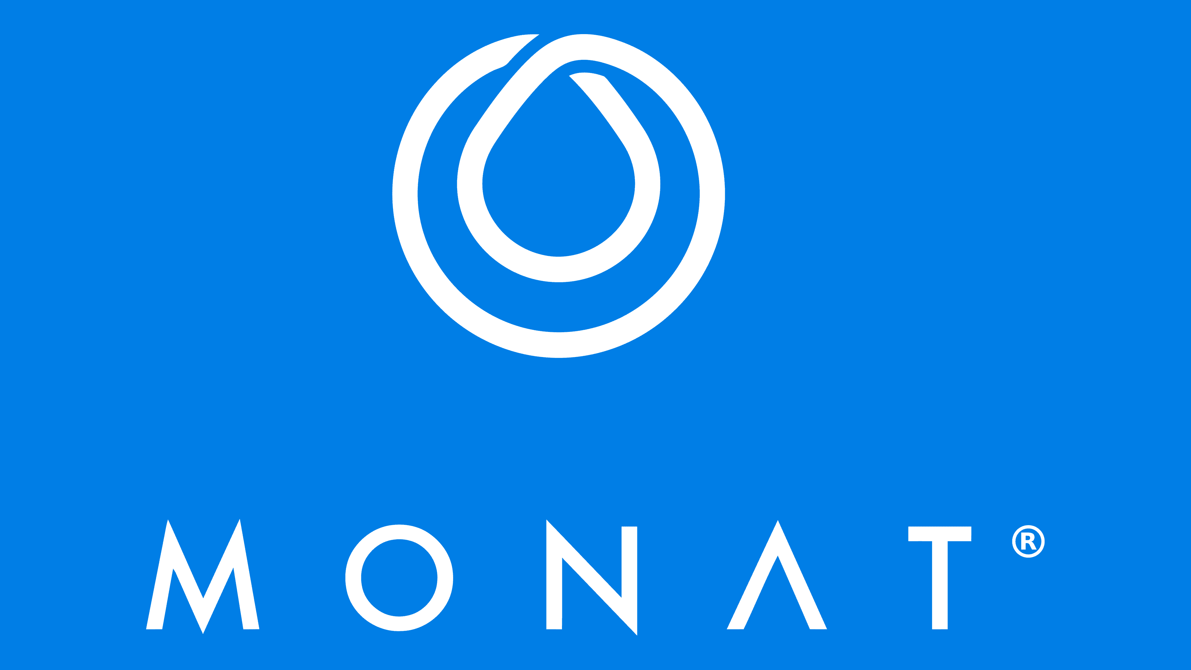
The Monat logo promises the perfect hair structure. The company uses soft, nourishing cosmetics to deliver silky, manageable strands. The soft lines of the emblem show harmony and beauty.
Monat is the shortened name of the American company Monat Global Corp. It is a subsidiary of Alcora Corporation. The company’s main activity is producing and selling hair-care cosmetics. Another direction is the sale of animal hygiene products. The founders and owners of the brand are the Urdaneta family. According to the scheme in which the work is carried out, this is the parent organization of the network business, which appeared in the autumn of 2014. The headquarters is located in Doral, Florida.
The brand began by mastering environmentally friendly raw materials. As a result, the company offers products that help you enjoy a full life and healthy hair. It also produces skincare products based on biologically compatible ingredients.
In doing so, the firm builds its business on the trust of its customers, who can become its employees at any time. To do so, it offers to use its products, try them out, and start selling them to acquaintances, colleagues, and other potential customers. And since the networking organization has family values in the first place, it treats each person who joins it with respect.
Meaning and History
![]()
That family is a priority, as evidenced by the brand name, which is based on five principles: family, love, community, gratitude, and culture. These letters make up the name and form the basis of the brand emblem. The owners detailed the concept to emphasize the family’s importance in business and life. Therefore, the company treats its market partners and customers as close relatives.
However, the company is involved in several high-profile scandals involving lawsuits. Of course, this hurt the brand’s image, which is now trying to prove otherwise and restore its reputation. However, black PR is also PR, so the brand logo is becoming increasingly recognizable. And since this is a young organization, it has only one visual identity mark.
What is Monat?
This cosmetics company sells premium skincare, wellness, and hair care products directly. The brand offers innovative formulas featuring patented chemical and botanical ingredients that address a range of care needs through a network of independent sales partners. The range includes dietary supplements, anti-aging skincare lines, and comprehensive hair care systems that work together to achieve optimal results. The brand stands out for its combination of high-quality formulations and a social sales model, allowing customers to receive salon-quality products, personalized consultations, and support from partners.
2014 – today
![]()
The company’s identity and concept are well thought out. They are built on the principles of openness, trust, and purpose. This is evident from the shape of the letters in the word “Monat.” All the characters are in upper case and made with simple, straight lines. Only the “O” is rounded.
The other characters have sharp corners at the ends of the strokes. The exception is the “T,” which looks like a neat hammer. Whereas “M,” “N,” and “A” have peaked tips. Each has a different number of sharp corners: “A” has one, “N” has two, “M” has three. For better legibility of the name, the letters are spaced apart (with wide inter-letter spacing) but remain in a single row, forming a well-readable inscription “MONAT.” In addition, the “A” has no middle bar, which adds to the logo’s originality.
Above the text part is a small icon. It, too, is simple and made from a solid medium-thickness strip. The line is twisted into a strand of hair, usually drawn on packaging for coloring products to show the dye’s color. In this case, the icon is monochrome and hollow, consisting of an outline. The graphics and text form the original logo. It is used not only as a mark of identity but also as a mark of goods on signs and in promotional materials.
Font and Colors
The logo’s inscription is in a simple serif typeface. The letters have sharp corners and flat lines. The word “MONAT” is broken down into many parts, simplifying its visual perception. The brand palette is monochrome, with blue and white backgrounds.