 Monkey Baa Theatre Company Logo PNG
The Monkey Baa Theatre Company logo is a visual manifesto that embodies the organization’s commitment to pushing artistic boundaries. It invites one-of-a-kind experiences, encouraging audiences to expect the unexpected. The logo conveys the core philosophy: a commitment to transformative, unconventional storytelling that challenges norms and makes audiences think.
Monkey Baa Theatre Company: Brand overview
Founded in 1997, Monkey Baa Theater Company was the brainchild of Eva Di Cesare, Sandra Eldridge, and Tim McGarry. Their first production, Thief of the Boogalooogs, was presented at the Glen St Theatre in Sydney. Early on, productions such as Warts reached remote Australian communities, helping to expand Monkey Baa’s reach. The company’s seven-year tenure at the Seymour Center has been recognized with high honors, including the prestigious Helpmann Award for its production of Hitler’s Daughter.
2011 marked a significant change for the company as it moved to its mainstage run at the ARA Darling Quarter Theater. That same year saw the debut of the play Goodbye Jamie Boyd. A standout achievement was the play Josephine Wants to Dance, which ran on 49 stages across the country.
2017, and Eva Di Cesare became the primary artistic director. Five years later, Sandra Eldridge chose a new path, ending her 26-year association with Monkey Baa. For more than a quarter of a century, the theater company has enriched the lives of 1.6 million young Australians with exciting theatrical productions, and its legacy of creating and touring productions remains undiminished.
Meaning and History
1998 – 2012
2012 – 2022
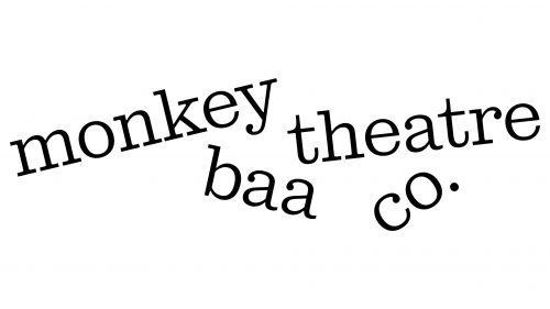
2022 – today
This logo is characterized by creative chaos: the words are so jumbled that it is difficult to make out the name of the group. All lines are diagonal, typed in a thin font in lower case. The letters have rectangular serifs and dots, missing only in the letters “o” and “e.” At the same time, the glyphs have neat curves, except for the letter “k,” which lacks them. This structure allows to show a high artistic potential within the framework of a static element representing the participants of the modern theatrical movement.
The use of diagonal lines and thin fonts enhances the sense of movement and fluidity akin to a theatrical performance. The lack of curves in the letter “k” makes it stand out, giving it an unexpected curve that attracts attention. The chaotic arrangement of words invites deeper insight into the content, reflecting the complexity of contemporary theatrical productions.


