


 Monster Hunter Logo PNG
The monsters have left their mark in the form of the Monster Hunter logo. The emblem shows that the player is in danger, frightened, and at risk in the darkness. Defeating evil and achieving the goal will take strength, energy, and quick reactions.
Monster Hunter began in 2000 within Capcom’s first production division as a project to showcase the PlayStation 2’s online capabilities. The early “MH Project” looked like a 2D fantasy platformer. Still, after Kaname Fujioka joined in 2002, they rebuilt it as a 3D hunting game with a more grounded world.
The first Monster Hunter launched in Japan on March 11, 2004. Capcom developed it alongside Auto Modellista and Resident Evil: Outbreak, hoping that one online game would sell 1 million copies. Monster Hunter did, mostly in Japan, while Western sales stayed limited.
The major shift came with PSP. Monster Hunter Freedom arrived in 2005, followed by Freedom 2 in 2007. Portable play fits Japan’s commuter culture, turning local co-op hunts into a social habit. Monster Hunter Portable 3rd, released in 2010, became the best-selling PSP game, selling nearly 5 million copies in Japan within one year.
The series grew into a Japanese pop culture brand, with TV ads, merchandise, and the 2008 manga Monster Hunter Orage by Hiro Mashima, best known for Fairy Tail. Western growth remained slower until Monster Hunter: World launched on January 26, 2018, for PlayStation 4 and Xbox One, and later for PC. It simplified entry, removed segmented loading zones, and was released worldwide. It sold 5 million copies in its first weekend and became Capcom’s best-selling game.
Monster Hunter Rise followed in 2021 on Nintendo Switch and sold around 10 million copies. Monster Hunter Wilds launched on February 28, 2025, and passed 10 million copies in under a month, setting a new Capcom record. By May 2024, franchise sales had topped 100 million copies.
Meaning and History
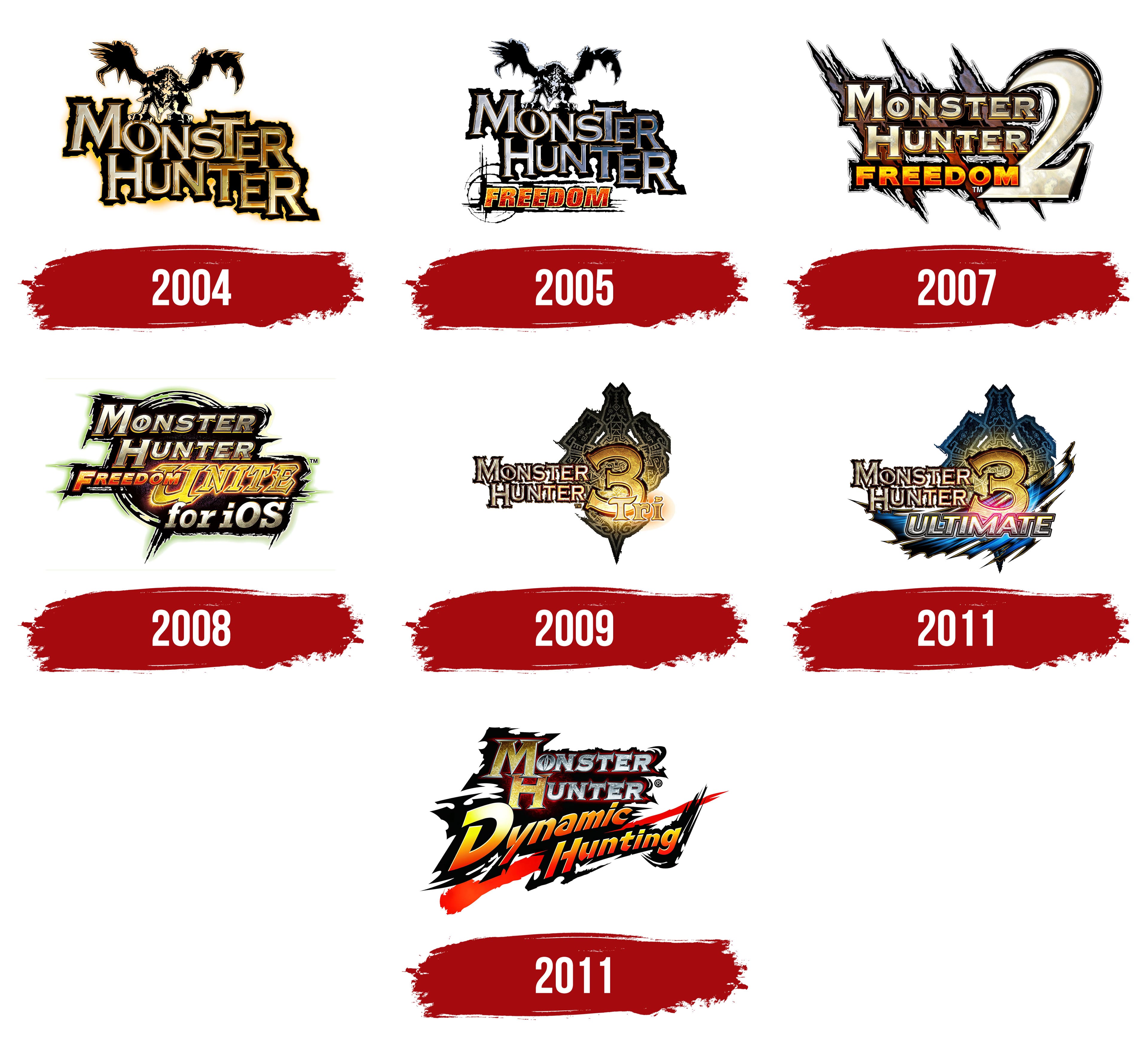
The Monster Hunter logos reflect multiple generations of the game, with each piece featuring a distinctive symbol. Evolution shows in both the graphic image and the inscription: the old-school design gradually gave way to a modern style, expressed through clear forms, bright colors, and visual depth.
In general, all MH emblems match the mood of the fantasy world. Given that gamers must complete quests to catch or kill monsters, the atmosphere is filled with danger and heroism. Logos, as an important part of the identity, also come across as threatening and pathetic.
What is Monster Hunter?
Monster Hunter is a commercially successful media franchise inspired by action role-playing games. The Japanese company Capcom develops and publishes the series. Capcom released the first installment in 2004. The games immerse players in a fantasy world filled with monsters. Players explore new territories, battle monsters, and collect resources to improve their weapons and armor.
Monster Hunter
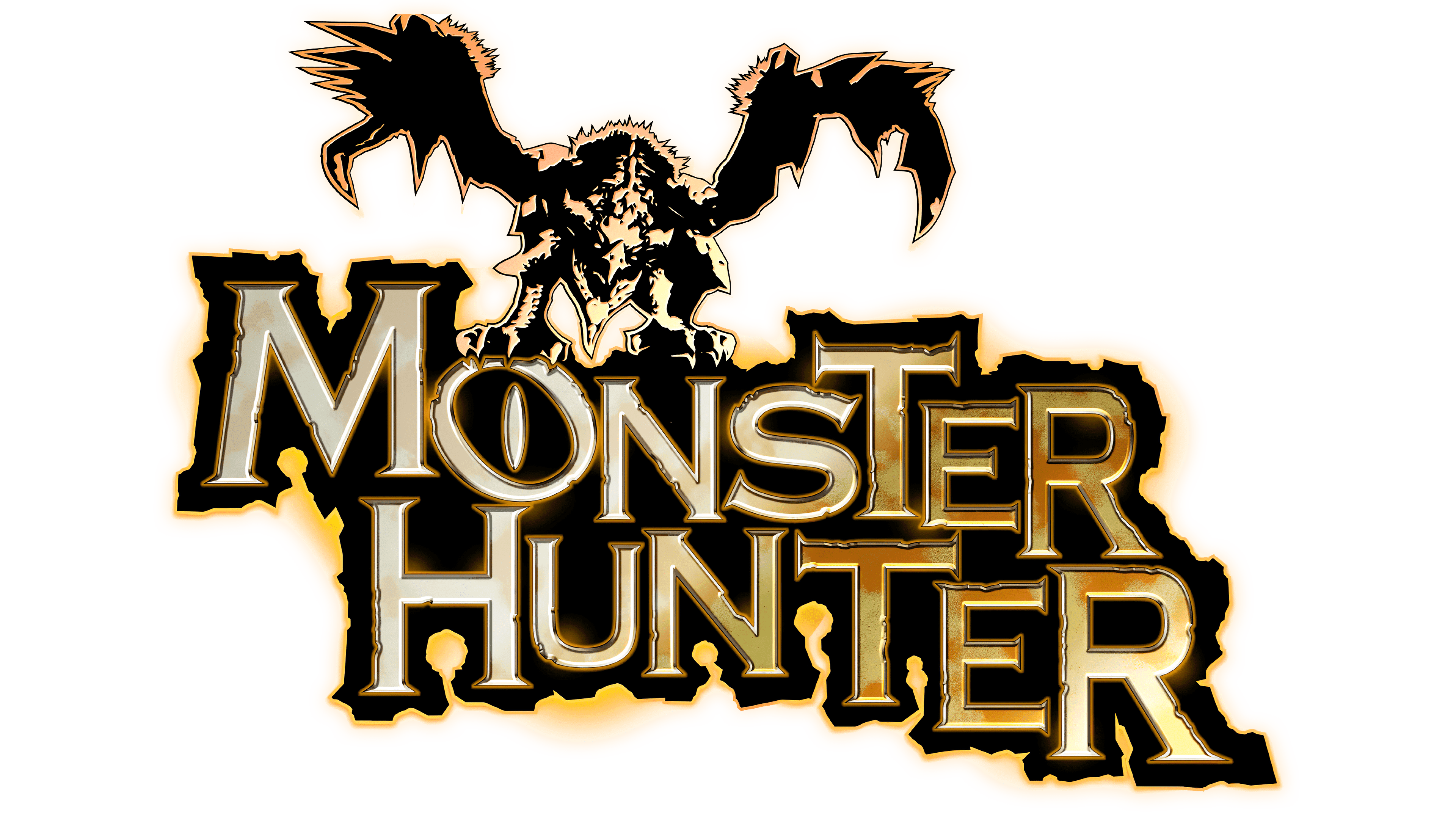
The first installment of the series was released outside Japan in September 2004. The action-RPG cover featured gold-colored “MONSTER HUNTER” lettering, split into two lines and surrounded by a trembling black shadow. The gradient made it look like the name of the game was melted out of shiny metal, and above “O,” which looked like a dragon’s eye with a vertical pupil, a winged monster from a fantasy universe towered. At the same time, all letters had short, sharp serifs (except for “O”) and varied in size.
Monster Hunter Freedom
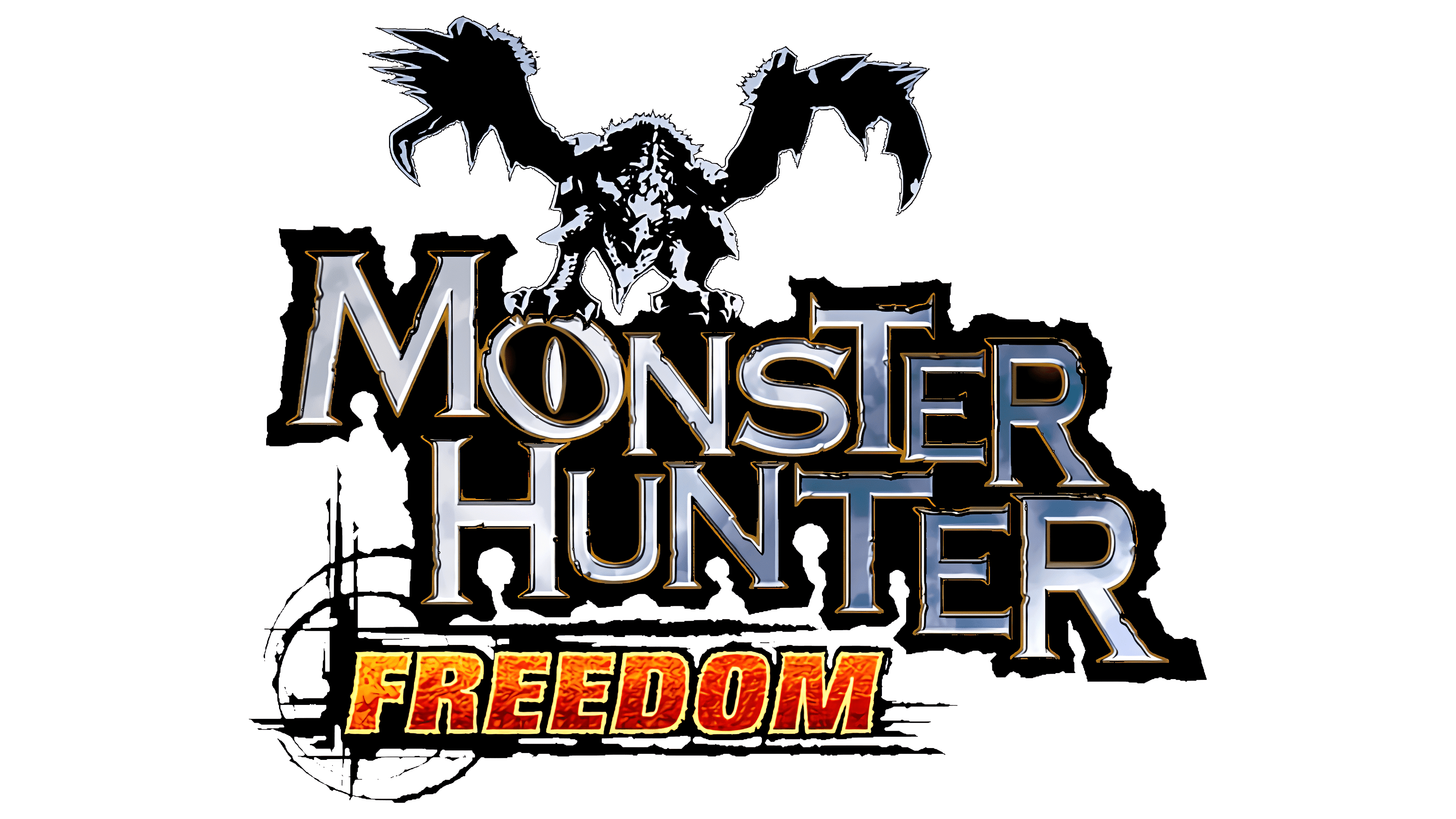
A PSP video game appeared in 2006. The developers kept the old logo design but replaced the gold color with silver. This applied to both the inscription and the monster atop it, which spread its wings. An additional word, “FREEDOM,” appeared at the bottom. It used sans-serif capital letters and sat against a black-striped background. The design also used a gradient: a smooth transition from yellow to red-orange.
Monster Hunter Freedom 2
In 2007, another action role-playing game for the PlayStation Portable was released in the USA. It was a direct sequel to Monster Hunter Freedom, but its logo was very different. The designers removed the winged monster and left the only hint of monsters: three long, jagged lines that resembled claw scratches. They were painted in several colors: gray (top), orange (bottom), and black (along the outline).
In the foreground, the video game’s title appeared in the same font as before. All letters except the first “M” and “H” are equal in size. The “O” no longer looked like an ellipse; it was a circle split in two by a vertical stripe. On the right side was a huge white-and-silver “2”.
Monster Hunter Freedom Unite

In June 2009, PSP owners could play an enhanced version of Monster Hunter Freedom 2. The new product was called Monster Hunter Freedom Unite, and the logo reflected that. It was in a circle of black lines. The first three words used the same font as before, but with a slight rightward slant. For UNITE, the designers used stylized yellow caps.
Monster Hunter Tri
In 2010, the third installment of Monster Hunter was released for the Wii. The emblem indicated the game’s order because the central element was an abstract figure with three dragon heads and a large “3”. The series title sat on the left and looked slightly different from before: the letters lost their clear shape. In the lower-right corner, the word “Tri, glowed with golden light.
Monster Hunter Tri: Ultimate

The logo for Monster Hunter Tri: Ultimate, released in 2013, differed little from the previous one, except that the lower part was covered with black and blue lines. The luminous number “3” remained in its place, and below it was the word “ULTIMATE,” written in silvery cursive letters.
Monster Hunter: Dynamic Hunting
2011 saw the debut of a spin-off called Monster Hunter: Dynamic Hunting. It was designed specifically for the iPhone and had touch-based gameplay. Its wordmark contained four lines. MONSTER HUNTER was written horizontally, while DYNAMIC HUNTING was written diagonally. As before, blurry black shadows surrounded the lettering. A long red line ran below.
Font and Colors
Each game in the MH series featured an emblem displaying its title. Various designs (such as dragon heads, winged monsters, and claw prints) complemented nearly all of the inscriptions, except MONSTER HUNTER DYNAMIC HUNTING. The graphic elements visually expressed the franchise’s fantasy world.
Designers used individual stylized fonts for all Monster Hunter word marks – sometimes with serifs and sometimes without. All logos, including the last one, were multi-colored and had a gradient. The current version is the most colorful: it contains bright shades of yellow (#fff514), burgundy (#9d0504), orange (#fe6300), and red (#ed2400). They are complemented by the basic colors: black, white, and silver.