The company helps cars on the road. Its spare parts are not afraid of any turns and turns. The Mopar logo is an example of balance and harmony. It doesn’t matter which way the car goes; it will still use the manufacturer’s services sooner or later.
Mopar: Brand overview
| Founded: | 1937 |
| Founder: | Stellantis |
| Headquarters: | United States |
| Website: | mopar.com |
Meaning and History
It all started when Chrysler Motor Parts Corporation introduced antifreeze and sold it under MoPar (from MOtor PARts). Over time, the brand expanded to include a full range of parts, not only for cars but also for trucks. Car enthusiasts generally used the term Mopar to refer to all Chrysler vehicles, from Dodge to Jeep.
But the division doesn’t make its cars—it doesn’t even have personal assembly lines. Only 13 stores work directly in the factories, so customers can order the necessary parts to be installed when buying a car. Nevertheless, the company has put several cars under its brand name on the market—a typical example of factory tuning.
By the distinctive logo, the brand can be recognized by the letter “M,” stylized as the symbol of Omega. It appeared only in 1964; before that, the manufacturer used text signs with a different design.
1933 – 1936
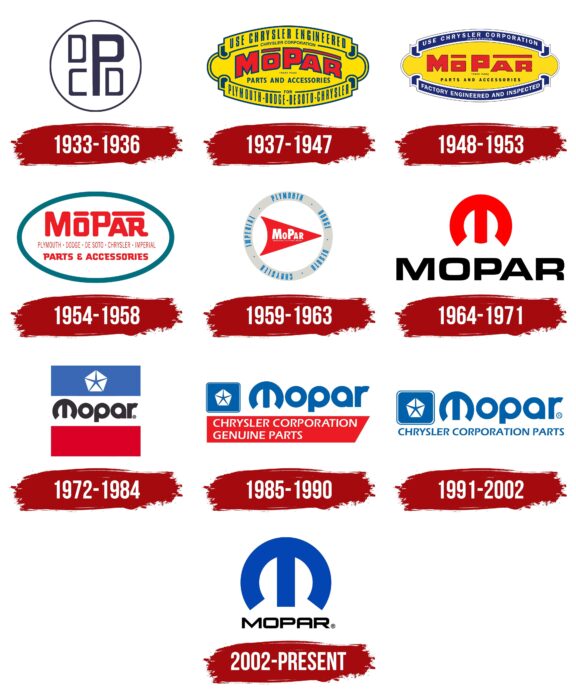
In 1929, the first Motor Parts plants started working. Until 1937, they made antifreeze, which had no trade name. Its logo consisted of a dark ring with a monogram placed inside. The letters “D,” “C,” “P,” and “D” represented the main series of Chrysler Corporation cars: DeSoto, Chrysler, Plymouth, and Dodge.
1937 – 1947
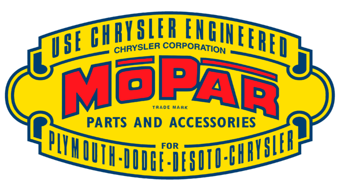
Nelson Farley, who headed Motor Parts, opened a marketing department. His specialists devised a separate name for the antifreeze brand—MoPar. The brand sign was changed accordingly. It looked like a label with lots of text. In the middle, inside a yellow ellipse, was a red arched word “MOPAR.” The letters “O” and “AR” had a superscript underline. Burke Bartlett created this design. At the bottom was the phrase “TRADEMARK” in small print, and underneath in large bold letters was “PARTS AND ACCESSORIES.”
The top ribbon contained the phrases “USE CHRYSLER ENGINEERED” and “CHRYSLER CORPORATION.” A similar ribbon below the ellipse specified “for Plymouth-Dodge-DeSoto-Chrysler.” A darker shade of blue was used for lettering and outlines.
1948 – 1953
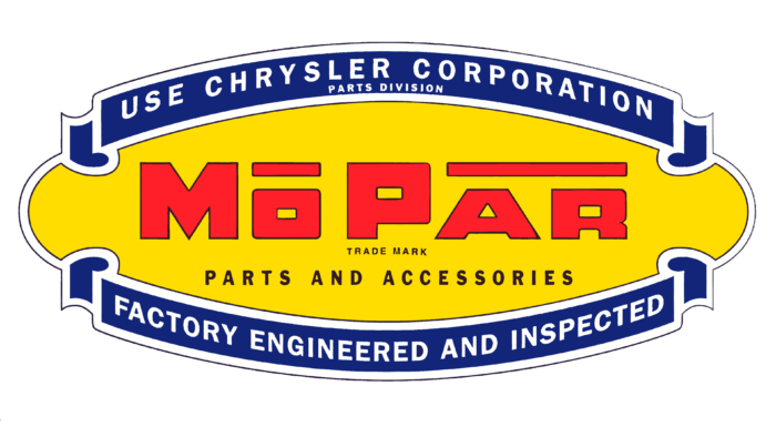
The brand started with antifreeze and gradually expanded into engine parts, filters, heaters, radios, and many other products. After the advent of the Master Tech curriculum, the logo was redesigned to reflect the development of Mopar. The central inscription remains, but the name has become flatter and more distinctly geometric. The hue of the yellow ellipse shifted to a darker shade, and the color of the ribbons was replaced with a darker blue. The outlines and inscriptions outside the ellipse became white. At the top were the words “USE CHRYSLER CORPORATION” (in large letters) and “PARTS DIVISION” (in small letters), and at the very bottom was “FACTORY ENGINEERED AND INSPECTED.”
1954 – 1958
The parent company briefly closed all its parts warehouses in the post-war period. It began returning them only in 1953. 1954, a separate Imperial model was added to the Chrysler Corporation brands. The modernization of the Mopar logo marked these events. It turned into a white oval with a turquoise border. The text contained the name of the spare parts brand, a listing of the traditional line of cars, and the phrase “PARTS & ACCESSORIES.” The corners of the letters in the word “MOPAR” were rounded, while the “P” and “R” were serifed. A similar font was used for the last phrase.
1959 – 1963
After another redesign, the names of the automobile brands turned blue and appeared in a gray ring. In the center was a red arrow pointing to the right. It had white inscriptions: “MOPAR” (with enlarged “M” and “P,” but without the usual upper underline) and “REGISTERED U.S. PATENT OFFICE.”
1964 – 1971
The emblem update occurred against Chrysler’s attempts to take over the race car market. During that period, Mopar had many racing parts. At first, they were sold only to professional athletes, but then they became available to everyone. Therefore, the company needed a new distinctive sign.
In 1964, George Robinson designed the famous Omega-M symbol, which is still used today. Until 1971, it was red and combined with the black word “MOPAR” at the bottom. The logo debuted at the 1964 Winternationals along with the 426 Hemi engine.
Georgia Robinson on her husband George Robinson (author of the “Mopar logo 1964”)
My husband was an extremely talented designer, working for Chrysler in Detroit at the time in marketing and merchandising. He was a young 33-year-old and truly loved the design world. Chrysler didn’t authorize my husband to design the Pentastar, thus giving it to an outside design firm. The boss under whom George Robinson worked assigned him to design a “new” Mopar logo; George was delighted with the opportunity.
As I look over at the history of the company, I am so surprised that since 1964, many combos have evolved, with always the Omega “M,” and here it is today it has gone back to the original design, just reversing the size of the “M” and the word “mopar.” It goes to prove that once something is perfectly designed, you don’t change it. The symbol is recognized throughout the world, and my George made it happen.
He passed away in 2013 at the age of 83 but lived long enough to have been recognized by many.
This is his legacy, and his family is so proud of him…
1972 – 1984
The brand’s new graphic symbol comprised the day’s Plymouth, Chrysler, and Dodge signage. It also reflected the 1969 Dodge logo. “Mopar” was written in black inside a white rectangle, with the so-called Omega-M instead of the standard “M.” All other letters were lowercase. At the top of the big blue quadrangle was the Chrysler star, the Pentastar: five triangles forming an open pentagon. And below the lettering was an empty red rectangle at the very bottom. Three differently colored blocks with different content together looked like a flag.
1985 – 1990
In 1985, the designers completely redesigned the design. They placed the Pentastar in a small square with rounded corners to the left of the blue word “Mopar.” And the red rectangle below turned into a narrow rectangular trapezoid. It was a two-line white text: “CHRYSLER CORPORATION GENUINE PARTS.”
1991 – 2002
In 1991, the five-pointed star was moved closer to the brand name. The word “GENUINE” disappeared from the lower inscription, combining the words in one line. The red base was removed, and the text became blue.
2002 – today
The final redesign brought the logo closer to the old version, which appeared in 1964. The black lettering “MOPAR,” consisting of capital letters, became slightly smaller. The Omega-M symbol, on the contrary, was much bigger. At the same time, the designers made it dark blue. A monochrome version also used a muted shade of blue for both the design and the word.
Font and Colors
When designing the Omega-M design, George Robinson wanted to please the company’s directors, who wanted it to reflect the newness of their marketing strategy. They wanted a design that was simple but modern and unparalleled. The letter “M” (the first one in the word “MOPAR”), stylized as an inverted Omega sign, is perfectly suited for this purpose.
The logo’s typography uses a modified version of the Dodger font. All letters are capitalized and have partially rounded corners. The branding guide prescribes a blue (#003DA5) color scheme for Omega-M and black for the lettering. In the monochrome version, both elements are muted blue.
