The Morgan Motor Company logo is like a bird spreading its wings to fly. The emblem indicates the speed of the uniqueness of the machines—their ability to rise to stand out from the competition. The sign promises pleasant moments behind the wheel.
Morgan Motor Company: Brand overview
| Founded: | 1909 |
| Founder: | H.F.S. Morgan |
| Headquarters: | Malvern, Worcestershire, United Kingdom |
| Website: | morgan-motor.com |
Morgan Motor Company is an automotive company owned by the British Investindustrial, which has been assembling exclusive cars by hand for over 100 years. The company produces only 850 cars annually, so there is a waiting list.
Henry Morgan designed the first car for himself and then created an entire empire to produce 3-wheeled cars since 1935 4-wheeled cars. The firm prospered under the direction of the founder and then his son until 2003. In the future, managers, including the grandson of Morgan, quickly succeeded each other until an outside investor acquired the company.
Meaning and History
The visual sign of the company has changed slightly over the years while remaining true to the chosen symbol. By this, he emphasizes the constancy of the Morgan Company and its commitment to a single style. The company is very reluctant to implement changes. For 40 years, MMC produced cars on three wheels. And when I decided to introduce a chassis for four wheels, I used it until 2020. The company is the only one that has been using wood for bodywork for over 100 years. Therefore, the company logo embodies tradition, reliability, and style.
What is Morgan Motor Company?
A company that assembles luxury sports roadsters in aluminum, wood, steel, and leather. The workshop has been based in Malvern since its inception. It employs only 220 people. The company’s product range includes the following models: 3 Wheeler, Plus 4, 6, and 8, Aero Supersports, and Eva GT.
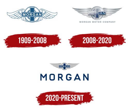
1909 – 2008
The exact year of the famous winged logo is unknown. A workshop was opened in 1904, the production of cars according to the Morgan project began in 1910, and in 1912 a trademark was registered, and the first orders appeared. Most likely, the image was born after 1910.
In the center of the emblem is a wheel from which wings extend, allowing it to fly. The image conveyed the idea of racing. Henry Morgan considered his tricycles to be sporty. At the competition, they were so superior to their 4-wheeled rivals that the organizers forced them to start a circle later than the rest of the participants. Therefore, the theme of speed is central to the logo.
Many companies use spread wings in their signage, but Morgan was one of the first.
2008 – 2020
After the death of the son of founder Peter Morgan in 2003, the era of constancy and stability ended in the company; leadership positions began to be filled by non-family members. Charles Morgan, the founder’s grandson, only took over in 2010 and was quickly removed.
The new leaders wanted to make the sign more modern, so the logo was changed. The wings were straightened, and the pattern of the wheel spokes and the central cross formed the prototype of the flag of Great Britain.
All symbol elements appear aluminum and are painted with a metallic sheen. Aluminum is the main material that the company works with. It allows you to lighten the design and increase the speed of machines.
Below the image, the inscription Morgan Motor Company is displayed in pale gray letters. The translucency of the name is like a prediction. After two years, MMC ceased to exist, and all assets were bought out by the new company Morgan Technologies, created by the owners of MMC, to cover large financial losses.
2020 – today
In 2019, most of the company’s shares were bought by the British investment fund Investindustrial. As part of developing and strengthening the brand’s position, management changes were made, and the visual identity was updated.
The new owners tried to preserve the historical image of the logo as much as possible, leaving the icon in the form of a wheel, a cross, and wings. However, it has become smaller, showing the diminishing influence of the founding family, which now has only a minority stake.
Below the image in large blue capital letters is Morgan, the name of the main brand of cars. The inscription shows that the owners will save the brand and give it a new life. The second identical word is located on the ancient image in the center of the cross, but it indicates the founder’s name.
Font and Colors
The main colors of the company are dark blue and light gray. They embody the principles of reliability and fidelity.
- Gray – lightness of machines, manual assembly, smoothness, and ease of operation. Exclusivity, a small number of cars.
- Blue – strength, strength, the embodiment of dreams. Each machine is individual, created to order.
Lettering font Geogrotesque Sharp Extended Semi Bold. The spacing between the letters and the upper case highlights each element, conveying the exclusivity and rarity of the brand’s cars.
Morgan Motor Company color codes
| Cool Black | Hex color: | #002d5e |
|---|---|---|
| RGB: | 0 45 94 | |
| CMYK: | 100 52 0 63 | |
| Pantone: | PMS 648 C |
| Dark Gray | Hex color: | #b3b3b3 |
|---|---|---|
| RGB: | 179 179 179 | |
| CMYK: | 0 0 0 30 | |
| Pantone: | PMS Cool Gray 5 C |
