


![]() Motley Crue Logo PNG
Motley Crue Logo PNG
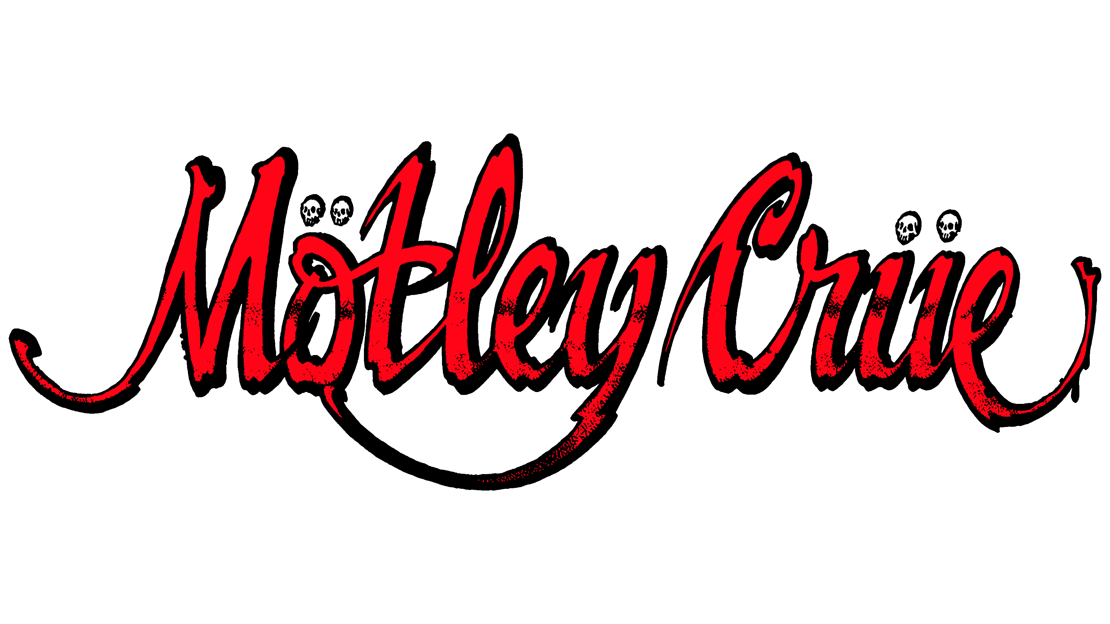
The bright protest symbolism of the Mötley Crüe logo immediately evokes a metal band. Energy and expression are visible in the lines and shades of the logo. The sign evokes a sense of disorder, disharmony, and the musicians’ attempt to dominate evil.
Mötley Crüe began in Hollywood in January 1981, when bassist Nikki Sixx left London and started rehearsing with drummer Tommy Lee. Guitarist Mick Mars joined after placing a newspaper ad, and Vince Neil completed the lineup on April 1. On April 24, the band played its first show as Mötley Crüe at the Starwood club.
The name came from a phrase Mars remembered from his earlier band, White Horse: “motley looking crew.” The spelling was changed, and Neil suggested the umlauts after seeing a Löwenbräu beer label. In November 1981, the band recorded Too Fast for Love in three days. It was released on Leathür Records, selling 20,000 copies before Elektra Records signed them and reissued the album in 1982.
Shout at the Devil followed in 1983, with “Looks That Kill” and “Too Young to Fall in Love” pushing the band onto MTV and national charts. In 1984, they toured with Ozzy Osbourne. That December, Vince Neil caused a drunk-driving crash that killed Hanoi Rocks drummer Razzle and injured two people. Neil later paid $2.5 million and served 30 days in jail.
Theatre of Pain arrived in 1985, Girls, Girls, Girls reached No. 2 on the Billboard 200 in 1987, and Nikki Sixx’s near-fatal heroin overdose later shaped “Kickstart My Heart.” Dr. Feelgood topped the chart in 1989. Vince Neil left in 1992, returned in 1996, and the band later published The Dirt in 2001. After a 2015 farewell show, Netflix’s The Dirt revived interest in 2019. Mötley Crüe reunited, toured with Def Leppard in 2022-2023, and John 5 replaced Mick Mars for live work.
Meaning and History
![]()
This band impresses with carefully planned fire shows with fiery guitars, “flaming” drum kits, and lots of pyrotechnics, including a “burning” bassist. So musicians try to fully immerse themselves in the atmosphere of thunderous flashes, reflecting the mood of their compositions, which are not only loud but also bright. The rockers’ career was interrupted in 2016, after the final concert on 12/31/15. But 2.5 years later, the team has recovered again, announcing a breakthrough in musical activity.
In 1981, when the four talents decided to unite and establish a creative fraternity, they briefly searched for a name. Rejecting Sixx’s proposed Christmas option, the guys became Mötley Crüe with Mick Mars’ light touch. He remembered that that was roughly the name of the White Horse band he played with. To add originality, the rockers slightly twisted the grammatical spelling of the words and added diacritical symbols – two dots above the vowels. It is supposed to be a tribute to the German beer Löwenbräu that they were drinking at the time. The transformed version of the inscription, presented in different styles, gradually flooded all the team’s albums, becoming not only a decoration but also a logo. There are ten of them in total.
1981 – 1983
![]()
The debut album features a large charcoal-black rectangle. It has the musical group’s name written in red. The italicized font is pulled upward. The characters are large and have sharp or right angles. Above the “O” and “U” are dots. They are exactly opposite the lines that form the letters.
1983 – 1985
![]()
The Motley Crue band’s second compilation has a lined and smoothed cover. The tall letters have rounded corners, and the dots are joined together and moved to the middle. The dark background is gone only a white neutral space remains.
1985 – 1987
![]()
During this period, the text had a Gothic design: elongated “flowing” down black characters, small dots, like eye pupils, and “screaming” letters. The scream is conveyed through the enlarged inner gaps, depicting an open mouth in horror. The “O” and the “E” stand out in this regard. “C” looks like clenched teeth, and “M” and “R” have extended spike-like legs. Sharp serrations are present almost everywhere.
1987 – 1989
![]()
Red handwritten lettering appears on the album cover. Unlike the previous versions, this version looks mystical. And all because of the black background in the form of a rectangle, resembling a coffin. Besides, it looks like the text was written with blood, so bright was the color chosen by the designers.
1989 – 1994
![]()
The theme of death and horror continued in the next logo, which adorned the 1989 music collection. The rectangle became narrower, the letters straight and outlined. But at the same time, they retained the handwritten style. White skulls and crossed bones lurk to the right and left (in the curves of “M” and “E”). The “Motley Crue” inscription is in lower case, except for the first letters.
1994 – 1997
![]()
In 1994, a cardinal change of the logo took place. On the cover of the next album, the bloody imprint of the name of the musical band appeared again. The characters are large, capitalized, and wide. The surface of the letters is blurry as if they had aged or been shabby. The text is broken into two lines, with the lower one slightly overlapping the upper one, hiding the ends of the characters. Around and inside are horizontal and dotted bars of the same color as the letters. The background is a black rectangle.
1997 – 1999
![]()
The emblem shows the same lettering but in a revised form. The designers removed the geometric figure and stretched the text in a single row. The letters are now linear but different in size and location in words – some higher, others lower. The edges of the characters are jagged, as if torn. The “C” has a thickening that resembles a crescent moon.
2000 – 2008
![]()
The cover of Motley Crue’s next album features a Japanese-style inscription. Each letter looks like a hieroglyph with a point at the bottom.
2008 – 2011
![]()
Now the compilation’s cover is decorated with characters from the Old English alphabet. The characters have thickenings, spikes, swirls, and other symbolic elements. Some of the letters (especially the “t,” “l,” and “u”) look like downward-pointing arrows, and the capital “C” is shaped like an axe blade. The white words are set against a contrasting black background, with red facial fragments and ornaments.
2012 – today
![]()
The current version of the logo features strict geometric lettering with members of Mötley Crüe behind it. Real photographs combined with drawn elements are used for the cover. The band’s name is diagonal and pointed upward. The diacritical marks above the “U” and “O” look like the musicians’ suits’ orders. The background is a wide gray rectangle with a gradient and small dark dots.
Font and Colors
The stylized name of the famous American glam rock band also adorned their albums. They used it at concerts and on tours during the marked period. Naturally, the design necessarily echoed the songs’ content and reflected their hidden meaning. But in addition to those listed, there was another variant of the logo: an inverted pentagram. Earlier, this sign was interpreted as a symbol of Christ, but then it was given an aura of Satanism. The five-pointed star is surrounded by a red ring and overlaid with a black inscription. All the letters in it are tall and thin.
Each album is a unique world with its own style, so the fonts are different. According to the musicians, in 1985 they used the Midnight Moon typeface with a gothic design, and in 1987 they used italic with an accent on graffiti. In 1989, they chose a calligraphic italic typeface; in 1994, a stencil typeface with sloppy strokes; and in 1997, a magazine typeface. The typeface on the cover of the 2000 collection was in hieroglyphics to emphasize the Asian atmosphere. In 2008, the logo lettering was in complex Old English, and in 2012, it was printed with a chrome effect.

The palette of Mötley Crüe’s musical logos is consistent with hard rock and heavy metal. It consists of rocks and features the classic black-and-red combination. In some cases, they are diluted with white. The last emblem is more varied in color, with, in addition to the traditional gamma, restrained steel shades mixed with cold blues and blues.