Motorola’s iconic logo symbolizes the relentless evolution, leadership, and ambition that defines the company as an innovator in electronics. The logo’s modernist design reflects its creativity, not only in its original artwork but also in the latest technology used in its products.
Motorola: Brand overview
| Founded: | September 25, 1928 |
| Founder: | Paul Galvin |
| Headquarters: | Chicago, Illinois, United States |
Meaning and History
Although Motorola was founded in 1928, it took a few years to get its famous name. It was founded by two brothers with a common surname Galvin and named after themselves: Galvin Manufacturing Corporation. But in 1930, one of them decided to create a new brand of car radios. He registered it as “Motorola,” combining two parts in a coined word: “motor” (a hint of a motor car) and “ola.” The last three letters are a tribute to the fashion for names with the same endings like “Crayola” or “Moviola.” Although in this case, the inspiration was the Victrola trademark, under which cars with a turntable and a horn were produced.
Due to the incredible popularity of radios, the neologism “Motorola” stuck as the company’s official name. The time after World War II proved to be extremely successful for the communications equipment manufacturer: he undertook to develop new technologies and supplied communication devices for NASA space programs. He acquired his iconic logo in the form of the letter “M.”
Before this, Motorola had other brand names: mostly inscriptions without decorative elements. But the last emblem, designed in 1955, proved to be the most important. It remained relevant until the end until the company split into two parts. Post-2011, Motorola Mobility LLC and Motorola Solutions, Inc. inherited the symbol “M” from their predecessor.
Throughout the 20th century, the Motorola logo has become a mark of quality. One day, a Japanese customer refused the semiconductors he ordered only because they had a very pale and indistinct “M” applied to them. The manufacturer had to replace the batch, offering chips with a clear logo.
As far as is known, the company once wanted to redesign and abandon the logo designed in the 1950s. This happened in the late 1990s: Motorola executives even called in a specialist for a consultation so that he could evaluate an already prepared alternative. Contrary to expectations, he dissuaded them from changing the emblem and said that cell phones seem outdated not because of the “M” symbol applied to them but because of their external clumsiness.
What is Motorola?
The American company Motorola was once a telecommunications service provider. Its activities extended to the development and sale of equipment for wireless networks. It appeared in 1928 and existed until early 2011, when it was split into two unrelated entities: Motorola Mobility LLC and Motorola Solutions, Inc.
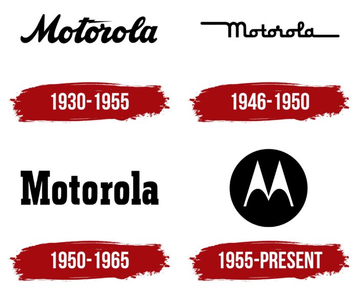
1930 – 1955
The famous Motorola name appeared in 1930; before that, it was known as the Galvin Manufacturing Corporation. A logo update accompanied the rebranding: the designers developed a wordmark using a handwriting-imitating typeface. The letters were bold but graceful. This impression was created due to a slight tilt to the right and also because of the high contrast between the thickness of the main and secondary strokes. The glyphs were interconnected; that is, the font was coherent. The horizontal line at the lowercase “t” was shaped like a lightning bolt, which hinted at the lightning speed of signal transmission using communication equipment.
1946 – 1950
In 1946, another version of the “Motorola” lettering was created. The font was still cursive but looked unnatural due to the vertically aligned letters. The connections between glyphs became horizontal, which was also atypical for a calligraphic typeface. And yet, the designers have achieved visual harmony by making the three “o” and “a” perfectly round. It turned out to be an interesting effect because vowels alternated with consonants in the name of the company. In addition, the word was balanced by two long horizontal lines: one started at the top corner of the “M” and ran to the left, and the second was a continuation of the tail of the “a” and ran to the right.
1950 – 1965
Motorola had a new lettered logo in the middle of the 20th century. It used a typeface roughly similar to Dharma Type’s Rama Slab E Bold: a bold serif with short rectangular serifs. Apparently, the designers decided to make the text compact because the protruding part of the “r” was truncated. The lower “t” curve also looked shortened.
1955 – today
In 1955, a significant event took place in the history of Motorola: Thomas Miller designed the M-shaped emblem for Motorola, which was used for the following decades. This rebranding turned out to be very useful because, in the post-war period, the communications equipment manufacturer created its first TV set and began to open factories abroad. In such circumstances, he needed a new corporate identity suitable for international markets.
The logo for Motorola was designed by African-American Thomas Miller, who, due to racism, was behind the scenes for a long time until Morton Goldsholl Associates hired him. The designer depicted two elements in the form of triangles with oval recesses at the bottom. They resembled the pointed tips of fountain pen nibs and, when combined, formed the letter “M.” At first, they were placed inside ellipses and squares, but in 1965 a permanent configuration appeared: a white stylized “M” in a black circle.
The famous Motorola symbol has two unofficial names: “Bat Wing” and “Emsignia.” It is somewhat reminiscent of the wings of a bat: perhaps with its pointed shape. The triangular vertices forming an abstract “M” represent mid-20th century modernist graphics. They also demonstrate the equipment manufacturer’s leadership and its desire for new heights.
Font and Colors
In June 1955, along with the Bat Wing logo, Motorola introduced a new corporate font – Univers Com 93 Extended Extra Black Oblique. But it is worth noting that it was not used in developing the M-shaped symbol: the emblem was formed only by a combination of geometric shapes.
Even earlier, the company had various wordmarks, including two with imitation handwriting and one consisting of bold letters with short rectangular serifs. And yet the latest version without inscriptions turned out to be the most popular. But the palette has always been stable because, for many decades, only two colors were relevant: black and white.
Motorola color codes
| Black | Hex color: | #000000 |
|---|---|---|
| RGB: | 0 0 0 | |
| CMYK: | 0 0 0 100 | |
| Pantone: | PMS Process Black C |


