Sharp bubbles of gas burn at the sight of the Mountain Dew logo. The emblem is full of freshness, sweet and bright taste. The drink invigorates and increases efficiency due to the natural additives included in the composition.
Mountain Dew: Brand overview
| Founded: | 1940 |
| Founder: | PepsiCo |
| Headquarters: | United States |
| Website: | mountaindew.com |
Meaning and History
In the 1930s, soda (sparkling water) was usually mixed with alcohol, such as whiskey. The Hartman brothers were the inventors of the new drink. They turned it into a brand and developed the original brand identity. At first, the bottles were decorated with a label with a simple country boy (Willie the Hillbilly) stylized as a cartoon image. The first sketches of the logos were created by John Brichetto in 1948, immediately after the trademark received official registration.
Carl E. Retzke of Owens-Illinois Inc suggested the name for the soft drink. The original meaning of Mountain Dew was an Irish (Scottish) slang word for moonshine in the 19th century. It was used as a joke, so the label artwork was humorous. But after PepsiCo bought the brand, it undertook a redesign, dramatically changing the accents of the visual identity mark in 1969. The new owner focused on young people who love drive, movement, and the outdoors.
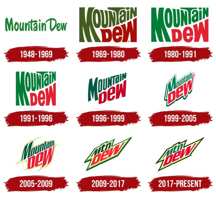
This priority remained for two decades. And since 1996, the company applied its usual strategy and started regularly redesigning, just like its flagship brand Coca Cola. The changes also involved the appearance of other flavors. One of the most significant adjustments was in 2008, as it was rebranded, and the word combination “Mountain Dew” was replaced by “Mtn Dew” on the logo.
1948 – 1969
In the first years, the cartoon lettering prevailed, corresponding to the image, since it was based on Willie the Hillbilly – a kind of country simpleton. The green letters are elongated but not straight – each one looks like it was drawn with a pencil (marker or felt-tip pen), so their edges are disproportionate. And the uppercase “D” and the lowercase “w” are reminiscent of the characters in the Disney logo.
1969 – 1980
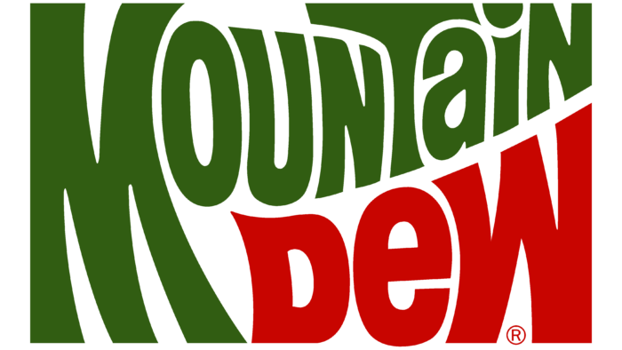
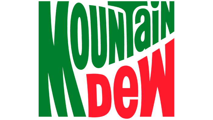
The result of this redesign was a more serious logo aimed at young people. The basis is a rectangle, filled from edge to edge with the brand’s name. Therefore, on the edges, the letters look like cropped letters. The phrase “Mountain Dew” is placed in two rows, where the capital “M” occupies both lines simultaneously. To make the lettering clearer, the designers used different colors: one part is colored green, the other – in red. At the same time, the characters are curved, elongated, and differently shaped, adapted in height to neighboring signs. They are mostly uppercase. The only exceptions are lowercase “i,” “a,” and “e.”
1980 – 1991
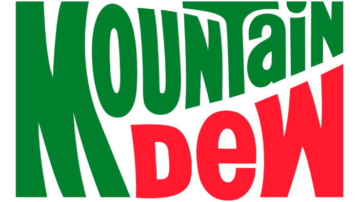
The saturated tones became muted and lighter. Neither the lettering nor the style and shape have changed – they have remained the same.
1991 – 1996
In 1991 the developers stretched the letters vertically even more, and with them the rectangle, essentially turning it into a square.
1996 – 1999
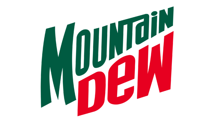
This time the designers made all the inscriptions diagonal, whereas before, the bevel had only the first word (and only at the bottom). Both lines now point upwards. The first row tapers towards the end, while the second, on the contrary, expands. This graphical technique is preserved from the previous version of the logo and slightly corrected. The “M” remains curved. The “T” cap is dropped in line with the rest of the characters and linked to the adjacent “N” and “a.”
1999 – 2005
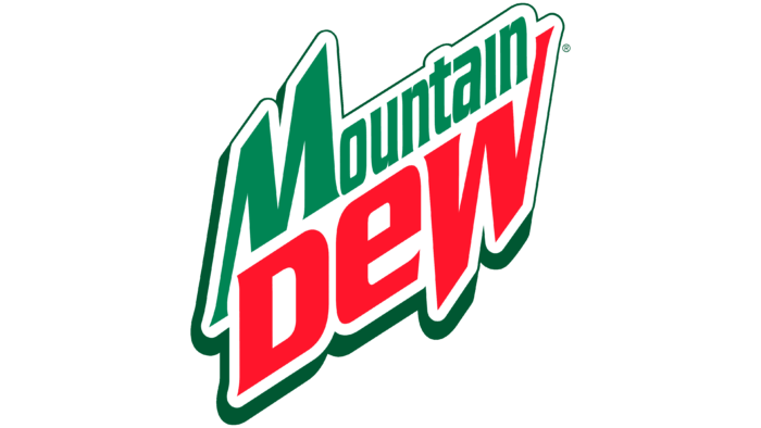
The inscription has a double border, a common white and dark green. The latter has an uneven width: at the bottom left, it is wide; at the top right, it is narrow, like a thread. The developers have now moved all the letters from the upper part of the name to the lower case. The uppercase letter remains only the “M,” which resembles an inverted “W” from the bottom row. They have the same structure, width of lines, and bottom line-height.
2005 – 2009
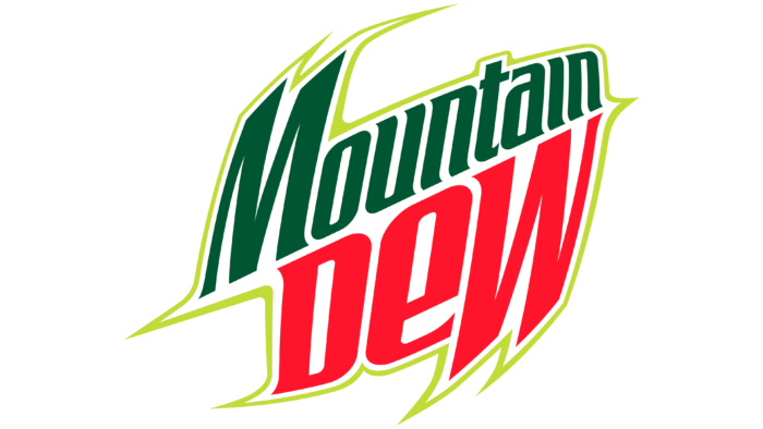
To modernize the Mountain Dew brand logo, management approved a logo with a magnifying glass effect, where the middle is large, and the edges are deformed. The pull toward rounding is evident in the sharply curved elements of the “M,” “W,” and “D”: though they look in different directions, they are smoothed out at the ends. The name now has an edging in the form of a thin yellow stripe.
2009 – 2017
After the rebranding, the emblem received a zigzag shape but arranged horizontally instead of vertically. And now there are three letters – “Mtn” and “Dew” – at the top and bottom. The lettering is bordered throughout with double light green and dark green lines.
2017 – today
The outer band is now painted black. The light green line is retained, as is the mix of lowercase and uppercase letters in both words. The color scheme has been changed to a more muted color scheme.
Mountain Dew: Interesting Facts
Mountain Dew is a citrus soda with a colorful history and a special spot in the drink market.
- The Beginning: In the 1940s, Barney and Ally Hartman, two Tennessee bottlers, created Mountain Dew. It was originally a whiskey mixer, and its name came from old slang for homemade whiskey.
- Joining PepsiCo: After changing owners a few times, PepsiCo bought Mountain Dew in 1964. This move helped it become well-known and loved across the country.
- The Taste: Mountain Dew’s original taste is like citrus lemonade. Over time, they’ve added many new flavors, catering to all kinds of taste buds.
- Code Red: In 2001, Mountain Dew brought out Code Red, a cherry variant, which was a big hit. This success led to more new flavors and special editions.
- Gaming Connection: Mountain Dew has become the favorite drink for gamers by sponsoring gaming events and releasing game-themed flavors, like “Game Fuel.”
- DEWmocracy: Through its “DEWmocracy” campaigns, Mountain Dew lets fans vote on new flavors and marketing ideas, showing how much they value consumer feedback.
- Baja Blast: First made just for Taco Bell, Baja Blast, with its tropical lime flavor, became so popular that it was sold in stores for a limited time.
- Eco-friendly Moves: PepsiCo is working on making Mountain Dew’s packaging more environmentally friendly to tackle plastic waste issues.
- Changing Logos: The Mountain Dew logo has changed many times, moving from a cartoonish look to a modern design that appeals to young people.
- Pop Culture: Mountain Dew appeared in songs, movies, and TV shows, making it a well-known brand in pop culture.
Mountain Dew keeps bringing out new products and marketing ideas, staying popular with its fans, and drawing in new ones with its adventurous flavors and vibrant marketing.
Font and Colors
Mountain Dew’s visual brand identity sign has always had a dual structure: the top of the name is green, the bottom is red. Only their shades varied. The exception is the debut logo, where the word combination was monochromatic. The main feature of the logo was the slanted lettering, with the right side of the words pointing upwards. It is also known that for the logo on the branded line of tin cans, the parent company announced a contest in which 35 independent skateboard stores participated. They submitted artwork by various tattoo artists and artisans. According to reports, the winner received a cash prize, but their result has not yet been printed.
The free Air Millhouse Italic typeface has been chosen for the textual identity. The designers have personalized it a bit, changing the shape and size of the letters. The color palette is more stable: it always stays green and red. Their shades varied – from scarlet to crimson and from lettuce to emerald.
Mountain Dew color codes
| Imperial Red | Hex color: | #ed1a37 |
|---|---|---|
| RGB: | 237 26 55 | |
| CMYK: | 0 89 77 7 | |
| Pantone: | PMS 185 C |
| La Salle Green | Hex color: | #07703c |
|---|---|---|
| RGB: | 7 112 60 | |
| CMYK: | 94 0 46 56 | |
| Pantone: | PMS 7726 C |
| Yellow Green | Hex color: | #94c93d |
|---|---|---|
| RGB: | 148 201 61 | |
| CMYK: | 26 0 70 21 | |
| Pantone: | PMS 368 C |
| Black | Hex color: | #000000 |
|---|---|---|
| RGB: | 0 0 0 | |
| CMYK: | 0 0 0 100 | |
| Pantone: | PMS Process Black C |
