The iconic Movistar logo appeared in 2004 after a name change. The latest version, adapted to modern requirements, became a bright, simple, and understandable emotional symbol of modernity, executed in a minimalist style.
Movistar: Brand overview
| Founded: | 25 July 1995 |
| Founder: | Telefónica |
| Headquarters: | Spain |
| Website: | movistar.com |
Meaning and History
The prototype of the famous graphic sign Movistar appeared in 2004. Before that, simple emblems were used that didn’t leave a noticeable mark on the brand’s history.
What is Movistar?
Movistar is a Spanish telecommunications operator owned by Telefonica. It provides landline, broadband, and mobile services in Spain and Latin American countries. The company has been around since 1995 and adopted its current name in 2005.
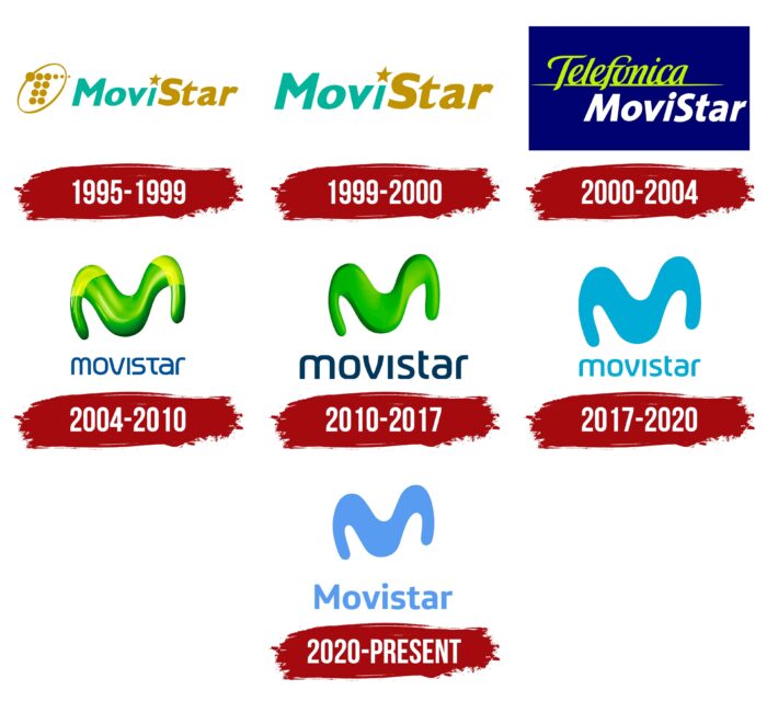
1995 – 1999
Initially, the telecommunications company was called “MoviStar”. This spelling with capital “M” and “S” was reflected in its debut logo. Designers interestingly played with the two parts of the word, making the first half (Movi) blue-green and the second (Star) yellow-orange. To add dynamism to the image, instead of a dot over the “i,” they used a small five-pointed star. The font of the inscription is italic without serifs.
To the left, the developers placed the letter “T,” consisting of 12 dots of different diameters. It’s outlined by a slanted oval line. This is a tribute to the Spanish company Telefonica, which owns Movistar.
1999 – 2000
In 1998, designers simplified the logo by removing the stylized letter “T.” This decision allowed for increasing the word “MoviStar” and emphasizing it. Other details remained unchanged.
2000 – 2004
At the turn of the millennium, the brand started being called “Telefonica MoviStar”. This was reflected in its logo, which is completely different from the previous two versions. The inscription “Telefonica” is located at the top and underscored by an elegant yellow-green line. The font mimics handwritten text. Below the line is the word “MoviStar” in white—the brand star over the letter “i” has given way to a regular dot. The overall background is a dark blue rectangle.
2004 – 2010
In 2004, the company was renamed Movistar. Immediately after the name change, it underwent a major redesign. That’s when the recognizable figure in the form of the letter “M” appeared, which became a cult element of the brand’s visual identity. It looks like an uneven wave of yellow-green color. Due to shadows and highlights creating a 3D effect, the figure seems plastic. The font of the inscription also changed. The characters in the word “Movistar” are round and lowercase, although “t” looks like a capital letter.
2010 – 2017
In 2010, the creators simplified the design but retained the previous concept. Bright spots disappeared, along with some dark ones. Now, the graphic sign in the form of the letter “M” doesn’t seem as “slippery” as before. Despite this, the volume remained, which was what the artists aimed for.
2017 – 2020
In 2017, the international branding agency Lambie-Nairn developed a new visual style. Experts adapted the logo to the digital world to position Movistar as a bright and modern company. They redesigned the letter “M” and made it flat, removing the signature 3D effect. They also changed the color palette, completely abandoning the gradient green.
2020 – today
In June 2020, the company introduced a new logo. As before, it has a vertical configuration. At the top is a stylized letter “M” in the form of a wave. Designers retained its plasticity, conveyed in serrations, bends, and curvatures. Below is the word “Movistar”. The developers capitalized the first letter “M” and used the Telefonica Headline font for the inscription. This bold grotesque belongs to the Spanish company Telefonica, which owns the Movistar brand and all its assets.
The font has several similar analogs: Core Sans NR 65 Bold from S-Core or Yorkten Demi from Insigne Design. But in the logo, the letter “t” has a small diagonal cut at the top. The color also changed: after the rebranding, it became darker and more saturated.
Movistar: Interesting Facts
Movistar is a big company that helps people talk to each other using phones and the internet. It started in Spain in 1995 and now works in many countries in Latin America, too.
- Starting Out: Movistar began in Spain, focusing on mobile phone services. It’s grown a lot since then, offering more services and reaching more places.
- Growing in Latin America: Movistar is not just in Spain; it’s also a big deal in countries like Argentina, Chile, Colombia, Mexico, Peru, and Venezuela. It’s one of the biggest names in phone services for Spanish-speaking people.
- Changing Its Look: In 2010, Movistar changed its logo and name to align everything under the same brand. This simplified things and helped people recognize Movistar more easily.
- New Tech: Movistar is always trying out new technology. It’s making internet connections faster with fiber optics and improving phone service with 4G, LTE, and 5G.
- TV Shows and Movies: Movistar also has a TV service called Movistar+, where you can watch movies, shows, sports, and other cool stuff.
- Loves Sports: Movistar likes sports. It sponsors cycling teams and soccer teams, and its cycling team is one of the best in the world.
- Helping the Community: Movistar doesn’t just focus on making money. It also helps with education and ensures more people can use the internet and enjoy local culture.
- Inventing New Things: Movistar creates new tech to improve its services, such as making cities smarter and finding new ways to use the internet to connect things.
- Taking Care of Customers: Movistar is working hard to ensure customers have a great experience. They’re using the internet to make it easier for people to get help and find what they need.
Movistar started as a small company in Spain and has become a big name worldwide for phone and internet services. They’re always trying to be better and help the community, too.
Font and Colors
The Movistar brand mark is the capital letter “M,” representing the name of the telecommunications company. Essentially, it’s a long, uneven strip that widens at the bends. The geometric figure has no angles, making it look plastic and dynamic. Since 2017, “M” has become two-dimensional: Lambie-Nairn simplified and removed the 3D effect to make the design more understandable, in line with the fashionable minimalist style.
The emblem is now light blue. According to creative director Tim Simmons, the chosen shade expresses more emotion. The shape of the figure in the form of the letter “M” remained the same. The word Movistar hasn’t changed either. But in this case, it plays a secondary role, as the main emphasis is on the “M.”
Movistar color codes
| Bright blue | Hex color: | #589cf1 |
|---|---|---|
| RGB: | 88 156 241 | |
| CMYK: | 63 35 0 5 | |
| Pantone: | PMS 279 C |
