MTS: Brand overview
The history of MTS (Mobile TeleSystems) began in 1993 when a joint venture called Mobile TeleSystems CJSC was established by MGTS (Moscow City Telephone Network), Moscow Cellular Communications JSC, Siemens (a German company), and several other Russian businesses. At this time, mobile communications were still in their early stages in Russia, and MTS quickly became a leader in this field.
In 1994, the company received authorization to provide GSM cellular services in Moscow and the surrounding areas. GSM was a more advanced and promising technology than the analog standards used at the time, making this a key moment in the company’s development.
The official launch of the GSM network took place on July 3, 1995, beginning commercial operations in the Moscow area. Initially, the network was limited to central Moscow, but it rapidly expanded.
In 1996, the provider began operations in Tver and Kostroma, marking the start of its regional expansion, which continued in the following years.
A pivotal moment in the company’s corporate history occurred in 1997 when AFK Sistema acquired a majority stake, bringing it under new ownership. This accelerated growth and led to strategic changes.
In 2000, the firm held an initial public offering (IPO) on the New York Stock Exchange (NYSE), becoming the first Russian company to trade its shares on the NYSE. This boosted its international reputation and attracted additional investment.
In 2001, expansion into the CIS countries began, with entry into the Belarusian market through a joint venture with a local operator. Over the next few years, services were launched in Ukraine, Uzbekistan, and other former Soviet states.
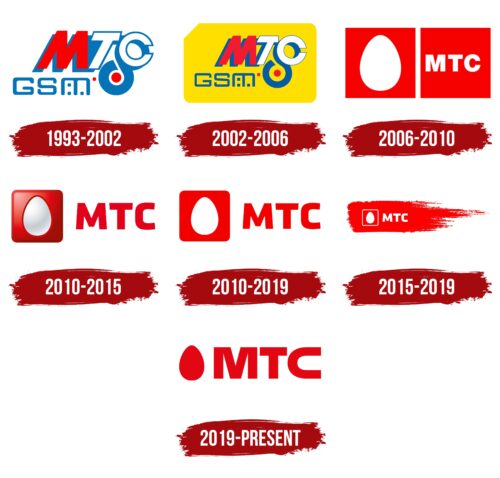
In 2003, the now-iconic logo—a white egg on a red background—was introduced, marking a rebranding that helped strengthen the company’s market presence and create a recognizable image.
In 2005, the company launched Russia’s first commercial 3G network, becoming a leader in mobile internet services and offering new options to customers.
In 2006, the acquisition of Comstar-OTS, a major Russian internet provider, expanded its reach into the fixed-line market and increased service offerings.
Diversification continued in 2008 with acquiring a majority stake in Moscow City Telephone Network (MGTS), strengthening its position in the fixed-line industry.
2010, the company began expanding its retail network by opening single-brand stores. This increased sales of devices and accessories while enhancing customer service.
In 2012, the firm launched Russia’s first commercial LTE (4G) network in Moscow, further establishing itself as a technology leader by providing high-speed mobile internet.
2014, the company launched MTS Bank, marking a major step in expanding into financial services and creating a broader service ecosystem beyond telecommunications.
In 2016, the provider introduced its own OTT (Over-The-Top) service to offer TV and video content, reflecting the aim to diversify in an evolving industry.
In 2018, a digital transformation plan was introduced to develop new digital products and services. The company began investing heavily in artificial intelligence, big data, cloud computing, and the Internet of Things.
In 2019, the firm rolled out the prototype 5G network in Moscow, continuing efforts to remain at the forefront of new communication standards.
In 2020, the launch of its streaming service, KION, and the expansion of MTS Bank’s capabilities further developed the company’s digital service ecosystem.
In 2021, significant strides were made in big data analytics, cloud computing, and the Internet of Things.
In 2022, the company continued expanding its 5G network, developing new digital products, and increasing its fintech and e-commerce presence.
By 2023, the company had solidified its position as Russia’s leading IT and telecommunications firm, offering a wide range of digital services. The focus remained on growing its ecosystem, spanning media, financial services, telecommunications, and IT.
The company has evolved from a small mobile operator to a key player in Russia’s digital transformation. Its success has been driven by continuous innovation, adaptability to market changes, and a well-executed diversification strategy.
Meaning and History
1993 – 2002
2002 – 2006
2006 – 2010
2010 – 2015
2010 – 2019
2015 – 2019
2019 – 2023
The MTS logo has a simple and powerful design. The large red letters make it recognizable and clear, emphasizing the brand’s strength and stability. The bright red color symbolizes energy, dynamism, and a drive for development. This color is associated with vitality and activity, and in the context of Russia, it may be associated with the historical significance of red, which may be linked to change and revolution ().
One of the most memorable elements of the logo is the drop-shaped symbol, which might resemble an egg. This symbol represents a beginning, new life, and growth, aligning well with continuous development and moving forward. The drop adds softness to the emblem, making it more approachable and balancing the boldness of the large letters. In this context, the company aims to show that despite its strength and solidity, the brand is open and customer-focused.
The font is strict and solid, highlighting the company’s serious approach to its work. The thick, even lines symbolize stability and reliability, which is crucial for a telecommunications company. Every emblem element creates an impression of protection and confidence, which is important in the competitive mobile communications market.
With the logo update, the company emphasizes its readiness to adapt to new conditions, leaving behind complex and ornate elements in favor of a more modern, concise, and meaningful design.
2023 – today
The new MTS logo is much simpler and more minimalist than previous versions. The familiar egg symbol, which many associated with new opportunities and beginnings, has disappeared. Now, the logo is much more straightforward, with all the focus on the three letters “M,” “T,” and “S,” placed inside a red square.
The red color remains unchanged, which makes sense, as it has long been a signature color associated with the brand. In this context, red symbolizes energy, activity, and strength. By retaining this bold color, the brand asserts its confidence and stands out among other operators.
The white letters in the new emblem are presented in a simple, clean font without any decorative elements. This font emphasizes simplicity and transparency. It’s all about the essentials—just the company name, with no unnecessary details. This choice suggests that the company is focusing on clarity and directness. The font is lighter and more refined, reflecting the brand’s updated approach—simpler, more accessible, and clearer.
The changes in the emblem signify the company’s transition to a new level. While the egg once symbolized the birth of something new, the brand no longer needs such symbols. The company has grown and matured, and now its visual identity is a concise and confident image that highlights only the most important thing—the name.