


![]()
Muse Group, an international company supporting musicians, aims to reintroduce itself to the world, this time more boldly and from an unexpected perspective. Instead of the old, slightly mystical, slightly eerie muse, the new symbol appears fresh and abstract. It avoids explicit references to antiquity, yet maintains a clear connection to music. Fragments of musical notation merge into the letter “M,” creating a sense of visual rhythm and harmony. Although some may interpret it as an “N,” the graphic remains bright and memorable.
The COLLINS team didn’t play it safe; instead, they experimented. Rather than producing a conventional musical logo, they created imagery that requires thoughtful attention, evoking associations with musical staves and melodic dynamics. The wordmark supports the symbol, featuring typography that is compact, friendly, and easily recognizable, though less dramatic than its predecessor.
![]()
The custom typeface developed in collaboration with Contrast Foundry is especially noteworthy. The font family starts simply, with an accessible sans-serif, yet gradually evolves, mirroring musical structures from a basic melody to a full symphonic composition. In the “Symphony” and “Riff” styles, the typeface becomes particularly expressive and bold, highlighting the company’s creative spirit. It follows the logic of a musical piece, transitioning from a simple foundation to complex improvisation.
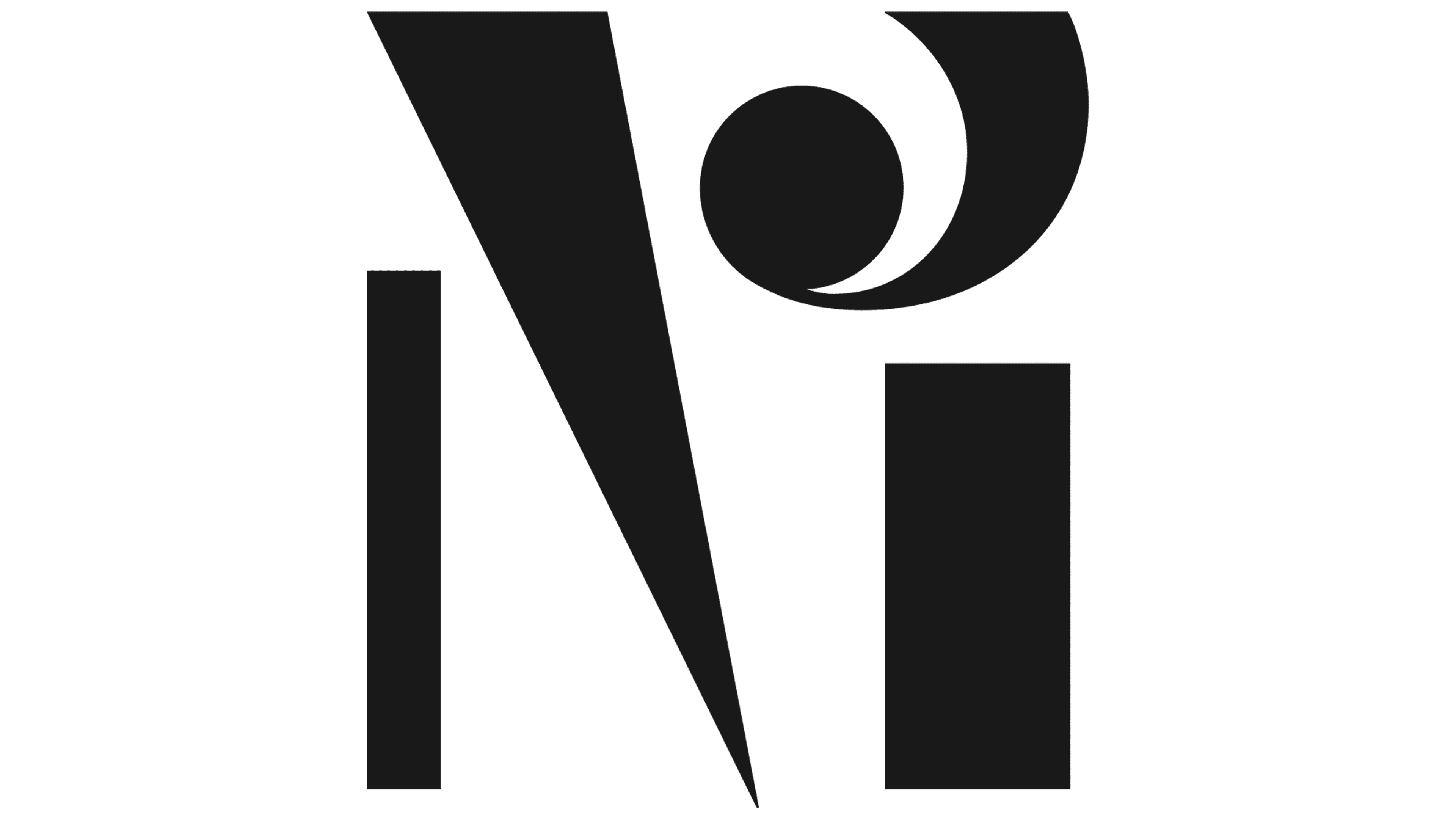
The sub-brand system is logical and clear. Each product has received its symbolic letter, continuing the musical theme. Particularly striking is the letter “G” for Ultimate Guitar, displaying a provocative, rock-and-roll character complete with subtle hints of horns and a tail. The remaining letters neatly maintain the musical motif, with some being more expressive and others slightly more conservative.
Muse Group’s visual system has become engaging and flexible. Its identity effectively captures the musical essence of the company, and the expressive typography sets the appropriate rhythm. This bold, vibrant update helps Muse Group appear not as a typical music brand but as an inspiring creative space.
![]()