


![]()
Music Week Poland has unveiled a new logo and visual identity created by TOFU Studio, setting the stage for its first-ever event in Warsaw, scheduled for June 26–29, 2025. Organized by Music Export Poland, the event aims to be a vibrant space for musicians and industry professionals to connect, collaborate, and spotlight talent with global potential. The updated visual identity reflects the event’s focus on artistic growth, emphasizing connection, diversity, and the ever-evolving nature of music.
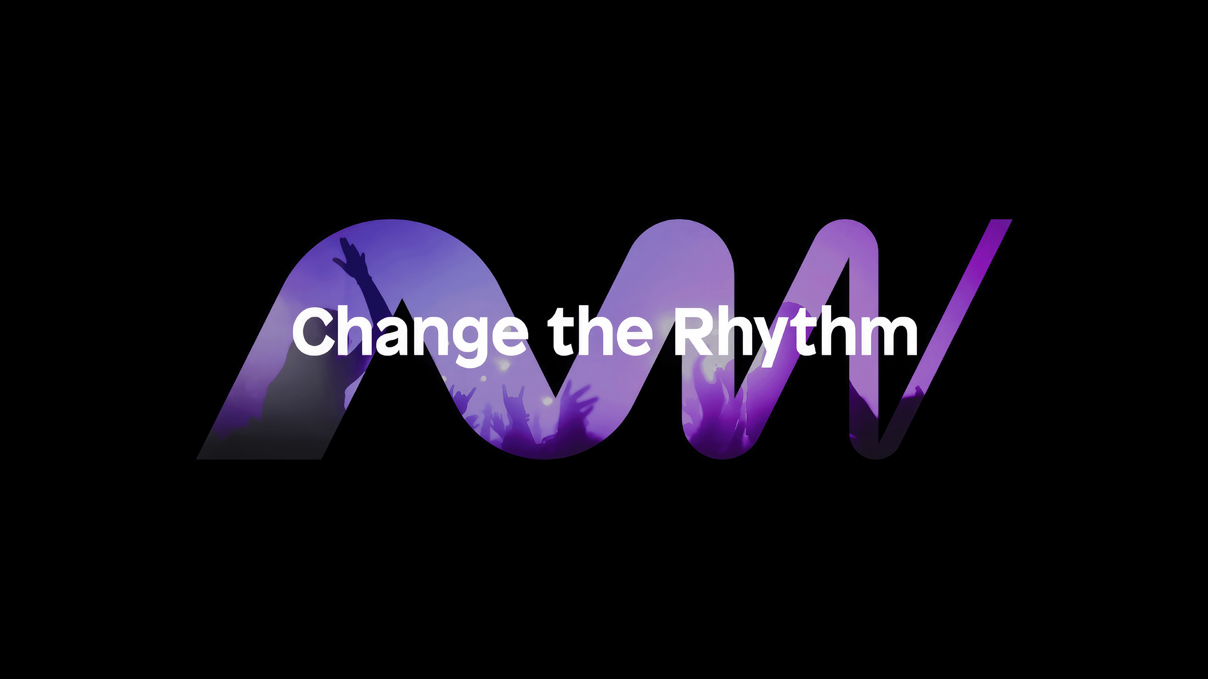
The new logo draws inspiration from the idea of networks and hubs, symbolizing how ideas, talents, and opportunities come together. At the heart of the design is a monogram that cleverly merges the initials “M” and “W” (for Music Week) into a shape that resembles a soundwave. Dual imagery captures the essence of the event—celebrating the universal language of music through sound while highlighting the importance of collaboration and growth.

The monogram itself has a flowing, wave-like design. Its lines start bold and gradually taper, mimicking the rise and fall of sound frequencies. The contrast between smooth curves and sharp angles adds a sense of rhythm and movement, reflecting the dynamic pulse of the music industry. The varying line thicknesses subtly guide the eye from the “M” to the “W,” enhancing readability without sacrificing the logo’s visual appeal.
Underneath the monogram, the event’s name, “Music Week Poland,” appears in a clean, sans-serif font. The typography is simple and modern, with evenly spaced letters that offer clarity and professionalism. The straightforward text complements the monogram’s more fluid, expressive design, creating a balanced, cohesive identity.
The color palette is intentionally minimalist, sticking to a striking black-and-white contrast. The white monogram and text pop against the solid black background, giving the logo a bold, timeless feel. The monochrome look works well across different platforms and reflects music’s universal, borderless nature.
What’s interesting is how flexible the monogram is. Beyond its role as a logo, it functions as a versatile design element—it can be used as a background pattern, a frame, or an abstract motif on promotional materials. Adaptability helps keep the identity fresh and dynamic, ready to evolve with future festival editions.
One thing to note is that while the identity feels modern and globally focused, it doesn’t include any specific visual elements that tie it directly to Poland. This might limit its local cultural connection, but it does give the brand a broader international appeal.
Even with its simple design, the new identity captures the festival’s spirit—a space where diverse musical experiences meet industry know-how. Combining the fluid monogram and structured typography reflects the event’s core values: artistic creativity and professional growth.