The My Chemical Romance logo represents a group closely examining themes of life and death. It points to artists fearlessly peering behind the veil of reality. The band’s emblems arouse interest and the desire to understand what’s happening.
My Chemical Romance: Brand overview
| Founded: | 2001 – 2013, 2019 – present |
| Founder: | Gerard Way, Ray Toro, Mikey Way, Frank Iero |
| Headquarters: | Newark, New Jersey, U.S. |
| Website: | mychemicalromance.com |
Meaning and History
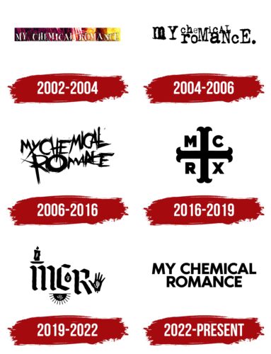
The band’s emblems changed with each new album. What unified the signs were a dark mood, tangled thoughts, and a theme of the afterlife slipping through the musicians’ artistry. In rebranding, one can trace a gradual maturation process, from early childhood through teenage rebellion to a mature and measured identity.
What is My Chemical Romance?
Musicians who virtually created the anthem of the emo movement – “I’m Not Okay” – and an album imbued with the theme of death, “The Black Parade,” received two platinum certifications. Each group album is like a separate story with chapters-songs, yet all compositions revolve around the transition to the afterlife. The group is considered a significant performer of the 2000s.
2002 – 2004
The first emblem – white uppercase irregular letters with the group’s name. A multi-level inscription embodied the sounds of the guitar and the sharp rhythm of rock and hinted at the disordered life of the young artists. One of the brothers drank and used drugs; the second dropped out of college and drank before concerts.
The band’s very name had a certain hint at illegal substances, as it came at the suggestion of Mikey Way, inspired by the book “Ecstasy: Three Tales of Chemical Romance.”
The white color of the letters symbolizes the beginning of the journey. The first steps in collaborative creativity. The sign was noticed on the performer’s debut album, “I Brought You My Bullets, You Brought Me Your Love.”
The light tones and irregular inscription also embodied turbulent love relationships and the dangerous disorderly life of the album’s characters, modeled after Bonnie and Clyde.
2004 – 2006
The album “Three Cheers for Sweet Revenge” is considered a continuation of the first story, where the murderer of the couple from the first album goes through purgatory. The album’s logo is done in typewriter font. Meanwhile, the letters have different sizes and are chaotically overlaid on each other, as if demonstrating the confusion in the head of a dying person. Images step forward, then decrease. Events intertwine and swirl. Black color emphasizes the theme of death and the alliance with Satan, which the collection’s hero makes.
2006 – 2016
In 2013, the group ceased to exist and only reassembled in 2019. However, the logo, first placed on the third album, “The Black Parade,” continued to be used even after the disbandment.
A chaotic inscription, as if made with an unsteady hand – the gloomiest of the band’s emblems. The content of the album – the quintessence of the emo movement. After the release of the collection, the group was accused of cultivating suicide. The black, frightening lines of the inscription reflected the theme of death, played out in the album.
Interestingly, the name “The Black Parade” itself became the pseudonym of the band under which they played for some time.
2016 – 2019
In 2016, the musicians, who no longer played together but continued solo careers, delighted fans with a disc of unpublished works for “The Black Parade.” In this way, the artists marked the 10th anniversary of the successful album.
They developed a new logo for the collection consisting of a cross with bifurcated ends. Between the elements of the figure on four fields were placed the first letters of the group’s name MCR and the Latin number 10.
The image is a variation of the heraldic cross Moline. The name is from ancient French and means mill. The appearance of the cross is associated with the Italian saint St. Benedict, so the Order of St. Benedict uses the symbol. The Way brothers, who were of the group’s origin, are Italians on their mother’s side and were raised as Catholics. Hence the religious theme in the emblem.
The overall appearance of the sign resembles the image on the Saint Benedict Medal. According to legend, the composition protects against evil, curses, and vice, opens doors, and paves the way. Such an amulet is necessary for the group, which has ceased joint activity due to disagreements and is going through a difficult period.
Like the four parts of the canvas, the four ends of the cross hint that the album was rewritten four times.
2019 – 2022
A symbol full of mysterious signs appeared at the reunion concert in 2019. The inscription is Gothic and consists of the group’s abbreviation. Meanwhile, the letter R is placed slightly lower. On the emblem, there are three symbols:
- Above the M, a candle on a saucer.
- Between MC and R, a black drop with a white image of a hand raised.
- After the inscription, a palm, inside is a white image of a palm.
- Below the emblem, a stripe from under which peeks half of a black sun with a white palm on it.
The symbols of the emblem are largely associated with Halloween. The concert happened on Halloween, and the candle symbol hints at the nocturnal holiday—the fire as if showing the way. The band is ready to start anew and invites us to spend time together. The symbols of the white palms – prototypes of spirits touching the world on Halloween night. The embodiment of souls inside mortal bodies.
2022 – today
Black capital letters became the new symbol of the matured, united group. Perhaps, this is the first calm, even, and straight logo in the history of the collective. The symbol represents new thoughts, stability, a transition to serious adult life, and creativity.
Font and Colors
The color of the inscriptions is black, corresponding to the emo movement, the ideas of which are echoed by the musicians’ songs. The shade speaks of darkness, death, and Satan. It indicates a color of depression and addictions, with which the band members often struggled.
The font of the inscription, TT Wellingtons ExtraBold, is distinguished by stable, even, bold glyphs. The choice promises stability and coordinated joint work of musicians in the future.
My Chemical Romance color codes
| Black | Hex color: | #000000 |
|---|---|---|
| RGB: | 0 0 0 | |
| CMYK: | 0 0 0 100 | |
| Pantone: | PMS Process Black C |

