


 N64 (Nintendo 64) Logo PNG
Alluring and eye-catching, just like the console it represents, this is the key characteristic of the emblem of the famous video game console. Colorfulness adds personality, so the N64 (Nintendo 64) logo is widely known in gaming. Moreover, three-dimensional letters are readable from any angle, including from the left or right, which is characteristic of a comfortable console.
Nintendo 64 began in August 1993, when Nintendo and Silicon Graphics announced Project Reality at a press conference in San Francisco. SGI, known for high-end computer graphics used in Hollywood, worked with Nintendo on a home console intended to bring arcade-level 3D graphics to living rooms for under $250.
The project was later called Nintendo Ultra 64 before receiving the final name Nintendo 64. The hardware was mostly ready by mid-1995, yet the launch was delayed to allow key games to be completed. The console went on sale in Japan on 23 June 1996 and in North America on 29 September 1996 at $199.99. On its first day in North America, 300,000 units were sold.
Nintendo kept cartridges at a time when Sony PlayStation and other competitors were moving to discs. Cartridges loaded quickly and helped limit piracy, yet they cost more to manufacture and held far less data. PlayStation discs could store up to 700 MB, while N64 cartridges reached about 64 MB. Many third-party studios moved to Sony, including Final Fantasy, which shifted away from Nintendo platforms.
Nintendo’s own titles shaped the console’s reputation. Super Mario 64 set new standards for 3D platform games, The Legend of Zelda: Ocarina of Time arrived in 1998, and Rare’s GoldenEye 007 helped define console multiplayer shooters. Time named the Nintendo 64 “Machine of the Year” in 1996. Production ended in 2002-2003, with about 33 million units sold worldwide, before GameCube replaced it. It remained the last major cartridge-based home console until the Nintendo Switch.
Meaning and History
The Nintendo 64 got its name from the 64-bit processor built into it. The first word is translated from Japanese as “free hanafuda temple” because Nintendo sold nothing more than hanafuda cards in the century before last. Later, video games and consoles were added to its assortment. The N64 is a fifth-generation game console produced from 1996 to 2002. It is considered the successor to the 16-bit Super Nintendo Entertainment System.
Interestingly, the Nintendo 64 began development in 1993. At that time, the name of this model was not yet officially disclosed – it was known only as a kind of Project Reality, on which the Nintendo Integrated Research department worked with the American software manufacturer Silicon Graphics, Inc. The console’s debut was delayed because everyone was waiting for Super Mario 64 to finish.
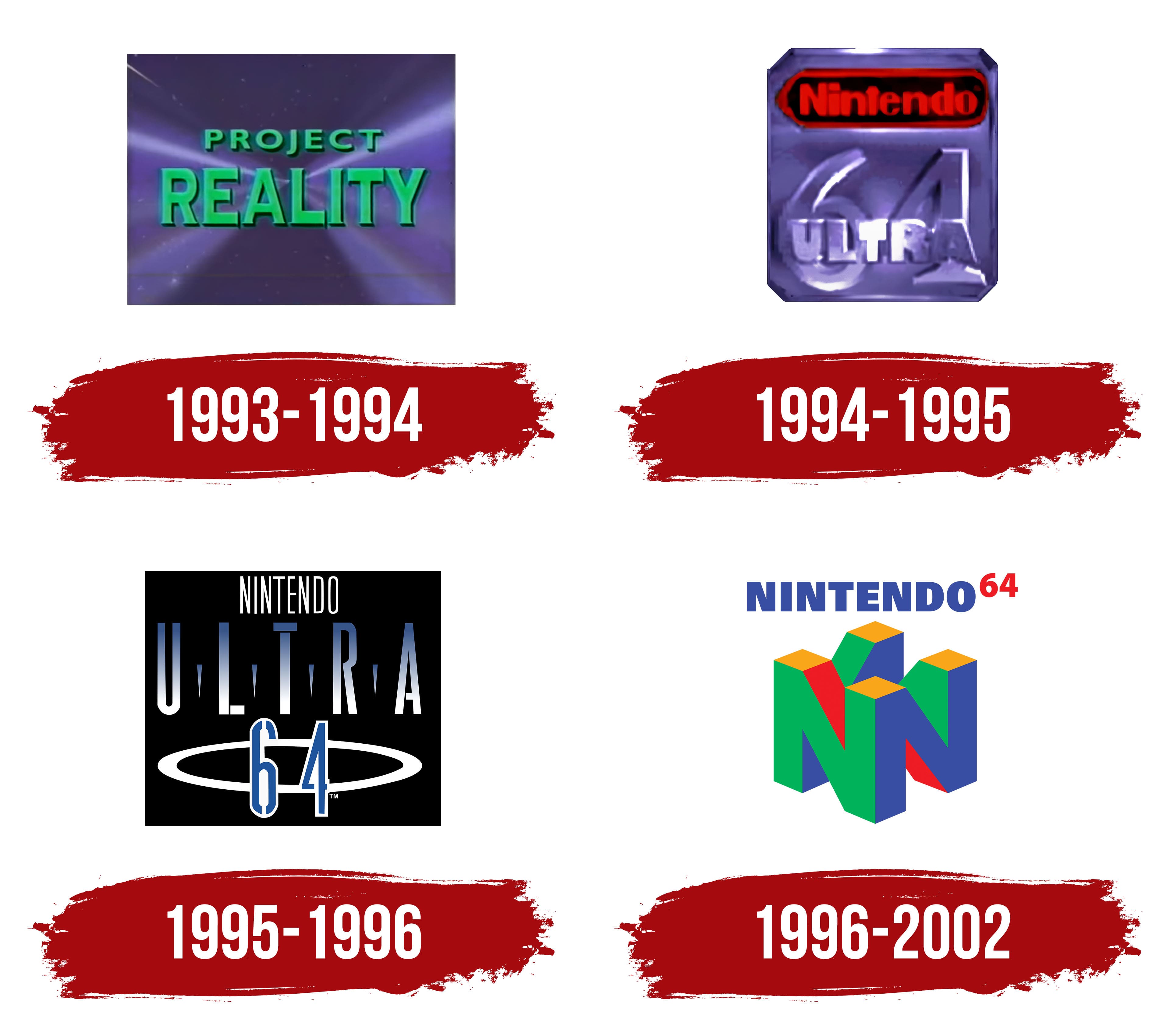
The final version of the N64 logo appeared simultaneously in 1996. Before that, the issue of visual identification was unresolved for two reasons. Firstly, the developers had been choosing a name for the game console for a long time: for example, in Japan, they wanted to release it under the Ultra Famicom brand, and abroad, as Nintendo Ultra 64. However, it turned out that the Ultra Games trademark already belongs to another company; any reference to it may be considered a copyright violation. Secondly, the emblem introduced at the 1995 Nintendo 64 announcement was “raw,” so it was redesigned over the next few months.
What is N64 (Nintendo 64)?
N64 is the short name for the Nintendo 64 game console. This device was created in 1996, so it belongs to the fifth-generation era. The console’s release ended in 2002, when its successor, the GameCube, appeared. The N64 has become one of the most popular consoles in six years thanks to video games such as Super Mario 64, Banjo-Kazooie, and GoldenEye 007.
1993 – 1994
Nintendo Integrated Research and Silicon Graphics, Inc. began working together on the mysterious Project Reality in 1993. It became the fundamental basis for N64, but no one knew about it: the public received only limited information to keep the intrigue. The project’s logo was unveiled at the 1993 International Consumer Electronics Show. It contained the code name inside a blue rectangle with a space theme. The designers slightly reduced the first word and enlarged the second, splitting them into two lines and centering them.
The letters were green, with thin, dark outlines. “PROJECT” used a bold geometric sans-serif, while “REALITY” used an antique with thin, pointed serifs and thicker horizontal strokes for glyphs such as “L” and “T.” In addition to cosmic expanses, long rays emerging from the middle of the rectangle were depicted in the background. They illuminated the inscription from different sides, like spotlights.
1994 – 1995
Working under conditions of maximum secrecy, the Project Reality team decided in 1994 to lift the veil. It announced that the game console would be officially called the Ultra 64 (outside Japan). Under this brand, two games were even released: the arcade racing game Cruis’n USA and the fighting game Killer Instinct. They had a new logo in a vertical rectangle with cut-off edges. That is, the geometric figure had eight corners in total, but in shape, it did not resemble a classic octagon. This part of the emblem was purple. It served as the basis for Nintendo’s branding, which featured the company’s name in red inside an elongated oval with the same red border. The background behind the word was black.
In the lower half of the logo, the number “64” appeared. The word “ULTRA” was written across it. Both the letters and the numbers seemed engraved or stamped because of their color: they were the same purple as the base, yet they stood out only because of unevenly lightened and darkened outlines.
1995 – 1996
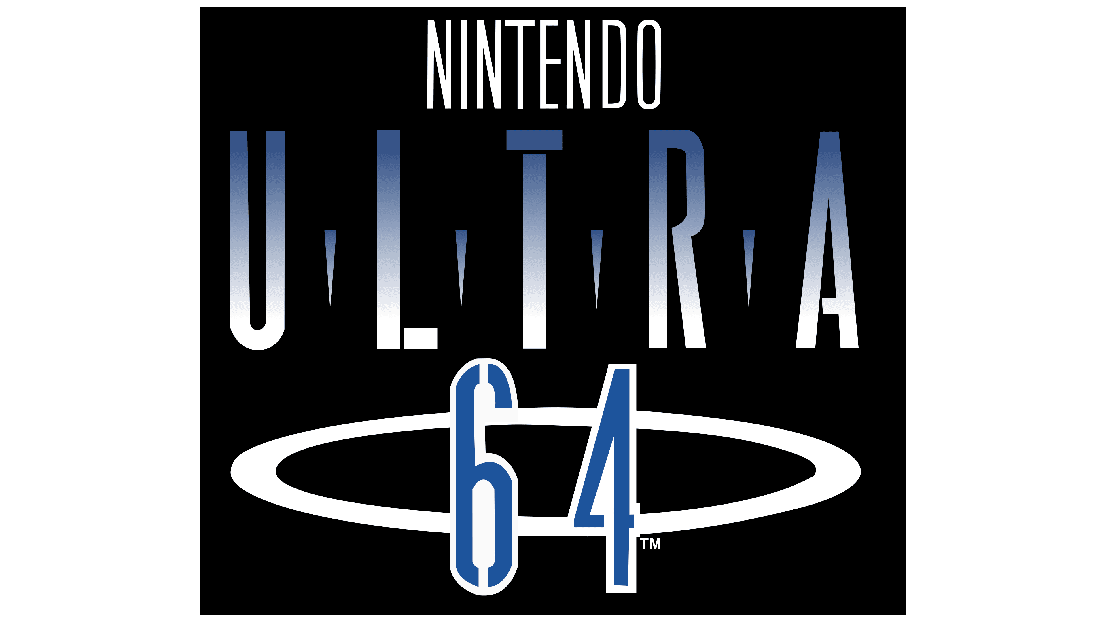
Shortly before the Nintendo 64 (N64 )’s official debut, it received a new decal. That phrase took center stage since it was still planned to be called the Nintendo Ultra 64. The first word was written at the top, in white, vertically elongated letters with very thin lines. The second part of the inscription was in the middle line. The designers used a gradient, making the glyphs half blue and half white. Between the “U,” “L,” “T,” “R,” and “A” were depicted long, downward-pointing triangular spikes.
The third line contained the blue number “64”. The interior of each digit and its outline were white. The background was the same white oval ring, similar in shape to a halo. All elements were enclosed in a black rectangle. This logo first appeared in public during the Electronic Entertainment Expo 1995.
1996 – 2002
In mid-1996, the final version of the N64 console (Nintendo 64) and its graphic symbol, a 3D figure of several stacked “N” letters, were presented at the largest video game industry exhibition, E3 1996. To make it clear that this object is three-dimensional, the designers depicted it at a slight inclination and turned its edges forward. So you can see the junction of two “N” in front and the tops of two more similar letters behind. In this case, the sides of all four “N” are painted in different colors: green, blue, red, and yellow.
Above the intricate geometric design is the dark blue “NINTENDO” lettering. A registered trademark sign mimicking a dot immediately after the “O” in the lower corner. Above it hangs the red number “64”. It has superscript formatting, which makes it look like an exponent in mathematics.
Font and Colors
The cube figure composed of four letters “N” remains the main symbol of the N64 (Nintendo 64), even though the game console was released in 1996 and has not been released since 2002. There are rumors that the three-dimensional structure has 64 sides and the same number of vertices, but this is just a myth. It was refuted by users who calculated the actual number and found that the 3D model has 24 sides and 48 vertices; there is no hidden reference to the brand name here.
Univers Extra Black is the only font used in the logo of the Japanese N64 console. This is a bold sans-serif designed by Adrian Frutiger. However, the color scheme is much richer, containing green (#319B44), blue (#0047B3), red (#DB3236), and yellow (#FFFF00).