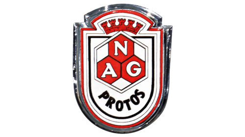
The NAG logo is steel, strong, and noble. The emblem reflects hard work. As bees collect honey, the company works diligently to develop new modern cars. The emblem emphasizes perfect assembly, maximum protection, and durability of the vehicles.
NAG: Brand overview
In the early 20th century, Berlin, Germany, saw the establishment of NAG (Neue Automobil-Gesellschaft) in 1901. Emil Rathenau took the initiative to diversify his electrical enterprise, AEG, by branching into the automobile industry. By 1902, Rathenau’s decision to assimilate coachbuilder Kühlstein into AEG paved the way for NAG’s transformation under the watchful eyes of engineer Joseph Vollmer, giving it a distinct identity in auto manufacturing.
The developing years of NAG showcased the two-cylinder Typ A and the four-cylinder Typ B, both introduced in 1902. These initial offerings echoed the design sentiments of contemporary Mercedes vehicles. A significant moment for the brand occurred in 1907 when they rolled out the enhanced Typ B2, powered by a robust 7.9-liter engine. Empress Auguste Viktoria became the proud recipient of one such model that year.
Despite its reputation for producing well-crafted and dependable vehicles, NAG wasn’t particularly known for groundbreaking designs. Their focus leaned heavily towards the luxury segment of the market. By 1915, the brand underwent a name change, adopting “Nationale Automobil-Gesellschaft,” translating to National Automobile Company.
While NAG’s genesis years were marked by prosperity, the post-WWI era was less forgiving. Financial constraints began to tighten their grip on the company, culminating in its acquisition by BMW in 1928. The NAG emblem briefly coexisted alongside BMW’s in the luxury segment during the initial 1930s, but by 1934, the NAG brand gracefully bowed out. In its 33-year lifespan from 1901 to 1934, NAG made a commendable contribution to Germany’s automobile narrative, producing approximately 5,500 cars. Though they paved the way in the German automotive scene, the sands of time saw them overshadowed by their contemporaries.
Meaning and History
What is NAG?
The esteemed German car maker, NAG, was established in 1901 by Emil Rathenau in the heart of Berlin. Initially operating under Neue Automobil-Gesellschaft, the company underwent a name change to Nationale Automobil-Gesellschaft in 1915. NAG’s automobiles were celebrated for their remarkable quality during their era, earning substantial recognition across Germany. While NAG concluded its operations in 1934, its heritage as a trailblazer in German car engineering continues to echo as an acknowledgment of its accomplishments.
1901 – 1934
The logo is designed in an antique style, resembling a coat of arms. At its core is a shield, symbolizing courage, reliability, and nobility. Multiple borders and layers make the symbol stand out among competitors’ emblems. It illustrates the company’s gradual development and achievements.
At the heart of the emblem are three honeycombs stacked together and unified into a pentagonal shape. This image highlights professionalism and the skillful assembly of cars. Inside each element is the abbreviation of the company’s name, Neue Automobil-Gesellschaft. The honeycombs might represent the company’s three main goals: quality, reliability, and modern technology.
As the brand’s “character,” the Greek word “protos” (initial, first) is featured to show the company as a pioneer in the automotive industry. NAG is always at the forefront of technical progress.
The next layer is a crown made of towers from a fortress wall. The brand’s main focus is creating the most reliable cars. The company aims to glorify the country and make Germany stronger. Success in this mission is evidenced by winning the Gothenburg Cup (winter car trials in Sweden) three years in a row. Even after the company closed, part of its production (NAG-Büssingcommercial) was used to create armored vehicles during World War II, further emphasizing the brand’s outstanding reliability.
The white, red, and shiny iron borders convey novelty, premium quality, and the cars’ beauty. Overall, the symbol fully aligns with NAG, representing all the manufacturer’s advantages.


