The Napster logo symbolizes the love of music because it is an audio-sharing platform. Using a few clear symbols, the designers tried to convey clarity, volume, dynamics, and high sound quality.
Napster: Brand overview
| Founded: | June 1, 1999 |
| Founder: | Shawn Fanning and Sean Parker |
| Headquarters: | United States |
Napster is a convenient American online resource for sharing music files. It was the first file-sharing service based on peer-to-peer technology. Today, the platform is owned by Rhapsody and offers users a wide range of opportunities for sharing and selling audio files.
It is licensed and has a multilingual interface, thanks to which the program can be used by people worldwide. The visual concept of Napster has changed several times, but the main elements that convey the essence of the program have always been present. This indicates a respectful attitude to history and developments.
Meaning and History
During its existence, the peer-to-peer network managed to become one of the most popular in the world and went through a period of decline and further revival in the new version. All the events that took place, as well as the periodic change of owners, were directly reflected in the corporate identity and logo: changed execution, colors, and fonts.
What is Napster?
Napster is a popular online file-sharing service that specializes in music and podcasts. It was launched in 1999 and revolutionized the music industry by making it possible to distribute songs for free over the Internet. In 2001, the network was closed due to a lawsuit, and two years later, it returned again, but already as part of the American company Rhapsody. She had to change her business model and become a legal online music store.
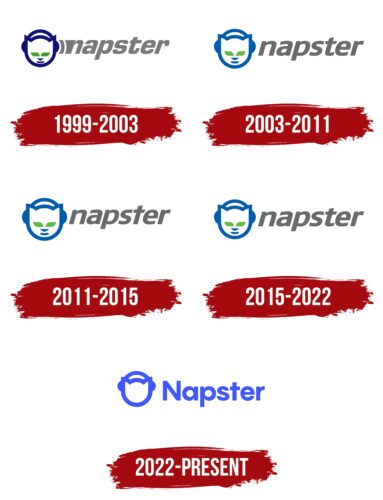
1999 – 2003
A unique service for sharing music was created in 1999 in America. Programmer Sean Fanning played a key role in its development. Together with their friends Jordan Ritter and Sean Parker, they managed to make a profitable alternative to the data transfer protocols that existed at that time. The new development was highly specialized. It was aimed only at music files and provided the most convenient exchange.
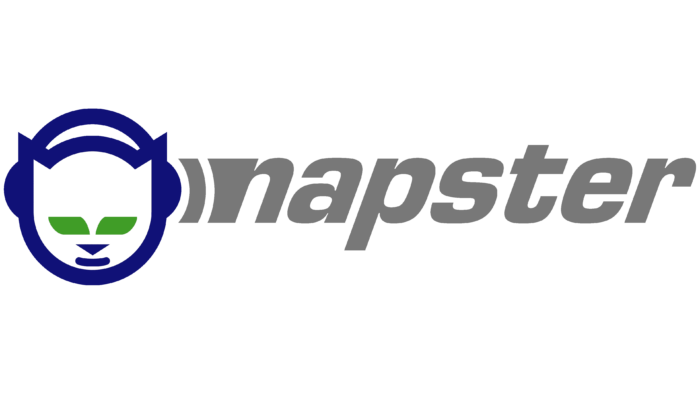
The name was based on the pseudonym of one of the developers, and the design was made in a playful comic style. The logo consisted of the inscription Napster and a picture in the form of a cat’s head. The animal icon had a special meaning. It was a response to the dog logo that belonged to the main competitor – Lycos.
The cat’s head was presented in headphones, which translates the main direction of the platform. The company’s name was located after the image and was a harmonious continuation of the picture. Another interesting feature was the curve between the earpiece and the company name. She symbolized the sound wave. The colors of the logo of that time consisted of 3 colors:
- gray (inscription);
- blue (head);
- green (cat’s eyes);
The shades were quite saturated and expressive, which meant the firmness of the company’s intentions and the desire to spread activities over a larger area. For the inscription, an original soft font was chosen, which provided for the arrangement of letters at a small distance from each other.
The unusual execution made the logo quite stylish, thanks to which it attracted the attention of many music lovers. For a while, Napster achieved its goals, gaining the trust of hundreds of users. But, soon, a lawsuit led to the closure of the company and a change of ownership. Roxio held the controlling stake.
2003 – 2011; 2015 – 2022
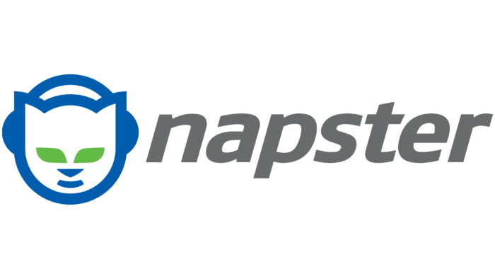
In 2003, the service began to use an updated logo. It didn’t differ much from its predecessor. The changes affected the font and color. The Napster wordmark was written in bold italic, neat, and clean sans-serif lines. The chosen style added tradition and confidence to the logo.
In addition, such letters balanced the cat’s funny face. She, too, has changed. The eyes changed from parallelograms to leaf-shaped elements, and thick lines were used for the contours of the muzzle. In general, the emblem has become more fluid and stylish. The sharp corners on the previous logo have been removed, emphasizing a friendlier tone.
The color scheme has brightened. Instead of saturated blue and gray colors, lighter shades were used. This added lightness and freshness to the logo. Such an update emphasized stable improvements in the operation of the service itself.
2011 – 2015
At the beginning of 2001, the functionality of the online platform was updated once again. The changes were also reflected in its emblem. But, this time, the owners decided to make only minor adjustments. Colors and general style remain the same. Only the font has changed. It became more expressive and bold, which demonstrated the continuous development of the brand.
In 2015, the management again decided to change the corporate logo. The new version of the icon received a monochrome color palette and an improved font. This option looked more powerful, authoritative, and expressive. In addition, the updated logo has become more versatile. It looks great on any object and background. Since then, the emblem has not changed and is still used in this form.
2022 – today
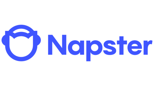
In June 2022, Napster introduced a new logo that differs from the previous one with a more rigorous and simplified design. The letters are now written straight, which gives them an official look, creating a sense of clarity and order. The brand name looks confident, using a bold geometric sans-serif typeface similar to cretype’s modified Caros Extra Bold. But the rounded shapes of the glyphs and the pale blue color soften the overall impression a bit, inspiring subconscious trust among users. The chosen palette is associated with innovation, technology, and the modernity of the music service.
Interestingly, the cat-music lover has disappeared eyes, nose, and mouth. Only the silhouette of a head with triangular ears and large earpieces has been preserved. Perhaps this is due to the desire of the company to radically change its image and mark the beginning of a new, legal era of activity, albeit with a 19-year delay. Without a provocative squint, the cat looks neutral.
Font and Colors
A characteristic feature of the modern Napster logo is a stylish black color scheme. Thanks to this color, the icon stands out against the background of other emblems of similar Internet resources. It combines expressiveness, uniqueness, and stability. The last point is manifested in the fact that the two parts of the emblem are made in the same shade.
The shape and location of the cat’s face remained unchanged. As in previous versions, it is in front of the inscription. This symbolizes respect for the historical past and the efforts of developers who have invested maximum efforts in its development throughout the company’s existence.
But, in parallel with this, the program’s work improved all the time. To some extent, constant development also symbolizes the font. The updated version has become more massive and clear, and soft diagonal cuts have appeared in the lines. The execution is fully consistent with modernity and the rules of the brand style.
Napster color codes
| Neon Blue | Hex color: | ##4056ff |
|---|---|---|
| RGB: | 64 68 255 | |
| CMYK: | 75 66 0 0 | |
| Pantone: | PMS 2736 C |
