


![]() Nardi Logo PNG
Nardi Logo PNG
For furniture manufacturers, the most important things are high reliability, durability, and aesthetics. The Nardi logo embodies all three: it looks strong, and its design aligns with the current minimalist style.
Nardi S.p.A. began in the early 1990s in Chiampo, a town in Italy’s Vicenza province. Giampietro Nardi and his wife, Maria Grazia Mezzanero, founded the company around outdoor furniture made from polypropylene, focusing on chairs, tables, and sun loungers.
The location mattered. Veneto already had a dense industrial base, with suppliers in plastics, metalwork, textiles, chemicals, and packaging. Nardi kept its three production sites in Chiampo and built the business around local manufacturing control. While many competitors moved production to Asia, the company continued to promote its furniture as “100% Made in Italy.”
Polypropylene defined the company’s product logic. Unlike wooden or metal garden furniture, it did not need painting, coating, or winter storage, and it worked well for restaurants, hotels, private gardens, terraces, and bars. In this market, Nardi competed with Fermob, known for metal outdoor furniture, and the Spanish brand Resol, which worked in a similar price and material segment.
In 2011, management passed to the founders’ daughters, Floriana and Anna Nardi, while Giampietro Nardi remained chairman. By the 2010s, Nardi products were sold in more than 130 countries. The range grew from standard chairs and rectangular tables to loungers, cushioned armchairs, modular sofas, bar furniture, and umbrellas. For stronger load-bearing parts, the company used fiberglass reinforcement and anodized aluminum frames.
Meaning and History
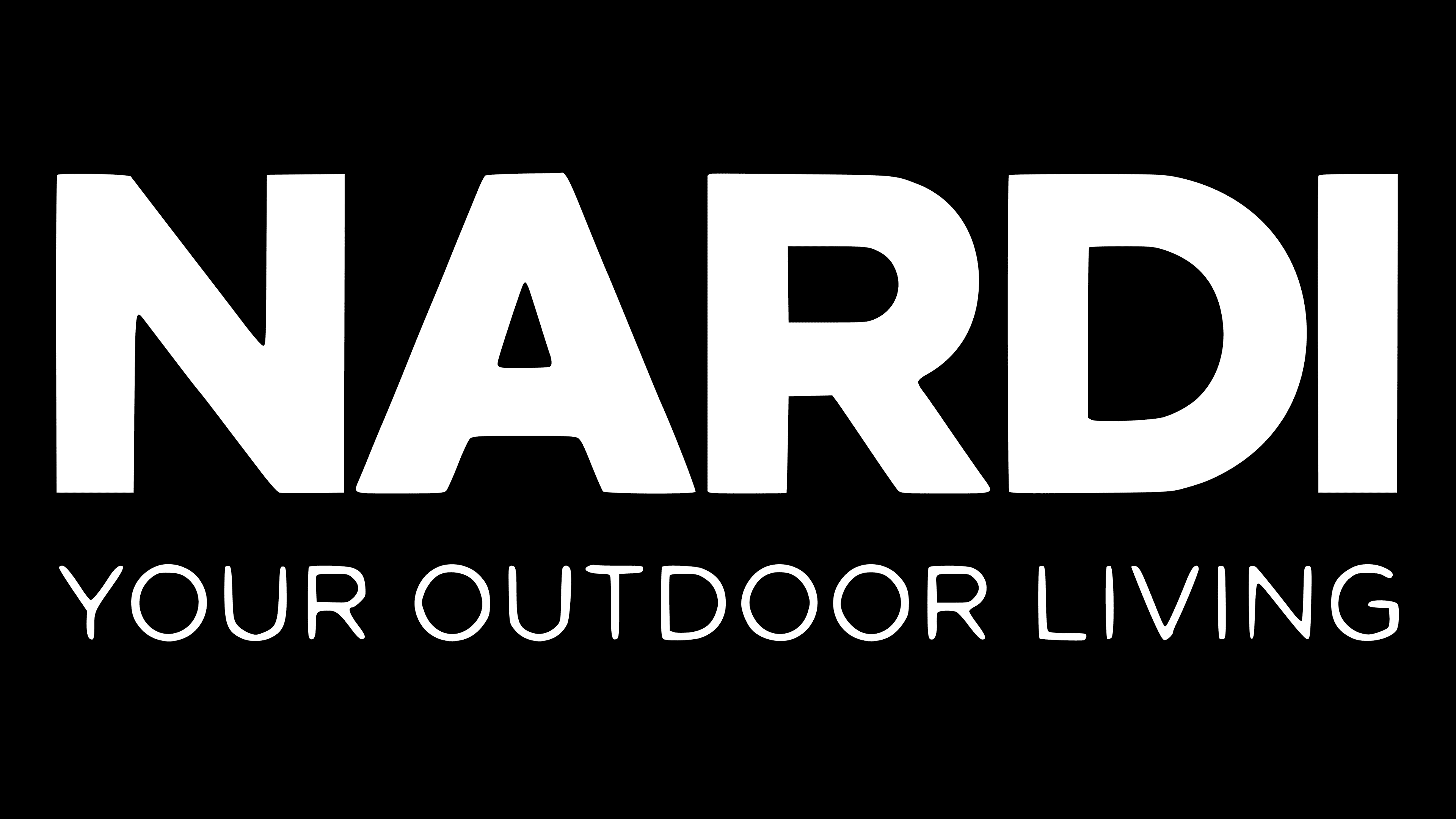
The brand’s visual identity and the company’s uniqueness are also made possible by a minimalist, stylish logo. It has not changed much since the company’s inception. In most cases, it consists of a verbal inscription and a slogan located below. It consists of three words, namely “Your Outdoor Living.” The slogan is set in a classic sans-serif font with all caps. These are heavy, powerful characters with lots of space between letters. It is easy to read and conveys to potential buyers the message that the company has laid down. Most often, black letters on a white background are used, but there may be differences.
The main inscription is much larger and set in classic bold type. The lines in the letters are straight and thick. All letters are easy to read, and the minimum distance between them creates a feeling of unity among all elements. The width of the brand name is equivalent to three words of an additional slogan.
What is Nardi?
This is an Italian brand that has been considered the world leader in garden furniture production for more than two decades. It is behind this that the fastest profit growth and the greatest interest from the target audience are observed.
Despite the minimalism and conciseness, the logo looks saturated due to the presence of additional elements. And there is not even a full-fledged emblem here. After reviewing the logo, one may feel that the company’s key values are the growth of quality and interest from the target audience. In general, the logo clearly conveys the company’s past, present, and future and indicates what it wants to be for its customers.
Naturally, the lack of bright, memorable colors prevents the logo from standing out immediately from the competition. However, it is easy to place on any surface.
Font and Colors
Both the brand name and the slogan use a very similar all-caps sans-serif typeface. However, the company places the greatest emphasis on the main verbal inscription. This is noticeable due to the height of the letters and the thickness of the lines. As a result, both elements look harmonious together. We can definitely say that without a slogan, the logo looks empty because the company chose not to use any emblems or other visual elements.
If we talk about the color palette, brand management decided not to cycle through bright colors and preferred the classic black-and-white combination. Perhaps gloomy shades can scare off potential buyers, but at the same time, such a choice associates Nardi with an authoritative, progressive brand ready to surprise.