


![]() National Broadband Network Logo PNG
National Broadband Network Logo PNG
Globality and the integration of many users into a single network are the main motives of the National Broadband Network logo. The emblem conveys the ideas of globalization, gradual accession, and growth, grouped around a single center.
National Broadband Network grew out of Australia’s telecom gap. Throughout the 1990s and early 2000s, much of the country still relied on Telstra’s old copper lines. At the same time, private operators had little incentive to fund fiber upgrades outside dense markets.
In 2007, Kevin Rudd’s Labor Party promised A$4.7 billion for a next-generation network. After Labor won, the government opened an FTTN tender, but the 2008-2009 financial crisis made the plan unworkable. The tender was canceled on April 7, 2009. That day, Rudd announced a state-led model. NBN Co Limited was registered on April 9, 2009, with Mike Quigley later named CEO. The plan covered up to A$43 billion over eight years, with fiber to 93% of premises and wireless or satellite for the rest.
Tasmania became the first test site, with early homes connected in July 2010 and commercial fiber customers added in 2011. In the same period, deals with Telstra and Optus moved users from older networks to NBN. After the Coalition won in 2013, the project shifted to a Multi-Technology Mix. Full fiber was reduced, while Telstra and Optus FTTN and HFC networks became core parts of the rollout.
Costs rose to about A$51 billion by 2018. NBN was declared complete by June 2020, though fiber upgrades continued. In January 2025, NBN Co reported that it had over 8.6 million connected homes and businesses. In September 2025, the base fiber and HFC plan changed from 100/20 Mbps to 500/50 Mbps.
Meaning and History
![]()
The preconditions for creating the National Broadband Network arose in 2006, when the infrastructure project was only a pre-election promise by one of the parties. The Labor Party announced that, if it wins, it would replace the old telephone system with copper cabling and increase the speed of wired Internet connections. After winning the federal elections, politicians decided to fulfill their promise and build a network using FTTN technology.
To implement the project, NBN Co Limited was created and later renamed NBN. This mini-rebranding is reflected in everything related to the company’s visual identity.
What is National Broadband Network?
National Broadband Network is a fiber-optic data transmission network designed to provide high-speed internet access to all residents of Australia. Its construction began in 2009. The government-owned corporation NBN, established in the same year, is responsible for the project. By 2020, the telecommunications infrastructure upgrade was 90% complete. Its goal is to boost the country’s economic growth and improve the quality of life for its population.
2007 – 2015
![]()
The Australian broadband provider emerged in 2009. It was first registered under the unique nine-digit number “A.C.N. 136 533 741 Limited” and, only a few months later, was renamed NBN Co Limited. The corporation’s name became the basis for the wordmark. Designers used two sans-serif typefaces: bold and regular. The fact is that “NBN” and “Co” were written together, visually separated only by a different font.
Above the dark gray lettering in the upper-right corner was an abstract image of the National Broadband Network: wide, multicolored lines that appeared to circle an invisible ball. The ball is not simple but earthly because the graphic sign was intended to convey the global nature of telecommunications infrastructure. The designers combined two bright shades (blue and orange) to attract attention, making a gradient transition.
2015 – today
![]()
On April 26, 2015, the company was renamed: the two-part name “NBN Co” was replaced by the simple “NBN.” Thus, she had to redesign the logo for the first time to match the new name. But the leaders decided not to limit themselves to lowercase letters and changed the font to a rounded sans-serif with no corners.
Also, the new version uses a completely different abstraction, rather than multicolored curved stripes. The artists have now depicted the connection as blue circles. The largest one is in the middle, and all the others, the small ones, form concentric rings around it. As you move away from the center, the color intensity changes from dark blue to light blue.
Font and Colors

The graphic symbol represents the National Broadband Network service. It can be interpreted as a cross-section of a fiber-optic wire and a connection point (the large circle in the middle), from which signals radiate in all directions (the concentric rings). So the NBN emblem symbolizes the national network based on FTTP, satellite, and wireless technologies.
But some criticized the new design. According to them, the Australian government spent 20,000 dollars on the logo because it could not keep its election promises and complete the national telecommunications infrastructure in time. They saw this as an attempt to distract attention from the real problems of NBN.
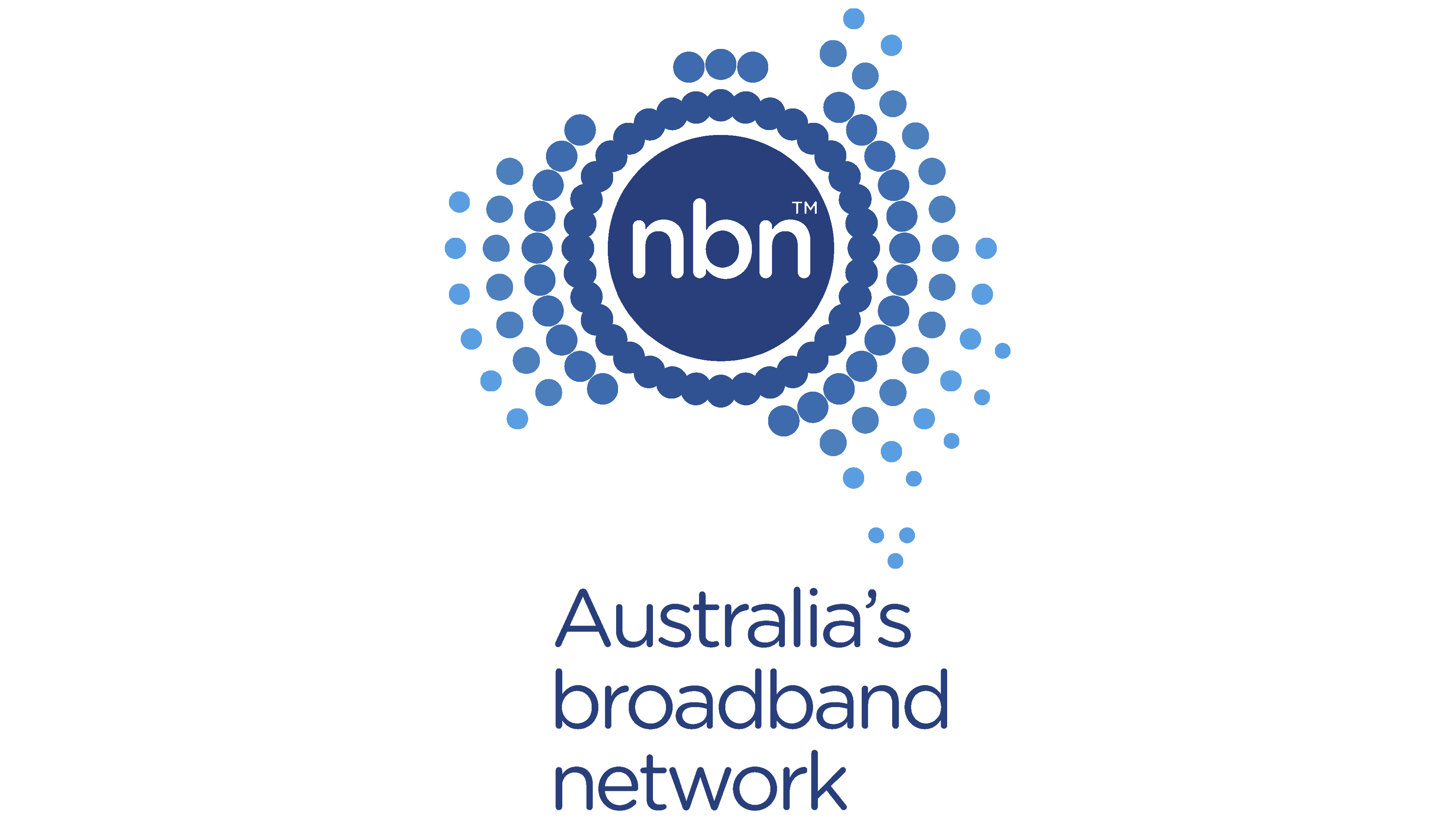
After the rebranding, the font changed: the company name was set in bold lowercase with rounded ends. This text design was chosen by the designer Sven Vill-Itlüd. He also suggested using blue as a base color. There is no longer any gradient as before. But the shades still change: each next ring is lighter than the previous one.