The National Car Rental Logo gives the impression that it is not stationary but constantly in motion, akin to a car speeding along the road. This effect is achieved through the smooth, flowing elements that designers have incorporated into the brand’s emblem, successfully conveying a sense of dynamics and speed.
National Car Rental: Brand overview
National Car Rental is an American car rental agency. It was founded on August 27, 1947. Today, the headquarters is located in Clayton, Missouri. Enterprise Holdings owns trademark rights. The agency pays special attention to regular customers who may not fill out rental forms at every interaction because the Emerald Club loyalty program is available to them. If the company had only 60 car rental points at its creation, today, their number is approaching 2500.
In 1947, National Car Rental started with 24 car rental businesses in the U.S. Their goal was to make a network for travelers after the war, both for work and fun.
Nationals grew fast during the ’50s and ’60s. It opened in big cities and airports and became known for clever ideas like letting people rent a car here and leave it there and giving perks to people who rented often.
In the ’70s and ’80s, nationalism grew in the U.S., Canada, Europe, and the Caribbean because more people traveled for work.
Then, in 1987, General Motors bought National, which helped it grow even more. It also started using computers to book rentals.
The ’90s were rough, with National changing owners a few times, but it kept pushing through.
In 2001, General Motors sold National to Cendant Corporation, combining it with Alamo Rent a Car.
Fast forward to 2006, and Cendant split up, leading National to become part of Avis Budget Group.
National has been all about using tech to make renting cars easier. With the Emerald Club, you can skip the line and just pick up your car. They’ve also got electric and hybrid cars and invested in apps and GPS to make renting smoother.
Today, National has more than 1,500 locations in over 80 countries. It serves everyone from vacationers to companies that need rental cars.
National has stayed on top of changes in car rentals by being innovative and keeping customers happy. They’re ready to face new challenges like car sharing and app-based rides.
With a well-known brand and global reach, National is set to keep leading, especially as travel bounces back after the pandemic.
Meaning and History
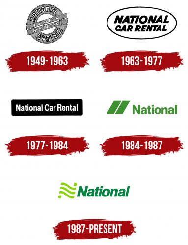
Visual recognition of the brand is extremely high among residents of the United States because tens of millions of citizens and tourists use National Car Rental’s services every year. For all time, two logos were presented to the target audience, combining a verbal inscription and a logo.
What is National Car Rental?
This is one of the most famous companies that provide customers with car rental services in the United States. Has more than 70 years of work in the market, and the number of points continues to grow from year to year. Today, you can rent a car of any class in all states of America.
1949 – 1963
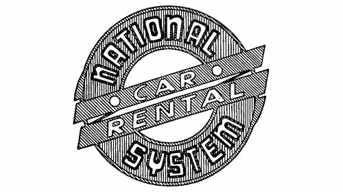
The first logo of National Car Rental, created in 1949 and used until 1963, featured a stylized steering wheel in black and white, clearly indicating its core business of car rentals. The design used dynamic fine lines to enhance recognition.
The circle in the logo represents a wheel of fortune, suggesting travel and good fortune for customers. This image conveyed the promise of enjoyable travels and successful experiences, in line with the company’s mission to provide convenient and high-quality car rental services.
The logo included two small wings on the sides of the circle, emphasizing speed and ease of movement. These wings highlighted the company’s focus on offering quick and efficient services, essential for the freedom associated with vehicle rentals.
An essential part of the logo was the phrase “National System,” which highlighted the company’s extensive network. This phrase informed customers of the widespread availability of National Car Rental’s services across different regions, ensuring easy access to car rentals for a wide customer base.
1963 – 1977
Following the transition of control to different investors, the company moved its headquarters and changed its management structure, which greatly affected its operations, including its corporate visual identity. This led to a logo redesign, which some initially viewed as a regression. The previous elegant and stylish symbol was replaced by a simpler, less expressive emblem: an oval containing the company’s name.
Despite criticism for seeming superficial and unoriginal, the new logo conveyed significant meaning and reflected the brand’s core values. The oval, a closed geometric figure with smooth lines, was chosen to represent the company’s full range of services, emphasizing its commitment to providing complete solutions.
The oval promised comfortable and attentive treatment for every customer, aiming to convey care and individual attention. The symmetry of the new emblem highlighted the company’s dedication to excellent service. This symmetry and the clean lines symbolized order, balance, and harmony—key qualities for a service-oriented business and a reflection of the company’s standards.
1977 – 1984
After experimenting with its corporate style, National Car Rental rebranded to reconnect with the core elements of its identity. This change aimed to strengthen the brand and its position in the market. The new logo featured a black rectangle with rounded corners and a bright white company name at the center. This design combined a sense of nobility and solidity, projecting a business-like and respectable image that underscored its status as a major player in the car rental industry.
The logo resembled a computer key and was chosen to represent National Car Rental’s innovative customer service and business management approach. The company introduced a computerized car reservation system, a significant technological advancement that allowed it to expand its network and customer base. This system made booking vehicles more convenient and quicker, boosting the company’s market position and supporting its growth and prosperity.
1984 – 1987
With new ownership, National Car Rental updated its corporate symbols, introducing a new emblem that featured green as the key color. This color represents the company’s commitment to innovation, readiness for change, and a focus on environmental sustainability. The updated logo reflects National Car Rental’s dedication to environmental care.
The redesign streamlined the car rental process by reducing bureaucratic delays and accelerating order processing. The introduction of a loyalty program strengthened customer relationships and increased satisfaction with the services. The emblem evolved to appear friendlier and more welcoming, emphasizing customer focus and needs.
The logo featured two diagonal parallel lines, similar to road markings, symbolizing movement and dynamism. This highlighted the company’s core service of providing cars for travel.
The logo used the abbreviated “National,” giving it a minimalist and modern look. This design emphasized efficiency and convenience, even at the cost of simplifying visual elements, aligning with the company’s focus on practicality and modernity.
1987 – today
In 1987, the National Car Rental brand underwent a significant redesign, embracing the epitome of conciseness in its logo. The revamped design retained only the word “National,” ensuring it mirrored the style and typography of the previous iteration. This streamlining of the logo signified the company’s commitment to efficiency and accessibility, echoing the straightforward nature of its services.
Though the emblem remained visually identical to its predecessor, it was subtly downsized. This change, while minor, catered to the evolving landscape of advertising and branding, making it more versatile for various applications. The emblem has become a distinctive brand mark, frequently appearing as a badge on rental vehicles, a recognizable icon on the company’s official website, and a prominent feature in advertising campaigns across multiple platforms.
Font and Colors
The National Car Rental logo uses a font similar to Helvetica, combining bold and regular weights. The entire text is slightly tilted to the right, giving it a dynamic feel fitting for a car rental company.
The font is clear and scalable, making applying the logo on various surfaces easy without losing its recognizability. The bold “National” conveys visual weight and reliability, while the thinner and regular “Car Rental” enhances balance and readability.
The primary colors of the logo are green and white, with different shades of green used for the emblem and name. A black-and-white color scheme is also an option.
Green is associated with growth, freshness, and eco-friendliness, reflecting the company’s commitment to innovation and sustainable development. White highlights the simplicity and purity of the company’s offerings.
Together, the font and colors create a memorable and recognizable image that reflects the core values and focus of the National Car Rental brand.
FAQ
Who is associated with National Car Rental?
National Car Rental, part of Enterprise Holdings, is one of the top car rental providers in the world. Enterprise Holdings also runs big names like Enterprise Rent-A-Car and Alamo Rent-A-Car. Together, these brands offer a huge range of cars worldwide.
They have a large network of many regional companies and franchises worldwide. This means they can offer smooth and widespread service that fits different customers’ needs, whether for one person or a whole company.
National Car Rental gets a lot of perks from being part of Enterprise Holdings, like offering many different cars and dependable service anywhere, be it a city trip in New York or a beach holiday in Paris.
Enterprise Holdings is about bringing in new ideas and caring for the environment. They’re always looking at new tech and better cars for the planet, which is good news for National Car Rental’s customers.
With such strong backing, National Car Rental is well-positioned to maintain its high standards and adapt to new ways people travel and rent cars.
Is Europcar the same as National Car Rental?
Europcar and National Car Rental are separate entities in the car rental sector. Although Europcar, a major European player, once managed National Car Rental and Alamo Rent-A-Car, it has stepped away from these brands. This move highlights the distinct paths and customer bases each brand targets. They each have special features, types of cars available, and approaches to customer service, aiming to meet their users’ varied requirements and tastes.
Does National own Avis?
Avis is not part of the National Car Rental. It’s a flagship brand under the Avis Budget Group, Inc., recognized as CAR on the NASDAQ stock exchange. This group oversees a collection of car rental brands, including Avis. The Avis company, established in 1946 by Warren Avis, was the pioneer in renting cars from airport locations, a groundbreaking idea at the time. Although Warren Avis sold his stake in the company in 1954, Avis has continued to expand and innovate, securing its place as a leading name in the global car rental market. National Car Rental, meanwhile, is managed by Enterprise Holdings, a different major player in the car rental industry that also manages various other rental services. Therefore, Avis and National operate independently within the competitive car rental sector, each backed by its corporate groups and strategies.
What car companies does the nation own?
National Car Rental, Enterprise Rent-A-Car, and Alamo Rent-A-Car belong to Enterprise Holdings, a global market giant in the car rental market. This group provides numerous travel solutions through a vast network of global locations.
Enterprise Holdings serves a wide array of customers by owning these brands. National specializes in services for business travelers, including the Emerald Club program, which speeds up service and offers free rental days. Enterprise Rent-A-Car is famed for its outstanding customer service and broad network, which makes it ideal for personal and business use. Alamo, meanwhile, targets vacationing families with its attractive pricing and specials in tourist hotspots.
With its collection of brands, Enterprise Holdings presents a range of vehicle options to suit all budgets and preferences, from economical cars to high-end luxury vehicles. The group’s focus on innovation and customer satisfaction has been key to its ongoing success and popularity worldwide.
