The National Geographic emblem opens the door to a bright and beautiful world of nature, behind the emblem lie journeys, thrilling adventures, and new information showing how amazing our planet is.
National Geographic: Brand overview
| Founded: | September 22, 1888 |
| Founder: | National Geographic Society |
| Headquarters: | Washington, D.C., U.S. |
| Website: | nationalgeographic.com |
Meaning and History
The National Geographic logo was designed by the branding agency Chermayeff & Geismar. They had a specific task: to depict something neutral, suitable for all areas of the scientific association’s activities – from film production to environmental protection. Thus, the famous brand name was born, adapted to all the society’s trademarks.
What is National Geographic?
National Geographic is a TV channel and magazine belonging to the namesake society. It is dedicated to flora and fauna issues, scientific discoveries, history, culture, and nature in all its manifestations.
1997 – 2001
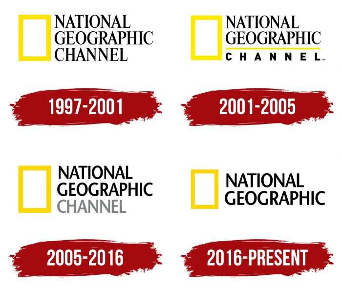
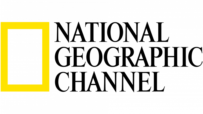
The debut logo consists of two parts: text and an icon to the left of the inscription. It looks like an elongated rectangle and resembles a standard magazine or display window. This is because the designers played with the society’s name as a “window to the world.” The yellow lines are broad. In height, they are comparable to the neighboring phrase “National Geographic Channel.” The inscriptions are arranged in three rows and done in a serif font.
2001 – 2005
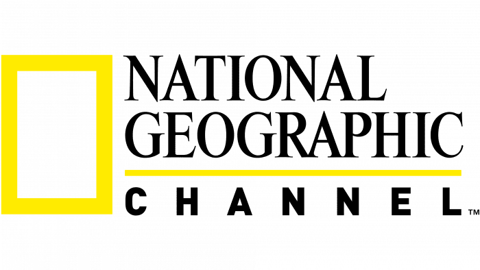
During this period, changes affected the form of the name. The top and middle parts of National Geographic remained the same, while the bottom Channel had a dividing line and a different style of writing. As a result, it lost its serifs and became half the size.
2005 – 2016
The management approved a new logo with a changed sans-serif font. Designers removed the dividing line between the parts, returned the word “Channel” to its original size, and highlighted it in gray.
2016 – today
Since National Geographic is a digital and satellite channel, society, publisher, magazine, and series of guidebooks, the administration decided to unify the logo. In the updated version, it now suits everything simultaneously. For this, developers removed the word “Channel.”
National Geographic: Interesting Facts
National Geographic has been teaching us about the world since 1888. It was started by 33 people who loved exploring and wanted everyone to learn more about our planet.
- The First Magazine: The first National Geographic magazine emerged in October 1888. It didn’t have pictures at first and was made for 165 special members.
- Pictures: National Geographic became famous for using amazing photos to tell stories. The first color photo was on the cover in July 1914, a big deal back then.
- More Than a Magazine: Besides being a well-known magazine with a yellow border, National Geographic also produces TV shows and books and has a website and social media that many people follow.
- Helping the Planet: The National Geographic Society, like the heart of the whole thing, raises money to help the environment, animals, and research worldwide.
- The Genographic Project: In 2005, they started a major project to study how humans moved around the earth long ago by examining DNA.
- Awards: People who write and take photos for National Geographic have won important prizes because they do great work.
- Worldwide: You can find National Geographic in many languages and countries, helping to teach people everywhere about the earth.
- Helping Schools: They also make learning materials for teachers and kids to make geography fun and interesting.
- Saving Animals: National Geographic works hard to protect animals and places in danger, such as big cats and the ocean.
National Geographic makes learning about the earth and all its creatures exciting. Stories and pictures show us how important it is to care for our world.
Font and Colors
The logo has been updated several times, but the main elements remained in place: a large white rectangle with a yellow frame on the left and the full brand name on the right, written in a standard font. Most often, changes concerned the text design: it was black-gray, three-lined, and with a horizontal line. The current version contains the phrase “National Geographic,” broken into two lines, and the sans serif font Stone Sans SemiBold.
Colors include yellow (for the rectangular frame), black (for the letters), and white (for the background).
National Geographic color codes
| Yellow | Hex color: | #ffd51c |
|---|---|---|
| RGB: | 255 213 28 | |
| CMYK: | 0 16 89 0 | |
| Pantone: | PMS 116 C |
| Black | Hex color: | #000000 |
|---|---|---|
| RGB: | 0 0 0 | |
| CMYK: | 0 0 0 100 | |
| Pantone: | PMS Process Black C |
FAQ
What Does the National Geographic Logo Mean?
The rectangle next to the name is made in the form of an honorary diploma. The yellow color in which it is executed signifies the sun – the source of light and favorable conditions for sustaining life on Earth.
Who Designed the National Geographic Logo?
The National Geographic logo was developed by one of the most famous American designers, Tom Geismar. He created it in collaboration with other employees of the branding agency Chermayeff & Geismar & Haviv.
How Much Did the National Geographic Logo Cost?
The cost of the National Geographic logo, developed by Chermayeff & Geismar & Haviv, is not disclosed.
Is National Geographic a Trademark?
Yes, National Geographic is a registered trademark, and its use is strictly limited. Third parties can use the company’s logo only in the case of an official partnership for work.
