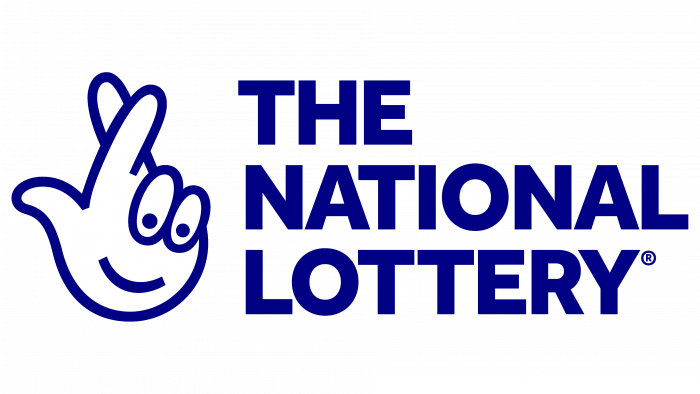
“Fingers crossed for good luck,” advises the National Lottery logo. The emblem shows the honesty and transparency of the drawings, concern for the players’ well-being, and life from scratch if you are lucky to win the jackpot.
National Lottery: Brand overview
| Founded: | 1994 |
| Headquarters: | United Kingdom |
| Website: | national-lottery.co.uk |
Meaning and History
The very first lottery was tried in 1988, but it was canceled even before the mass draw. The reason for the closure is legal reasons. A few years later, another one was approved – the French one, under the state license of the government headed by John Major. This event is dated 1993. Then in 1994, a national lottery was created – under a franchise provided to a private operator. It was the Camelot Group, which received permission in May of that year.
The debut drawing was held on 19.12.1994 as part of a TV show hosted by Noel Edmonds. There were seven winners. Gradually, many prize tiers appeared, promising additional winnings in a smaller amount.
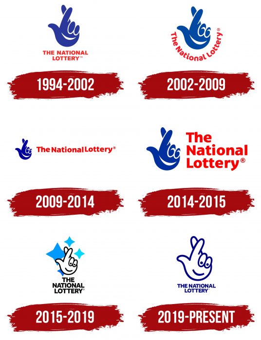
In 2000, National Lottery undertook a massive rebranding as ticket sales plummeted. The base games were named Lotto, and some additional games were removed due to low demand. At the same time, the emblem of the hand with fingers crossed for good luck was changed. As a result, the owners raised the game’s prestige and made it the most popular gambling event in the UK. Today it has six types of logos.
What is National Lottery?
The National Lottery is a British brand that encompasses several gambling games, including “UK Millionaire Maker,” “Online Instant Wins,” “EuroMillions,” “Set For Life,” “Thunderball,” “Lotto,” and others. Each game has its own rules and prize amounts. A portion of the funds collected is allocated to charitable projects. The first lottery draw was held in 1994. The Gambling Commission, established in 2007, regulates the games.
1994 – 2002
The debut version was authored by Saatchi & Saatchi. The emblem looks like a left palm with two fingers crossed – the middle and forefinger. This is a sign of good luck, understandable to the whole world. The nameless and little fingers are bent. They form peculiar eyes, under which a wide smile is drawn. Below is the inscription – the name “The National Lottery.” It is executed in two lines in capital letters in red, while the palm is blue.
2002 – 2009
After the great reboot, the lottery received not only enhanced features but also an updated logo. It was created by Landor Associates studio. The designers have completely retained the previous form because it is successful and concentrated on the details. They added a white touch to the bent fingers, forming not only the outlines of the nails but also stylized eyes with a perky look.
Complemented by a joyful smile, this option looks very attractive – the emblem seems to confidentially invite you to the game, evoking positive emotions from those around you. This is exactly what the lottery organizers were trying to achieve as it began to lose popularity. And the developers slightly stretched the smile, bringing the sharp angle almost to the thumb. They placed the inscription “The National Lottery” in a semicircle so that it also resembles a wide smile. The authors have replaced the strict angular font with smooth lines with a rounded one.
2009 – 2014
In this version, all elements remain the same – only their position has changed. Now the designers have moved the text behind the icon and placed it on the right side. In addition, they returned the hand to its original color, which was in the opening variation. The intensity of the red shade, on the contrary, was reduced and brought closer to pastel.
2014 – 2015
Corrections of the emblem mainly affected the grouping of the inscription. Now it occupies not one but three lines at once – each with one word from “The National Lottery.” The letters are enlarged but not changed in style – they are still the same rounded and smooth, with a soft effect. The developers have intensified the red color to scarlet.
2015 – 2019
Another reboot took place in 2015 when a radically different emblem was adopted. Its author is Wolff Olins. He removed the solid fill color and left only the outlines formed by a black line of medium thickness. The designer also removed the looped lines on the little and middle fingers, replacing them with large dots. They represent nails and eyes at the same time. Moreover, the crossed fingers have slightly changed the proportions: now they are less long and more proportional.
The smile in the form of a thickened arc is replaced by a slightly bent black line, which looks very pretty and friendly. Outwardly, it resembles an inverted parenthesis. This version is also interesting because it has a background – four stars, one of which is larger than the others. They are multi-colored and dyed in blue, mint, and ultramarine. The logo developers shifted the text down, writing it in clear block letters of the same size.
2019 – today
Designer Jones Knowles Ritchie made minimal changes to the logo. He replaced the black with a dark blue (cobalt hue), removed the starry background, and rearranged the lettering. Now it occupies not three but two lines: the top one is “The National,” and the bottom is “Lottery.”
National Lottery: Interesting Facts
The UK National Lottery started in 1994 and plays a big part in British life by funding projects nationwide and offering games of chance.
- Beginning: Launched in November 1994 under a government license, its main goal was to support arts, sports, heritage, and community projects with the funds it raised.
- First Draw: Happened on November 19, 1994, drawing millions of viewers hoping to win big.
- Supporting Good Causes: For every £1 spent on tickets, about 25 pence goes to funding over 600,000 projects.
- Olympics Contribution: It significantly contributed to the London 2012 Olympics, helping its success.
- Record Jackpot: In January 2016, a £66 million jackpot was split between two tickets, one of the largest in its history.
- Variety of Games: Offers EuroMillions, Thunderball, and scratchcards.
- Unclaimed Prizes: There are often big prizes that are not claimed. These funds eventually go to good causes.
- Age Requirement Change: Initially, 16-year-olds could play, but in April 2021, it was raised to 18 to prevent gambling harm in young people.
- Digital Moves: Players can now buy tickets and play games online or via a mobile app, making participating easier.
- Heritage Projects: The National Lottery Heritage Fund helps preserve the UK’s history and natural spaces, supporting the upkeep of historic sites and landscapes.
The National Lottery is a way to win money.
Font and Colors
In general, the evolution of the logo has developed systematically. There were no abrupt transitions and radical changes in it: a palm with crossed fingers perfectly conveys both the emotional mood and the main concept of the service. She says: everything depends on your luck; you may be lucky. The only major change has to do with color. If in earlier versions the whole hand is painted, in later versions only its outline is painted.
One of the early fonts is very close to Kareemah Black. Individual adaptation of the typeface is minimal and almost coincides with that used in the logos of 2009-2015. Then another version appeared, reminiscent of Effra Heavy. This font was created by designers Fabio Luiz Haag and Jonas Schudel and published by Dalton Maag. The closest free analog of this humanistic sans serif typeface is TABARRA BLACK Font.
The corporate palette consists mainly of a combination of red and blue tones. Depending on the year of appearance, these were scarlet, burgundy, blue, ultramarine and cobalt colors. Moreover, the developers of the emblem tried not to use many shades in one logo, so we can say that they are monochrome. The exception is the 2015-2019 version, where several variations of blue are present simultaneously. But black balances them well.
National Lottery color codes
| Navy Blue | Hex color: | #000084 |
|---|---|---|
| RGB: | 0 0 132 | |
| CMYK: | 100 100 0 48 | |
| Pantone: | PMS 2738 C |
