The NEC logo is flexible and malleable. The emblem represents a high-tech company of the future whose innovations transform the modern world, unlocking limitless digital possibilities.
NEC: Brand overview
| Founded: | 17 July 1899 |
| Founder: | Kunihiko Iwadare and Takeshiro Maeda |
| Headquarters: | Minato, Tokyo, Japan |
| Website: | nec.com |
Emerging in 1899, NEC Corporation initially bore the name Nippon Electric Company, Limited. Founded by Kunihiko Iwadare and Takeshiro Maeda in Japan’s capital city of Tokyo, the company’s initial enterprise centered on producing and marketing telephones and switchgear. By 1983, it had adopted the abbreviated moniker NEC Corporation to reflect its broadening scope better.
The 1980s were a transformative decade for NEC, as the company gained a foothold in Japan’s burgeoning personal computer market by introducing its PC-8000 series. This helped propel NEC to become the leading PC vendor in the country at that time. However, personal computers were merely one segment of the organization’s diverse portfolio, including telecommunications hardware, software solutions, electronic components, and supercomputing capabilities.
A milestone moment came in 2017 when NEC’s influence and market prowess were acknowledged through its inclusion on the Fortune 500 list. Today, the company has expanded its global horizons, employing over 100,000 individuals. NEC now provides many IT and networking services encompassing cloud computing, artificial intelligence, the Internet of Things, and state-of-the-art telecommunications hardware.
Situated in the NEC Supertower in Tokyo’s Minato district, the company remains a tech titan in Japan and the global market, continuously adapting to technological advancements to stay at the forefront of the industry.
Meaning and History
The first known logo of the manufacturer dates back to 1963, even though the corporation itself was founded in 1899 when cooperation between Japanese and American companies was officially permitted. The merger of two cultures has always been evident in the emblems of the tech giant. Like most large conglomerates, NEC’s visual identity is characterized by simplicity and a lack of graphical elements, reflecting its diverse operations and numerous subsidiaries and branches.
What is NEC?
A Japanese international corporation that produces electronics and computers. With a revenue of 153 billion yen, it ranks about midway on the Fortune 500 list. The company has received an IDC MarketScape award for evaluating AI providers. The company headquarters is in Tokyo, in a building named Supertower.
1963 – 1992
In 1963, the company started selling American Depositary Receipts, which allowed it to attract millions of dollars in investments and open Nippon Electric New York. The expansion into the American continent coincided with rebranding.
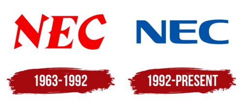
The new emblem consists of three capital letters, rendered in angular red font with a Japanese style. The letters stand for Nippon Electric Company, Limited. “Nippon” is the English transliteration of the Japanese pronunciation of the word “Japan.”
The use of an abbreviation from the English name emphasized that Nippon has always had strong ties with the West:
- The company was the first Japanese firm to involve American capital in its formation.
- Its management was modeled after the experience of its overseas partner, Western Electric.
- NEC served long as the trade representative for the British Automatic Telephone Manufacturing Co.
- The company’s products have been actively exported to other countries since the early 20th century.
Hence, the English name emphasized the company’s focus on the international market and its extensive international and intercontinental connections.
The English letters were incorporated into the 1963 logo to commemorate the opening of a major New York branch.
The pointed glyphs resembling flags and thickening elements conjured associations with fighters in Eastern martial arts and provided a sense of the country where the company was founded. The font was specifically designed for the corporation and bore a slight resemblance to the Tokio font, linking it to the city where the manufacturer’s headquarters are located.
The red color of the inscription added power and energy to the logo. It highlighted the strong potential the corporation possessed.
1992 – today
By 1992, several significant events occurred, leading to a rebranding. NEC had grown substantially, and its range of activities had expanded beyond telephony and switchboards. In 1983, the name was officially shortened to NEC. In the early ’90s, the company relocated to a new grand office building, the Super Tower.
Renaming, leadership in the PC industry, and the move prompted an identity change. The updated logo features the new, brief name NEC. The font of the inscription shows flexibility while simultaneously conveying the corporation’s confidence. The letters appear to be in the process of transformation, symbolizing movement and growth.
Partial rounding of the corners highlights a willingness to compromise and the ability to find optimal problem-solving pathways. The lower parts of the characters resemble ribbons bending to form the inscription. The softness of the lines conveys care for employees, community, country, and environment.
Square glyph elements with sharp angles are filled with strength and solidity. They encode the corporation’s scale and its confident movement towards its goals.
Font and Colors
The blue color of the inscription signifies NEC’s technological focus. The shade is associated with computer products, indicating digitization and manufacturing automation. The color accentuates the professional skills and experience of the workforce. The hue also suggests well-coordinated logistics and the smooth operation of numerous branches.
The font of the inscription bears a vague resemblance to Xbka but has unique features.
NEC color codes
| US Air Force Academy Blue | Hex color: | #0052a9 |
|---|---|---|
| RGB: | 0 82 169 | |
| CMYK: | 100 51 0 34 | |
| Pantone: | PMS 2935 C |


