


![]() Need For Speed Logo PNG
Need For Speed Logo PNG
Good and fair competitions received a bright and memorable logo. The symbols of the Need for Speed logo fly forward, overtaking each other. They cut through the air, personifying cars that, overcoming obstacles, strive to the finish line.
“Need for Speed” began at Vancouver-based studio Distinctive Software, known for racing titles such as Stunts and Test Drive II: The Duel. After Electronic Arts acquired the studio in 1991 and renamed it EA Canada, development started on a new racing project. The first game, Road & Track Presents: The Need for Speed, launched in 1994 on the 3DO with technical input from Road & Track magazine drivers, who helped shape realistic car handling.
The series shifted toward arcade racing with sequels in the late 1990s. Need for Speed III: Hot Pursuit introduced police chases in 1998, allowing players to race as fugitives or officers. Online multiplayer arrived the same year, while Need for Speed: Porsche Unleashed focused entirely on Porsche history and vehicles in 2000.
A major turning point came in 2003 when EA Black Box released Need for Speed: Underground, heavily influenced by street-racing culture popularized by The Fast and the Furious. The game replaced exotic supercars with tuned Japanese imports, adding cinematic storytelling and deep customization. Underground sold more than seven million copies, while Need for Speed: Most Wanted in 2005 became the franchise’s biggest success with around 16 million copies sold.
By 2009, total franchise sales exceeded 100 million units, competing with Burnout and Gran Turismo. Later entries experimented with track racing in ProStreet and simulation-focused gameplay in Shift. Control of the series later moved to Criterion Games and Ghost Games, while the 2022 release, Need for Speed: Unbound, combined realistic cars with stylized animated effects.
Meaning and History
![]()
Car tuning (body tuning) is available in the latest Need for Speed releases. Some games use realistic physics and are subject to visual and mechanical damage, while others are more benign. Somewhere, the tracks are very picturesque, but somewhere, gamers ride along the city streets. Moreover, these can be fictional locations in Chicago or London, as well as real racetracks like Mazda Raceway Laguna Seca and the Nürburgring. One of the key motives behind the NFS is police harassment. In some parts, you can even play as a law enforcement officer.
The only thing that is always stable is the logo. If it does change, it is only in small things, and the concept always remains the same. Only the first version was removed from the general list, which had a distinctive red-and-black design.
What is Need for Speed?
Need for Speed is one of the most popular gaming media franchises. It is based on a series of arcade racing games, the first of which was released in 1994. Since November 2013, it has been fully controlled by EA Sports. NFS fans enter the competition by choosing cars and tracks. Vehicle tuning is available, and in recent games, real car models are increasingly used.
1994 – 1997
![]()
The debut game was released in 1994. Its logo looked like a black rectangle with inscriptions. In the upper left corner was “ROAD & TRACK” (bold italic), a little to the right “PRESENTS” (small block letters with large spacing), in a column aligned to the right “THE NEED FOR SPEED” (bold italic font). The word “PRESENTS” was superimposed on the article “THE” because they were different colors. Bright red was used for the franchise’s main title, while white was used for the rest of the text. The ampersand was decorated with two dots and elegant curls around the edges.
1997 – 2003
![]()
The second part of the series came out in 1997. Her wordmark was minimal: simple black lettering, “NEED FOR SPEED” on a white background. The slanted and bold type with subtle serifs at the top gave the impression of the very speed the name suggests. At the same time, the letters were slightly extended upward. This logo was used for all games before 2002, including Hot Pursuit 2.
2003 – 2008
![]()
Need for Speed: Underground had a completely different icon: the series title with an extended “S.” Thanks to the standard aspect ratio, the letters are now more proportional. The contrast between the thicknesses of the vertical and horizontal strokes created the dynamics. The most conspicuous element was the capital “S,” with an elongated bottom line over which the word “FOR” hung.
2008 – 2013
![]()
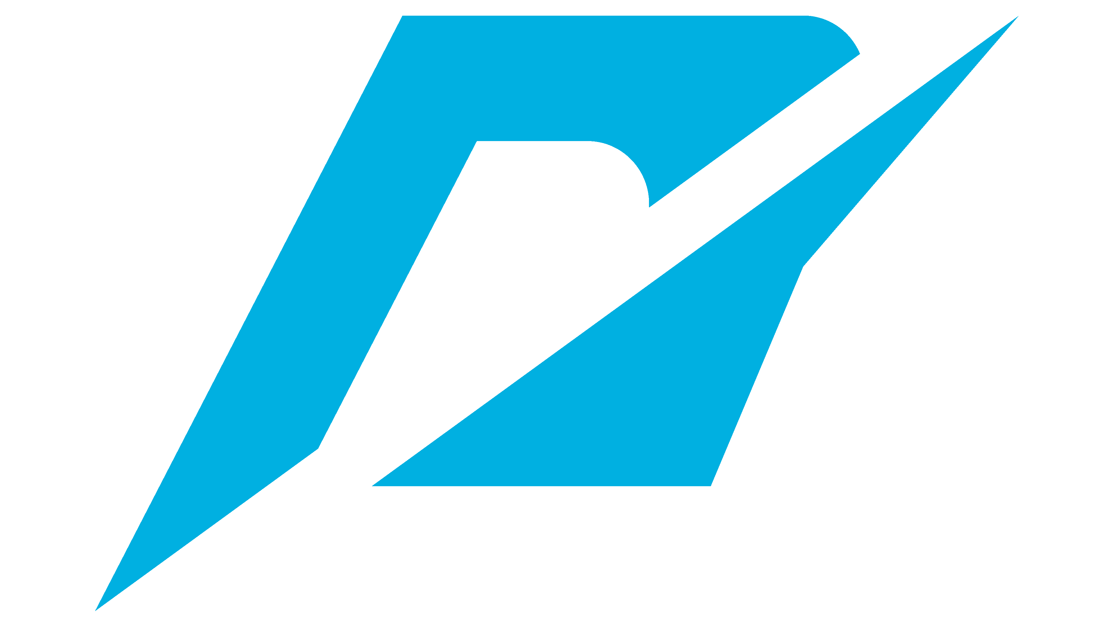
The creators of Need for Speed: Undercover introduced a new logo by shortening the bottom of the “S.” To style the text, they chose an unusual italic font with angled ends and many corners. The mixture of lowercase and uppercase letters was striking: “N” looked like this; the word was transferred to lowercase, although it did not differ in size from other characters.
To the right of the series, the name was an icon consisting of two deformed elements. In general outline, it resembled an “N” bisected by a diagonal Speedline. This lettering emblem was used until 2013, then briefly returned in 2020 with Need for Speed: Hot Pursuit.
2013 – 2014
![]()
For Need for Speed: Rivals, a two-tiered logo was designed with the words “NEED” above “FOR” and “SPEED,” which filled all the available space on the right side. The font is even more elongated than before. Because the letters were compressed on the sides, the spacing between them increased. In this version, the contrast between the words “NEED” and “SPEED” is noticeably much larger than that between “FOR” and its background.
2014 – 2020
![]()
The movie Need for Speed, based on the franchise of the same name, was released on March 14, 2014. Its logo looked like a reworked wordmark from 2008 to 2013. The designers returned the capital “N” to its familiar look and separated the merged letters to make the lettering more readable. The oblique cuts at the ends of the “E,” “F,” and “S” remained because they created the effect of movement.
The words “NEED FOR” were on the top line, and “SPEED” was on the bottom, and “FOR” was reduced. The tilt angle has increased slightly compared to previous versions.
2019 – 2020
![]()
2020 – 2022
![]()
The new logo is similar to the previous one but slightly modified. The title is written on one line, and the letter proportions have been changed. The word “FOR” has the most noticeable font update: the “F” and “O” are narrower, while the “R” has a pronounced transition from the top to the right leg. Apart from the full-size text mark with the words “NEED FOR SPEED,” an abbreviated one is used with the abbreviation “NFS.”
2022 – today
![]()
Font and Colors
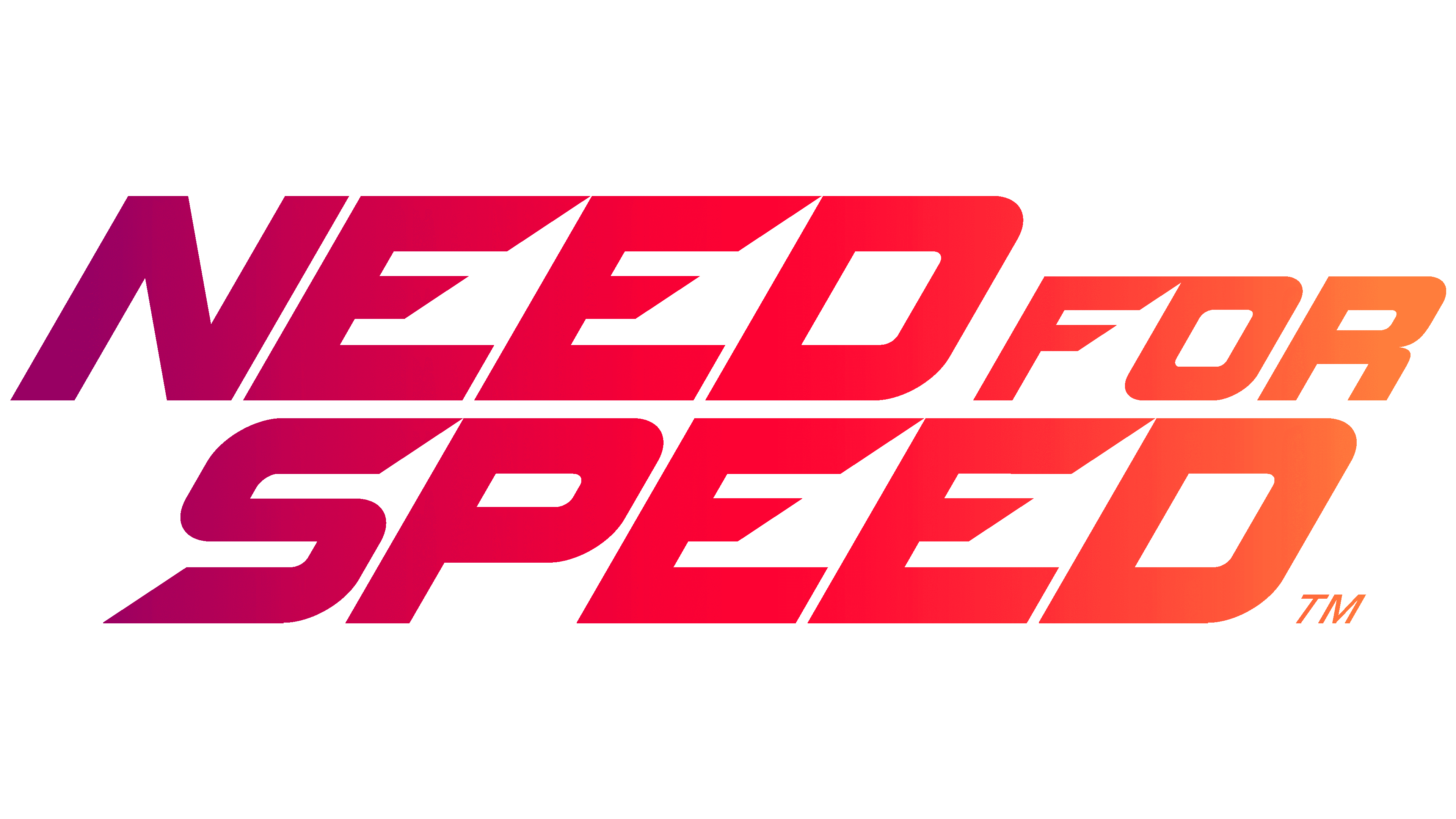
The video game logo has no graphic elements. From 2008 to 2013, the only symbol was an abstract shape, as the letter “n,” used throughout the Speedline runs. It symbolizes speed, which is the foundation of NFS.
Now, the movement is encrypted only in oblique letters, and it seems stretched due to the high speed. This reflects the game’s dynamic nature because Need for Speed is a racing franchise.
![]()
A font called NFS exists but is not used in a modern logo. The wordmark 2008-2013 served as the basis for this typeface, in which the capital “N” appeared as lowercase. With lowercase and uppercase letters combined, the unconventional design is no longer relevant. Based on the original NFS font, the designers have developed a new version that retains oblique cuts but has different character proportions.
All Need for Speed logos except the first have black oblique lettering. The debut version’s episode title was red, and the additional text was white. Black was used only as a background.
FAQ
What does the Need for Speed logo mean?
The video game series’ logo has changed over the years. The original logo was complex, featuring the game’s name and unique graphics. The graphics included a stylized portion of the letter “n” and a speedometer needle. These elements reflect the speed and excitement of the game, which are key themes of the series. The “n” in the logo ties directly to the game’s name, helping people quickly recognize the brand. The speedometer needle emphasizes the game’s focus on speed and racing.
The logo was recently simplified to just the name. This change follows a general trend toward simpler graphic design, making the brand easier to recognize and use in different contexts.
What is the NFS logo?
The NFS racing game logo is available in two styles, each showing the brand’s character. In the first style, the full name “NEED FOR SPEED” is written in a unique signature font, with the words tightly grouped and “FOR” smaller than the rest. The second style simplifies the logo to the acronym “NFS,” set in a slanted, sharp font that conveys speed and movement. This design fits well with the game’s fast-paced theme, making the logo lively and attractive. Both versions are suitable for everything from game covers to promotional materials.
What is the font of the Need for Speed logo?
The current logo features a set of symbols uniquely designed for the brand. This design differs from the 2008 logo, where the capital “N” appeared as a lowercase “n.” It now has a more traditional uppercase appearance.
The logo’s typography features bold lines, a rightward slant, and split horizontal strokes, giving it a dynamic feel that suggests movement and speed. This style aligns well with the fast-paced theme of a racing game.