Bright, warming, and burning alcohol belong to the Nemiroff logo. “This vodka is peppered,” says the forty-degree emblem. The raisin highlights the drink and is its hallmark, providing recognition.
Nemiroff: Brand overview
| Founded: | 1992 |
| Headquarters: | Ukraine |
| Website: | nemiroff.vodka |
Nemiroff is a Ukrainian spirits brand that celebrates its twentieth anniversary in 2022. It is owned by LVN Limited, which three partners jointly own. Nemiroff’s CEO is Yuri Sorochinsky.
The company is the largest exporter of vodka in Ukraine and one of the leaders in its production in the world (in 2021, it will be number one according to The Spirits Business). Production and bottling occur at the facilities of the three states – Ukraine, Russia, and Belarus. Since 2021 the brand has owned its distillery, which allows it to control the entire production process, from raw materials to export products.
The holding produces more than 60 varieties of hot drinks, sold in 80 countries worldwide. The vodka’s heart is a grain alcohol, which undergoes multiple filtrations. The brand has many reputable awards for quality and taste. The most famous series are Corkscrew, Nemirovskaya, Premium, Exotic Collection, Superpremium. The most popular of these series are:
- Delicate – filtered through natural birch and coconut charcoal.
- Honey with Pepper – chili pepper, honey, and herbs.
- Original – strong according to the old pre-revolutionary recipe.
- Lex – with a long aging period.
- De-Luxe – deluxe alcohol and 11-stage filtration.
- Nemiroff with berry and fruit additives: cranberry, orange, pear, strawberry, pineapple, coconut.
In 2021 a new line of The Inked Collection appeared.
Meaning and History
Nemiroff vodka appeared in 1992 in the Ukrainian city of the same name. However, the history of hot drinks from this area began much earlier. The Stroganoff family gave a start to the large-scale vodka production in Nemirov. Their father, who opened a distillery, and his daughter, who took over and multiplied everything her parent did. Under Maria Scherbatova (maiden name Stroganova), the distillery produced 5 thousand bottles a day and supplied not only her native land but also abroad. After the revolution, vodka production was interrupted for 72 years and was renewed in ’92 based on the old distillery, when Stepan Glus registered the trademark. He is also the author of the first vodka recipes.
The company survived long battles for the right of management and ownership between the Glus family and three other shareholders who joined the management team in 1997. In the course of numerous courts, the trademark went to shareholders Gribov, Finkelstein, and Kipish.
Old
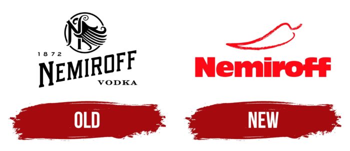
The company logo appeared sometime after the registration of the TM (it was developed in 1994 when the export of products began). Its concept focuses more on the male part of the population, so the logo looks strict, clear, and concise.
The visual mark is made in red. It is a Nemiroff inscription in straight, massive letters and the silhouette of red hot pepper.
The red colors create the impression of “hotness,” spiciness, fire, and exactly point to the hot beverage. Also, red is a sign of leadership and creativity (Nemiroff Price has many unusual combinations, such as strawberries and hot peppers).
The appearance of chili peppers on the logo is not accidental. Since 1998 the company has been producing a hot drink “Honey with pepper” according to a special recipe. It is the recipe that brought Nemiroff world fame. There was a small red pod at the bottom of every bottle, which was a recognizable trademark style. That is why the red pepper image became the main one on the old company logo.
New
After the ship disputes ended, the entire management process was overhauled. In 2016, the company was modernized to meet international quality certifications.
The logo was also completely renewed, becoming more sentimental and closer to “unisex,” according to modern European trends. The font of the logo is dainty, with elongated letters with serifs.
The brand name is written at an angle from the bottom upwards, which shows the aspiration for growth and development. Above the word Nemiroff on the left, there is a year of the first “pre-revolutionary” company foundation – 1872. With this, the modern owners wanted to show that the brand inherits the old secular traditions of the region.
On the right, below the name, is the word “vodka.” This identifies the brand as the producer of the world-famous original Slavic beverage. It signals to those foreign customers who want to try “Russian” vodka.
At the top of the logo is a visual representation of a circle in which a wing hugs the monogram letter N with fluttering feathers. The symbol looks like a seal, which represents the mark of quality. The stamp soars like a bird with one wing. It revived after 70 years of oblivion. The company has overcome many difficulties and risen to the very heights, occupying leading positions globally. The image reflects the unbroken spirit of Nemiroff.
Fabulous and little, resembling the real thing, the wing also represents the flight of fancy. When creating its drinks, the brand shows creativity, constantly surprising the world.
Nemiroff continues to evolve and is on the path of dynamic change. Since 2018, vodka has been a sponsor of the UFC martial arts company, which adds to the brand’s brutality and popularity among the male audience. And in 2020, the design of the bottle of the very first and oldest line of Original was changed. The container became lower, wider, and closer to a square shape but with rounded “smoothed” corners – a non-standard move for a vodka brand.
Font and Colors
The main colors are red (the old logo) and black (the new one). Black is a symbol of courage, rigor, and reliability. Font of the logo: PortsmouthbyOpen Window.
Nemiroff color codes
| Neon Red | Hex color: | #ff0916 |
|---|---|---|
| RGB: | 255 9 22 | |
| CMYK: | 0 96 91 0 | |
| Pantone: | PMS 172 C |
