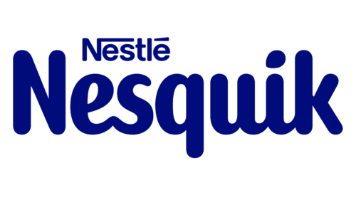
 The globally renowned brand, a subsidiary of the food industry giant Nestlé, decided to change its visual identity with the arrival of spring. The process will involve both the logo and the mascot. Therefore, in 2023, a new Quicky and a new logo will appear on the labels of the children’s food manufacturer. This step is associated with several consecutive factors.
- The old image of the rabbit did not meet all the expectations of modern consumers: it had become so familiar that it did not evoke a sense of novelty and freshness.
- The manufacturer wanted to join the global digitalization to adapt its mascot to the current demands of all information carriers.
- The company aimed to gain the trust of parents, get closer to them, and turn them into allies to strengthen consumer chains.
- The brand decided to participate in important events, be more dynamic and accessible, promote an active lifestyle, and develop and reinforce sustainable habits.
- The trademark intended to become a source of positive thinking, bring joy, and contribute to the strengthening of the emotional health of the younger generation.
- The management wanted to change Nesquik’s packaging to achieve a cohesive design when looking at the product, regardless of the type of container and its volume.
Designers were tasked with forming a close interrelationship between the mascot and the logo so that they would be perceived harmoniously not only individually but also together, appearing as a single whole. The work on updating the visual identity was entrusted to FutureBrand. The agency contributed to increasing the product’s relevance. As company representatives hope, this will give them the opportunity to attract new consumer segments.
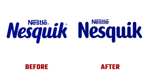
The emblem Nesquik focuses on relevance and goals, on communication and future innovations, while preserving the established audience. To achieve this, the developers used the old logo, making several adjustments. They removed the italics and made the inscription vertical, rounded the elongated dot over the “i,” removed the copyright symbols, and moved the word “Quicky” to the left, aligning it with the lowercase letter “e.”


