


![]() Nesquik Logo PNG
Nesquik Logo PNG
There is a lot of childish playfulness in the company’s visual image. At the same time, the Nesquik logo also conveys a serious approach to production and to caring for babies’ health. All company products are produced under strict control to bring only joy to children.
Nesquik began in 1948, when Nestlé launched Nestlé Quik in postwar America. The chocolate powder was made for busy mothers who wanted a fast way to turn milk into a drink children would accept. Its name came from “quick,” because it dissolved fast, even in cold milk.
In the 1950s, the product matched a market shaped by suburban families, rising birth rates, and demand for convenient children’s foods. TV ads with ventriloquist Jimmy Nelson and the dog puppet Farfel helped build early recognition. Farfel’s line, “Nestlé’s makes the very best… chocolate!”, ran for about 10 years and became part of the brand’s first major advertising era.
Nestlé sold the product in Europe under the Nesquik name, a combination of “Nestlé” and “Quick.” Banana powder appeared in 1954, the UK launch followed in 1957, and strawberry powder arrived in 1960. The rabbit first appeared on strawberry packaging and later became a TV character in 1973. Named Quicky, with a “Q” medallion and a voice by Barry Gordon, he became the brand’s main mascot. France, Greece, and Portugal had other mascots, including Groquik, Quikaras, and Kangurik, before global branding became more unified.
In the 1990s, Nesquik entered the ready-to-drink chocolate milk market, competing with Ovaltine and other children’s drinks. In 1999, Nestlé Quik in the US, Canada, and Australia was renamed Nesquik, and the “Q” in Quicky’s changed to “N.” The mascot was redrawn in 2005. In 2016, Nesquik Protein Power launched in the US, while the brand expanded into cereals, bars, and hot drinks. By the early 2020s, Nesquik was sold in more than 100 countries.
Meaning and History
![]()
The brand originated in 1948 as a chocolate mixture for quickly making cocoa. It was enough to add a couple of spoonfuls of the powder to the milk to achieve the result. It was so named: Quik (quick), a quick chocolate drink from Nestlé.
The brand has been associated with children’s delicious breakfasts and snacks almost from birth. Therefore, the visual mark never betrayed the pleasant “baby” colors and dynamic lettering as it evolved.
What is Nesquik?
This well-known cocoa drink brand has become popular among adults and children for its rich chocolate flavor and quick dissolving in milk. The product is made from carefully selected, high-quality cocoa beans, and its special formula ensures instant dissolution even in cold milk, creating a smooth, lump-free drink. The product line includes classic chocolate powder, ready-to-drink milkshakes, breakfast cereals, and flavors such as strawberry and banana.
1948 – 1974
![]()
The first logo was designed after the product’s launch in America. A discreet white background was chosen as a symbol of the beginning. Two words were used. The upper-left corner indicates the producing company, Nestlé, with its special trademark lettering. This was important for the product’s popularity since Nestlé by then had a rich history in the market. Its mention would have attracted customers’ attention. The second word on the logo is the name of the powder itself: Quik. It is centered and written from the bottom up at an angle, symbolizing development and the path to the top. Together, the word combination translates to Nestlé’s Quirk.
Given that the product was aimed at children and their parents, they made the words in color. However, the concern’s logo was black-and-white for a long time. For the Nestlé word, a pleasant burgundy was chosen, an indicator of confidence and conservatism, to inspire confidence in parents. The word “Quik” is in a deep, soft blue that symbolizes knowledge and mental development and is especially appropriate for children. The presence of blue and red in the logo was also subconsciously associated with the product’s suitability for boys and girls. The “quirk” was hinted at by the elongated and exposed leg of the letter K.
1974 – 1983
![]()
The product spread around the world. The concept for its promotion and advertising was already clearly defined, and the target audience (children) was studied and specified. Therefore, the informational message finally shifted towards the younger audience. The name of the powder was corrected to Nestle Quik. The emphasis was placed on how quickly and easily Nestlé drinks can be made. A child could manage it when his mother wasn’t around. Animated characters appeared for advertising: the Quicky bunny, the Grockey (a fat Kik that looks like a hippo), and the kangaroo Kangurik. The logo was set against a bright, cheerful yellow background, and the letters became more fluid and rounded. All the changes matched the purpose and attracted children’s attention as much as possible.
1983 – 1988
![]()
The brand lineup began to expand. In 1981, syrups were introduced. They could be added to milk, children’s drinks, and coffee. Therefore, the logo was slightly corrected to be suitable for adult audiences as well. The yellow background muted the production company’s name and the product, rendering them in a single shade of blue. The emphasis (white outline) is on the word “Quik” to associate the product with easy, quick preparation, which is important for busy people. The white lettering also adds a hint of novelty.
1988 – 1998
![]()
The company tries to expand its product range further. New flavors of milk powders are introduced (cherry, mango, creamy). Therefore, the logo’s message is tweaked. The new logo’s look is aimed at associations with milk and products for young children. A soft red and blue, white milky background, an airy white cloud with a soft blue frame in the form of the word Quik, on which the name itself ‘floats.’
1998 – 2002
![]()
A couple of years after the appearance of Nestle Quik, the creators discovered that the mix of words (Nesquik) sounds much more original. Therefore, two years after the presentation of instant drinks, they gradually introduced a new variant. In 1999, the brand name Nesquik completely superseded Nestle Quik. This entailed a change in the famous rabbit. It gained a new image thanks to cartoonist Ramon Casañez and became Nesquik. The brand also expanded its range, starting with children’s breakfast cereals and adding other sweet products. The logo has also changed.
NesQuik replaced the familiar word “Quik”. The capital letter Q was retained to help customers in North America, Australia, and Mexico get oriented faster (in Europe, the beverage was initially introduced as Nesquik). The name was made brighter, in deep blue. The wide white outline of the letters attracted even more attention.
A rich yellow background returned to the emblem, as the new range was suitable for children of all ages.
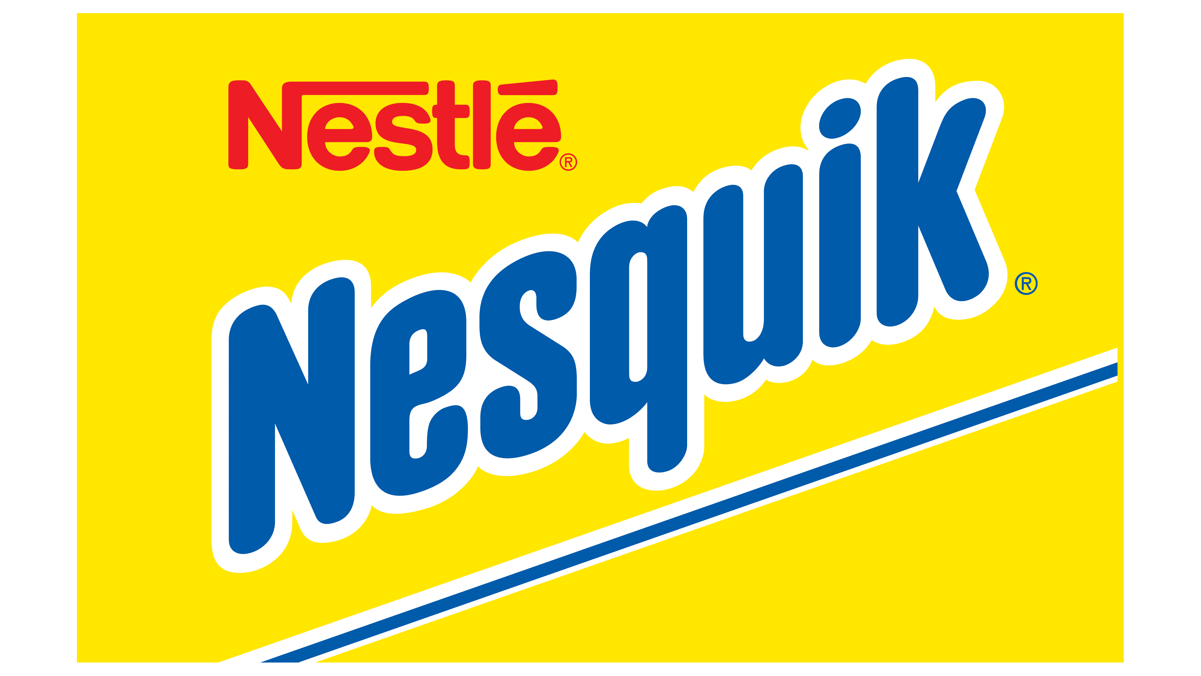
2002 – 2017
![]()
Three years later, after all markets were accustomed to the brand renewal, the main international logo was developed, combining the core idea of the Nesquik brand. It was used for many years.
The uppercase Q became uppercase. The name got big blue “cartoon” letters with white highlights, outlines, and shadows. It was placed on a cheerful, bright lemon background. The whole emblem was associated with children’s products. It showed that they add color, flavor, and joie de vivre to food, even white milk.
2018 – 2020
![]()
In 2015, the production company changed the color of its logo to blue. This happened for the first time in Nestle’s 160-year history. And the Nesquik logo acquired the same color. During this period, the company received many complaints about the high sugar content of its products (up to 7 teaspoons per glass). Given the widespread fight for healthy lifestyles and WHO standards, the company decided to revise the formulation starting in 2017, reducing the figure by half. Letters with a blue-to-blue gradient and a white shadow were intended to show the brand’s shift toward greater safety.
2020 – today (bottles)
![]()
In all logo versions, the brand name was angled, pointing upward. In the new logo, the word “Nesquik” is written straight up. This shows that the brand has reached the peak of its development. It looks confidently into the future and stands firmly on its feet. Only a slight italicization now hints at a move forward.
The concern’s name has moved from the top-left corner to the center, directly above the brand name. Thus, the logo looks more harmonious and compact. The white outline of the letters was removed. The only color is dark blue, evoking the Swiss lakes, the country where Nestlé’s fast cocoa originated.
2023 – today
![]()
In late March 2023, Nesquik introduced a new logo designed by the London-based company FutureBrand. It was created as part of a global update that affected packaging and the mascot. The wordmark has barely changed since the whole thing was not about it, but about the rabbit Quicky, whose smiling head adorns the yellow labels. The manufacturer of cocoa, ice cream, and candies decided to adapt the iconic character for the digital age to attract younger consumers.
At the same time, the packaging design was simplified to make it more noticeable on store shelves and more appealing to children. The dark blue logo immediately catches the eye with its rich color, which stands out against the soft yellow background. The rounded-edged, smooth-curved font adds warmth and friendliness. However, the word “Nesquik” is now written in straight letters rather than in italics. Some of the letters are connected, as if holding hands. The elongated drop above the “i” has taken on an egg-shaped form, with designers softening its pointed tip. As for the classic wordmark “Nestle,” it is shifted left and sits primarily above the “e” and “s.”
Font and Colors
The main colors of the logos are blue, white, and yellow, which are also predominant on the packages of all Nesquik products. Their brightness draws attention and reflects the children’s orientation toward the brand.
- Blue is the color of the sky, dreams, and early childhood.
- Blue is a symbol of vigorous mental activity, which Nestlé’s delicious, healthy products should promote.
- Yellow is joy. Snacks and breakfasts warm you up, give you energy, help you have fun all day long, and lift your spirits when you’re fatigued.
- White – milk, novelty, goodness, and naturalness.
The font is similar to Arial Rounded MT Bold.