The Nest logo is designed in the style of Google and connects the platform with the rest of the search engine’s offerings. The emblem has a hint of cloud technologies and a range of monitoring services. The sign promises a comprehensive approach for the complete safety of the client.
Nest: Brand overview
| Founded: | 2010 |
| Founder: | Tony Fadell, Matt Rogers |
| Headquarters: | Palo Alto, California, U.S. |
| Website: | nest.com |
Meaning and History
This is a very interesting and innovative brand, one of the first to offer a programmable and self-learning electronic product – Nest Learning Thermostat. The device has Wi-Fi support and monitors indoor heat savings. It learns the activities, lifestyles, and schedules of the house owners, independently adjusting the on / off of heating and cooling systems. Since moving to Google, the brand has expanded its range of smart products to include speakers, clocks, locks, displays, cameras, smoke, and carbon monoxide detectors.
Over the entire period of its existence, the brand has undertaken several optimizations of the production process: it has continuously improved and increased the list of its products. In 2012, the Internet giant acquired it for more than $ 3 billion. At that time, the company employed about 130 employees, and at the end of 2014, there were already 280 of them, and a year later – 1100.
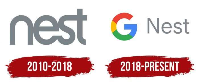
In 2018, the service ceased to exist as a separate independent business and was fully incorporated into the Google division structure, having received its current name. The most significant steps in her career were reflected in the logos, of which she has two.
What is Nest?
It is a subsidiary of Google. Various equipment for a smart home is produced under the Nest brand: locks, doors, cameras, detectors, thermostats, and much more. The devices are Wi-Fi capable, equipped with sensors, and are capable of self-learning.
2010 – 2018
The very first emblem of the company dates back to the period when it was Nest Labs – an independent production and trade unit with its line of technical devices. Its visual identification mark looked like simple, smooth lettering. It was a printed text with incoherent chopped letters. The symbols were streamlined, rounded, without sharp corners, except for the “e,” which had one inner corner. The letters “n,” “e,” and “s” touched at one point, while “s” and “t” smoothly flowed into each other: the end of the penultimate letter passed into the crossbar of the last one.
2018 – today
At this time, the Google Home brand disappeared, and the Google Nest appeared, which was reflected in the logo. Moreover, everything was renamed – not only the trademark but also every unit of goods. So the giant company has a single brand of home products. Accordingly, the Google sign appeared on the personal symbols – the bright letter “G.” It consists of several color fragments: blue, green, yellow, and red. In contrast to the catchy corporate palette, the gray color of the second half of the lettering looks faded. According to the spelling rules, the word “Nest” is written in thin lowercase characters, except “N,” which is uppercase.
Nest: Interesting Facts
Nest Labs, also known as Nest, is a company that has been very important in developing the smart home industry. Google bought it in 2014, and since then, Nest has brought out a lot of new products that change how we use our homes.
- Beginning and Founders: Nest was created in 2010 by Tony Fadell and Matt Rogers, who used to work at Apple. Fadell played a big role in creating the iPod, bringing his design knowledge to Nest.
- Innovative Thermostats: In 2011, Nest’s first big product was the Nest Learning Thermostat. It was special because it could learn what you like and adjust the temperature, making your home more comfortable and saving energy. It looked good and was easy to use.
- Smoke Detectors: In 2013, Nest made the Nest Protect, a smart smoke and carbon monoxide detector that could talk to you and be turned off with your phone.
- Google Bought Nest: Google bought Nest for $3.2 billion in 2014, showing they were interested in smart homes. This was a big deal in the tech world.
- More Smart Home Products: After being bought by Google, Nest made more products, such as security cameras (Nest Cam), smart doorbells (Nest Hello), and security systems (Nest Secure), which made Nest a big name in smart home devices.
- Saving Energy: Nest says its thermostats have saved a lot of energy in homes worldwide.
- Working with Google Home: In 2019, Nest products were included in the Google Home family, making them work even better with Google’s other products.
- Using AI: Nest uses Google’s artificial intelligence and machine learning to make its devices smarter to better understand and predict what you want.
- Setting Standards: Nest has greatly influenced the smart home industry, making useful products look good and are easy to use.
Nest started with the idea of making better thermostats and has grown into a major player in the smart home industry. Its products make our homes more comfortable, safe, and energy-efficient, showing how technology can improve our daily lives.
Font and Colors
The logo of the pioneering company changed in the direction of complication. If there was only one single word in the debut version, then after 2018, an icon appeared in the form of a massive letter “G” of different colors. The designers also changed the font, making it visually simpler. This change had a serious impact on the brand’s identity: its affiliation with Google was emphasized, while the native name Nest, on the contrary, became visually invisible.
First, a modified grotesque from the Akkurat family was used in the emblem. The designers cut off the tail of the letter “n,” getting the perfect streamlined semi-oval shape. The author of the sans-serif font is Swiss Laurenz Brunner, date and place of release – 2004, Lineto foundry. The modern version features a simple thin chopped typeface Fuller Sans DT.
The color scheme of the logo consists of calm shades of gray (lettering) and rich tones of red, green, blue, and yellow (the letter “G,” which acts as an icon).
FAQ
Is Nest a Google company?
Yes, it is a Google company. Google bought Nest Labs for $3.2 billion in January 2014, when the company had 280 employees. By late 2015, had grown to over 1,100 employees and opened a primary engineering center in Seattle. This acquisition helped Google expand in the smart home market by integrating Nest’s products with Google’s technology. The brand is known for its smart home devices like thermostats, security cameras, and smoke detectors, designed to improve home automation and energy efficiency.
Does Google make Nest?
Yes, Google makes Nest products. It is a brand under Google that focuses on connected home devices. They aim to create a helpful home environment where products work seamlessly together. On the Google Store, you can find various Nest products designed to enhance home automation and improve everyday living. These products include smart thermostats, security cameras, doorbells, and smoke detectors. The integration of these devices helps create a connected and efficient home system, reflecting Google’s commitment to innovation and user-friendly technology.
What is a Google Nest used for?
A Google Nest device is a smart home hub that makes life easier. It has many uses:
- It has Google Assistant for voice commands. You can ask it to play music, set reminders, check the weather, answer questions, and more.
- You can stream music, podcasts, audiobooks, and radio stations. It controls playback on smart TVs and speakers.
- The device works with many smart home gadgets, such as lights, thermostats, security cameras, and door locks. You can control these individually or set routines for multiple actions.
- It helps with daily tasks by setting alarms, timers, and reminders. It gives traffic updates, calendar events, and news briefings.
- You can make hands-free calls, send messages, and broadcast announcements to other devices in your home.
- With compatible accessories, it enhances home security. It monitors activity, sends alerts, and provides live video feeds from security cameras.
- The brand’s routines and scheduling make home automation easy. For example, you can set a morning routine that brightens lights, reads the news, and starts your coffee maker.
How many people use Google Nest?
About 27 percent of smart home users in the United States use Google Nest. Among the 76 percent who know the brand, 36 percent choose it.
Customer loyalty is strong. Around 23 percent of smart home users in the U.S. plan to use the brand again, suggesting that many users are happy with the brand and will keep using its products.
These statistics show the brand’s strong market presence and positive reception. A large user base and high loyalty rates highlight the brand’s success meeting consumer needs.
How do you make a nest logo?
To make a Nest logo, follow these steps:
- Use the Google icon, a multicolored “G,” with the word “Nest” in gray.
- Ensure the “G” has Google’s colors: blue, red, yellow, and green. The word “Nest” should be in a gray sans serif font.
- Choose a clean, simple sans serif font for “Nest” that is easy to read and fits the brand’s style.
- Balance the size and proportions. The “G” and “Nest” should align well. Check the branding guide for exact measurements.
- Refer to the branding guide for all logo options, color schemes, typography, and sizes. This ensures the logo fits the brand’s identity.
By following these steps, you can create a logo that looks good and follows the brand’s standards.
