Chilled natural tea is immediately readable in the image of the emblem. The Nestea logo is filled with the taste of fragrant green leaves and fruit additives that set them off. The image also hints at the pure spring water used in cooking.
Nestea: Brand overview
| Founded: | 1948 |
| Founder: | Nestlé |
| Headquarters: | Switzerland |
Nestea is Nestlé’s tea brand, offering ready-made fruit and tea drinks. The products are made from white, black, green, and red teas with the addition of flavorings and natural juices. Special technology allows preserving all the useful substances of the leaves. Nesti is distributed in 60 countries, mainly in Europe and America. The beverage is bottled and distributed by Nestle and Coca-Cola with partners.
Before getting to know Nestea, most people had no idea how diverse tea can be:
- Liquid concentrate for dilution.
- Concentrated powder for boiling.
- Chilled tea.
- Bottled tea with added fruit.
All this is so different from the usual leaf or bagged product! This is what helped the brand advance in the market. The company was able to satisfy the tastes of demanding gourmets. It provided an opportunity to drink tea comfortably in winter and summer, at home and on the road.
The idea to create such a tea came to Nestlé in 1943. The company used the same method for making the powder as for Nescafe coffee in granules. The first instant tea was introduced in 1948. The name of the new product and many brands of the corporation were a mix of two words: Nestle and tea.
Gradually manufacturers focused on bottled ready-to-drink beverages. The soft flavor of brewed tea was supplemented with refreshing fruits: lemon, apricot, peach, mango, pear, and berries.
Meaning and History
The logo’s main message can be summed up in four words: freshness, coolness, naturalness, and usefulness.
Nestea, Nesquik, Nescore, and Nescafe share the common prefix “Nes,” which indicates their Nestle affiliation. But each brand has its unique logo that emphasizes its distinctive features. For example, the main characteristic of Nestea is its herbal composition. Therefore, almost all of his emblems contain the image of leaves.
The designers emphasized that the drink has a pleasant refreshing taste not due to artificial colors and flavors but due to natural tea leaves from India. This is not only a publicity stunt designed for healthy food lovers but also an effective tool to attract attention. In combination with the amber color of the tea, the logo creates a thirst that customers immediately seek to quench.
What is Nestea?
Nestea is a brand of ready-to-drink tea sold chilled in plastic bottles. The range also includes tea concentrates. Drinks come in a variety of flavors, including the traditional lemon. Stevia is used as a natural sweetener. The trademark is owned by the Swiss multinational conglomerate Nestlé.
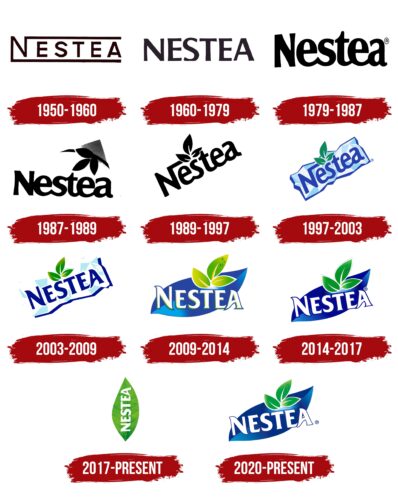
1950 – 1960
The first logo appeared in 1950. It was a slightly revised version of the name of the producing corporation. From the top and bottom of the letter, N went straight stripes outlining the rest of the words above and below. This symbolized patronage, care, and ownership of the brand by the company Nestlé the customer already knew. In addition, the stripes resembled the road the new brand was taking to life, taking its origins in a famous corporation. This road is straight and level. The color chosen for the logo was “teal” brown with yellow highlights on the edges of the lines. It created the effect of a slight blur, transitioning into a light watery background. The composition alluded to the water element and dissolution.
1960 – 1979
In the early sixties, tea gained popularity and the association with Nestlé no longer mattered. Therefore, the Nesti logo changed. The letters were made larger; the “protective” stripes were removed. The color scheme shifted from brown to black and gray. The brand’s drinks were made from black tea, which the coloring showed.
1979 – 1987
Tea was actively expanding into new markets. It became necessary to accentuate the contents of the bottles. So the name of the brand was written in capital letters, but with a space between the two parts of the word “Nes” and “tea.” This helped the word ‘tea’ stand out, so it was clear to the customer what kind of drink they were looking at. Another innovation was a slight arc-shaped curve. It showed a refreshing and uplifting taste. The upward stretching letters reinforced this association.
1987 – 1989
The logo has been given a background. It seems to be written on a paper or envelope lying in a corner, which is “sent out” to the world. In the top shaded paper corner, you can see a sprig of a plant with three leaves on it. The leaves are tilted toward the word “tea” and represent a tea bush. The emblem is now more associated with the plant beverage. The inscription letters are not so elongated, which looks more harmonious.
1989 – 1997
By 1991, Nestlé teamed up with Coca-Cola in Beverage Partners Worldwide (BPW) to work on Nesti Tea. Coca-Cola oversaw the bottling and distribution of the drink in 52 countries, which made adjustments to the brand’s advertising and logo.
The name Nesti was written at an angle, which showed the new start and active promotion of the drink in the world. The letter N again gained a top line, linking the brand to Nestlé and indicating patronage of the corporation. A roundness was added to the letters, a hint of the mild taste of the product. The tea leaves that appeared in the last version of the logo have moved above the lettering and ‘grew’ over the S. They were pointed upward, increasing the association with the delicate three-leafed tea tops. The traced white veins freshened them up. The composition created an impression of liveliness, freshness, and youthfulness.
1997 – 2003
In 1997 the emblem underwent significant changes, corresponding to the spirit of the time. The most important of them was the appearance of a color. The image came to life and became closer to natural colors.
The second important change was the placement of the inscription on a piece of ice. This immediately evoked a sense of coolness and was perfect for a chilled beverage logo. The size, the strong slant of the lettering, and the three tea leaves did not change. However, the typeface became typographic, and the special division of the word into two halves disappeared. The white outline of the letters enhanced the cool feeling.
The color of the letters and the logo’s border in blue tones linked the emblem with clean water. The green leaves indicated naturalness and freshness. In general, ice, water, and leaves were associated with thirst-quenching, coolness, and healthy herbal drinks.
2003 – 2009
The brand logo was refined and improved in the direction of naturalness and naturalness. The more clumsy blue edging of the ice-floe was transformed into a dark blue shade. The letters acquired the same tone, reinforcing the association with a refreshing cold drink. The tea leaves became three-dimensional, closer to nature, thanks to an interplay of light and dark green shades. The rounded font was changed into a chiseled, sharp, and “icy” one. On the whole, it looked as if an ice cube was falling into the glass.
2009 – 2014
Since 2009, Nestlé has contributed to the fight against obesity and diabetes and began developing healthy drinks and products. A series of Vitao products appeared on the market, made of three types of healthy antioxidant tea (white, green, and red) with the addition of fruit juices. And stevia is used as a sweetener. The brand logo has also changed. The emphasis has shifted toward health benefits.
Instead of ice, the background is a blue tea leaf. Blue is the sign of the water element. The color regulates melatonin levels, lowering them, which leads to increased vigor. This is exactly the result that Nestea products are supposed to bring.
The word Nestea has been given straight lettering, which symbolizes the brand’s reliability. The white color of the letters is an indicator of naturalness, usefulness, renewal, and a hint of consumption in a refrigerated form. The appearance of blue and green outlines gives the inscription a three-dimensional look. Each letter seems to be chiseled out of ice or snow.
The three already familiar tea leaves were depicted in light yellow-salad shades. This indicated an almost complete absence of fermentation processes in tea production to preserve maximum antioxidants and the lighter tones of drinks made from these leaves.
2014 – 2017
In 2017, the tea product collaboration between Coca-Cola and Nestlé was terminated due to a mismatch of global goals. The Swiss company decided to promote the beverage itself, leaving its partner with a license in only a few countries in Europe and Canada. The renewed tea is now as natural as possible. Nestlé removed all harmful additives from the beverage, as it strictly keeps the course for improving people’s health. This idea of renovation and health in the logo was reflected by changing the color of tea leaves from yellow and lettuce to green. Otherwise, the logo stayed the same.
2017 – today (US)
The logo, created in 2017 for the US market, looks like a drawing from a biology textbook. The artists painstakingly painted every vein of the green leaf to make it look like the real thing. And the shadows and gradient additionally emphasize the volume. It seems as if the sun’s rays are falling on the green surface. This inspires confidence and optimism. The tea leaf is located vertically and serves as the basis for the same vertical inscription, “NESTEA.” All letters are white, capitalized, and go from bottom to top – from “N” to “A.” The font looks the same as in previous versions of the emblem.
2020 – today (Europe)
The Nestea logo is used in Europe, with three tea leaves splashed with moisture. The 3D drops look refreshing, especially against the green gradient background. The leaves are not detailed and outlined with light contours. Below is a white inscription – the brand’s name, designed in the original font. More precisely, this is not a font but an individual set of glyphs with elegant triangular serifs. In the background is a blue figure of an elongated shape, stylized as another tea leaf.
Font and Colors
The entire gamut of the logo accurately reflects Nestlé’s core message. The basic tones are:
- Green – natural, plant-based, health benefits.
- Blue – pure artesian water, coolness.
- White – cooling, no harmful additives.
- Yellow – the basic lemon flavor of Nesti, also the color of joy and vivacity.
The logo font is close to Friz Quadrata.
Nestea color codes
| Air Force Blue | Hex color: | #162d8a |
|---|---|---|
| RGB: | 22 45 138 | |
| CMYK: | 84 67 0 46 | |
| Pantone: | PMS 2746 C |
| Baby Blue | Hex color: | #74cbf4 |
|---|---|---|
| RGB: | 116 203 244 | |
| CMYK: | 52 17 0 4 | |
| Pantone: | PMS 311 C |
| Pigment Green | Hex color: | #00a134 |
|---|---|---|
| RGB: | 0 161 52 | |
| CMYK: | 100 0 68 37 | |
| Pantone: | PMS 354 C |
| Pistachio | Hex color: | #94cb5b |
|---|---|---|
| RGB: | 148 203 91 | |
| CMYK: | 27 0 55 20 | |
| Pantone: | PMS 360 C |
