


![]() Ice Nine Kills Logo PNG
Ice Nine Kills Logo PNG
Ice Nine Kills’ logo pierces the viewer’s body like sharp nails at just one glance. The emblem is inspired by the horror theme, which the musicians develop and creatively play within their work.
Meaning and History
The band’s logo, like its name, did not emerge immediately. Initially, the group was named Ice Nine for six years before changing its name to its current one in 2006, the year it released its debut album. The band members also had to work on the visual representation. The idea of a “needle-sharp” logo emerged in 2009, following a complete overhaul of the group’s lineup. Spencer’s comrade, Jeremy Schwartz, left, unable to withstand the rigors of touring life. Therefore, Charnas invited musicians from the recently disbanded group Remember Tomorrow. They brought a new style of music, a new contract with Ferret Music, and a new logo.
What is Ice Nine Kills?
A heavy metal quintet from Boston, formed by two school friends in 2000. Spencer Charnas is the only original member of the group. The other musicians have undergone several changes over the 23 years of their creative work. The band has released six albums.
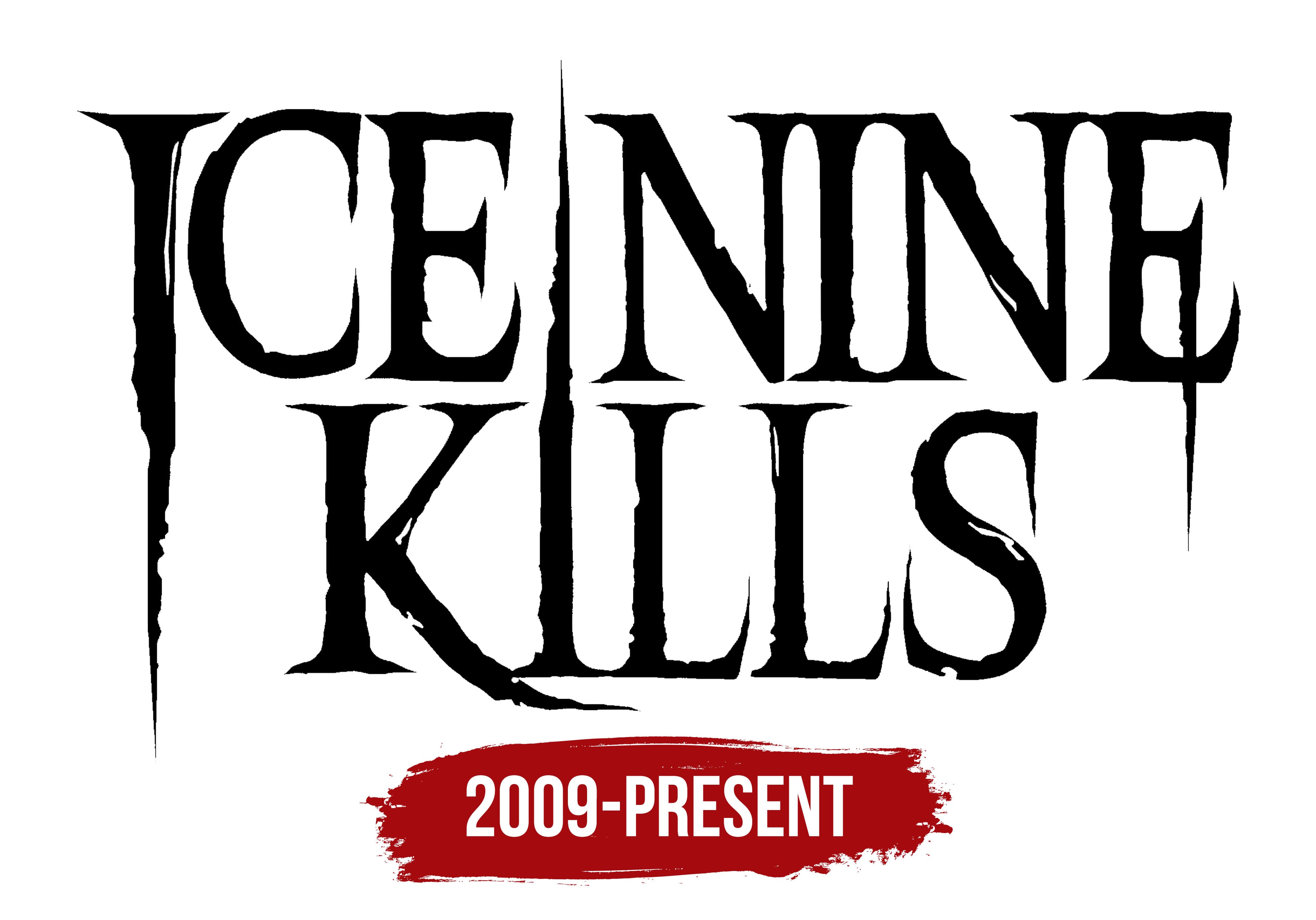
2009 – today
![]()
The band’s emblem features the group’s name in transformed letters. The first character in Ice and the “i” in kills have turned into sharp screws, and the E resembles an ancient cleaver. The inscriptions are meticulously crafted, just like the staged performances, which become mini-spectacles.
Each sharp object in the emblem is present in horror movies. The choice fits well with the overall spirit of the band’s songs and other marketing products. Themes of death, murder, and horror are the main directions. In many Ice Nine Kills videos, you can see a scene of the hero murdering his beloved. Interestingly, Spencer and his girlfriend always play the hero and the girl. The band also has a whole line of products depicting Disney characters as maniacs and killers. Therefore, the branding’s sharp elements, such as blades and nails, are entirely consistent with the band’s style.
The name is taken from Kurt Vonnegut’s science fiction novel Cat’s Cradle. In it, the fictional substance Ice 9 could freeze all water and cause human destruction. The band’s name is often abbreviated to INK. Interestingly, the band’s songs, especially those on the last two albums, The Silver Scream 1 and 2, are based on artistic works, just like the band’s name. According to the band members, they are inspired by the adrenaline of fear, and horror makes excellent material for staged scenes.
Another interpretation of the logo is the Roman numeral 9, written in blood. Below it is an inscription in a style similar to the first. Splatters and drops scattered everywhere resemble the work of a maniac. The image is associated with the comic Ice Nine Kills: Inked in Blood, released by the band in 2021. Sometimes, the 9 in the sign is made of bones.
Font and Colors

The black color in the logo stems from the band’s song lyrics. Most nightmares and scary events are inspired by the dark time of day. Negative characters and evil are always associated with blackness. The band’s clips, often reflecting scenes from famous horror movies, have a dark ambiance and take place at night.
The red color in the second interpretation of the logo evokes blood, flowing like a river in horror movies.
Overall, the group’s color palette, name, and style harmoniously combine, look bright, and are memorable.
The inscription’s font is unique due to the transformation of the letters. The word elements appear voluminous thanks to the white highlights. The sharp ends of each symbol, like claws, fangs, or saw teeth. The style of the inscription resembles graffiti drawn in a dark alley, evoking a sense of horror.